A Gift to Artwork, taken from the Caligula’s Horse song “A Gift to Afterthought”, breaks down and analyses your favourite album artwork. The first time an album’s name appears, it will link to a large and (where possible) high-resolution image of the cover so that you can take a closer look. Read other entries in this series here.
Editor’s Note: A Gift to Artwork features a regular guest contribution from Luis Flores (@luis.hoa), who runs and regularly writes for the excellent Heaviest of Art. If you’re looking for more analysis and discussion of album artwork Luis’ Behind The Cover column is a must-read.
Welcome one and all to 2022’s first edition of A Gift to Artwork. We’re keeping it short and sweet to kick things off this year, featuring three gorgeous covers from Allaegeon, The Final Sleep, and Ghost. Let’s get stuck in!
Allegaeon – DAMNUM (Cover art by Travis Smith)
The renowned Travis Smith is back for another magnificent entry in his revered catalogue of standout metal artistry with Allegaeon’s DAMNUM, a record as multidimensional as the cover illustration that represents it. Smith is no stranger to unconventional works that encourage deeper viewing, as his previous works for Opeth, Fleshgod Apocalypse, and Katatonia would suggest, and DAMNUM is no exception. It’s expansive and ambiguous, often turning a new face with each passing listen of the record as it exists as one with the lyricism it puts a face to.

Leading up to the record’s release on February 25th, Allegaeon frontman Riley McShane provided a brief overview of the collaboration with Smith, who immersed himself into the world that the band so meticulously crafted. The video presented is a proper entry point into the audiovisual partnership, but it’s simply that: an entry point. DAMNUM’s experience is best explored analytically as a warm colour palette sets a mysterious and quite sombre tone that appears enticing to passing eyes. Symbols and key figures are sprawling across the cover, a signature feature of Smith’s cover illustrations. A masked figure looking into a crystal ball with hands held back by a rope from the abyss, a separate mask and skull on a shelf, and peculiar figures hiding in the background are but a few of the many nods included here, expanding upon the record’s themes of sadness, anger, grief, and loneliness. The solace found in DAMNUM’s words were intentionally composed for audiences to reflect on their own experiences and the cover illustration provides a conduit for doing so. Smith understands them well with multiple universes or phases existing in this one cover. What do they mean? That’s for you to decide and align however you choose.
Like DAMNUM itself, Smith’s cover is not an easy view, but it’s a rewarding one for those with the patience to engage beyond a surface level.
– Luis Flores
The Final Sleep – Vessels of Grief (Cover art by Adolf Hirémy-Hirschl (1898))
New York prog metallers The Final Sleep have dug into the archives of the public domain for the cover art for Vessels of Grief, choosing Adolf Hirémy-Hirschl’s Souls on the Banks of the Acheron (here’s the original piece). In the centre stands Hermes, marked by his signature winged helm. His status as a god among mortals shines throughout the piece: in his powerful, determined and purposeful pose, his strong and muscular arm, his regal cloak, the halo of light around his head and the vitality in his flesh. The scene depicts him leading the recently deceased towards Charon, the boatman that will ferry them across to the afterlife. The dead are grey, sunken, and sallow, some resigned to their fate but many clamouring for reprieve – desperate for Hermes to save them, to send them back to the living.
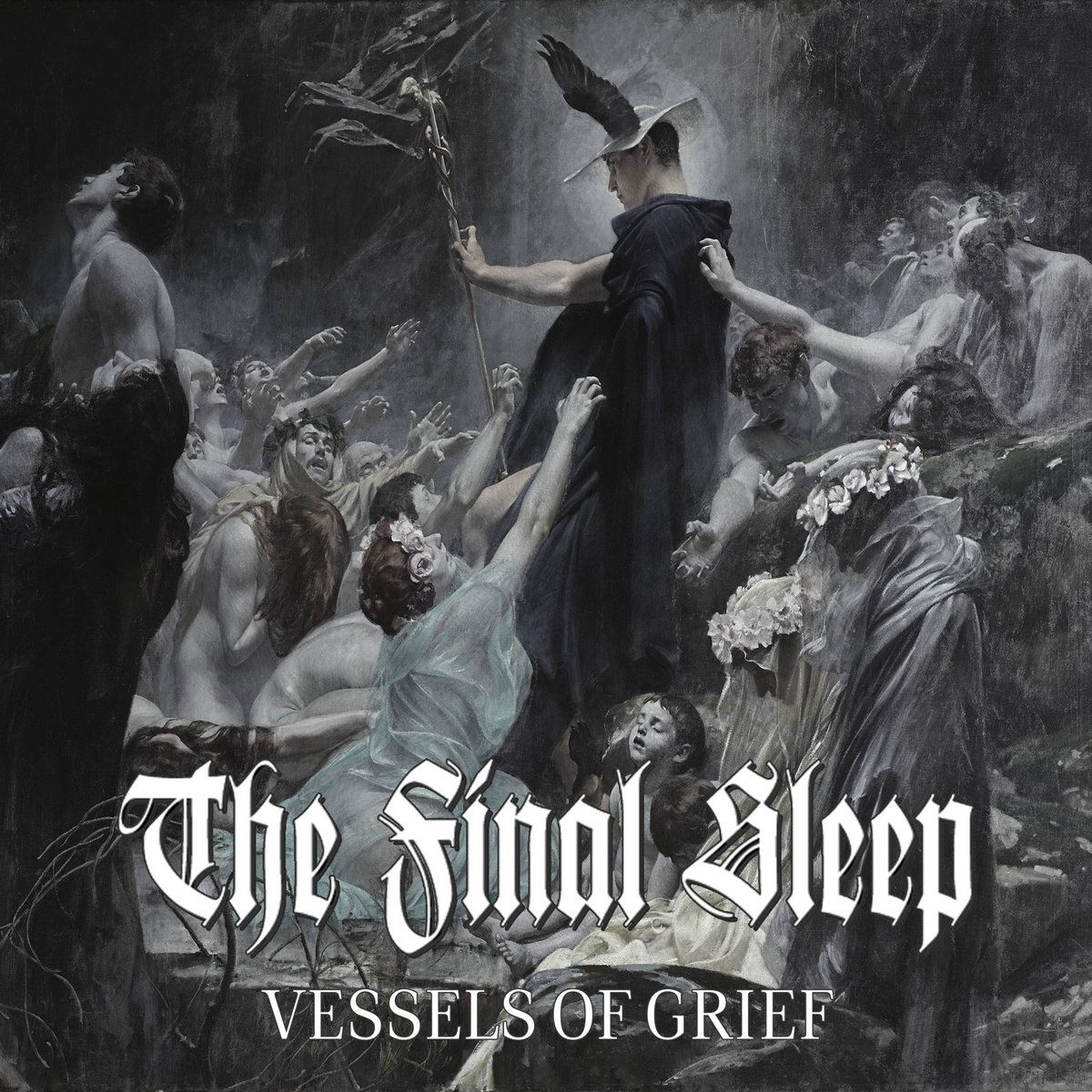
It is in the expressions of the dead that the artwork truly shines. The peace and silence of the child at Hermes’ feet. The anguished parent reaching down towards them. The collapsed woman placing her hand on Hermes’ shoulder, the realisation that there is no route back crushing her as she lies in the lap of her sullen partner, resigned to their fate. The crowd of hands reaching desperately, yet without hope. It’s a truly chilling scene, one which captures attention and perfectly matches the band’s name and the album’s title. A fantastic work of art and a fantastic choice as the cover of Vessels of Grief.
– Karlo Doroc
Ghost – Impera (Cover art by Zbigniew M. Bielak)
We’ve featured Zbigniew M. Bielak a couple of times before in this column, both for his prior work with Ghost and his iconic cover for Imperial Triumphant’s Alphaville. Those familiar with his work will immediately spot his signature all over the stunning cover for the forthcoming Impera – another masterpiece in his increasingly impressive portfolio. The style is reminiscent of the Alphaville cover with its cold and metallic textures, shining golden colours and ominous, foreboding scale.
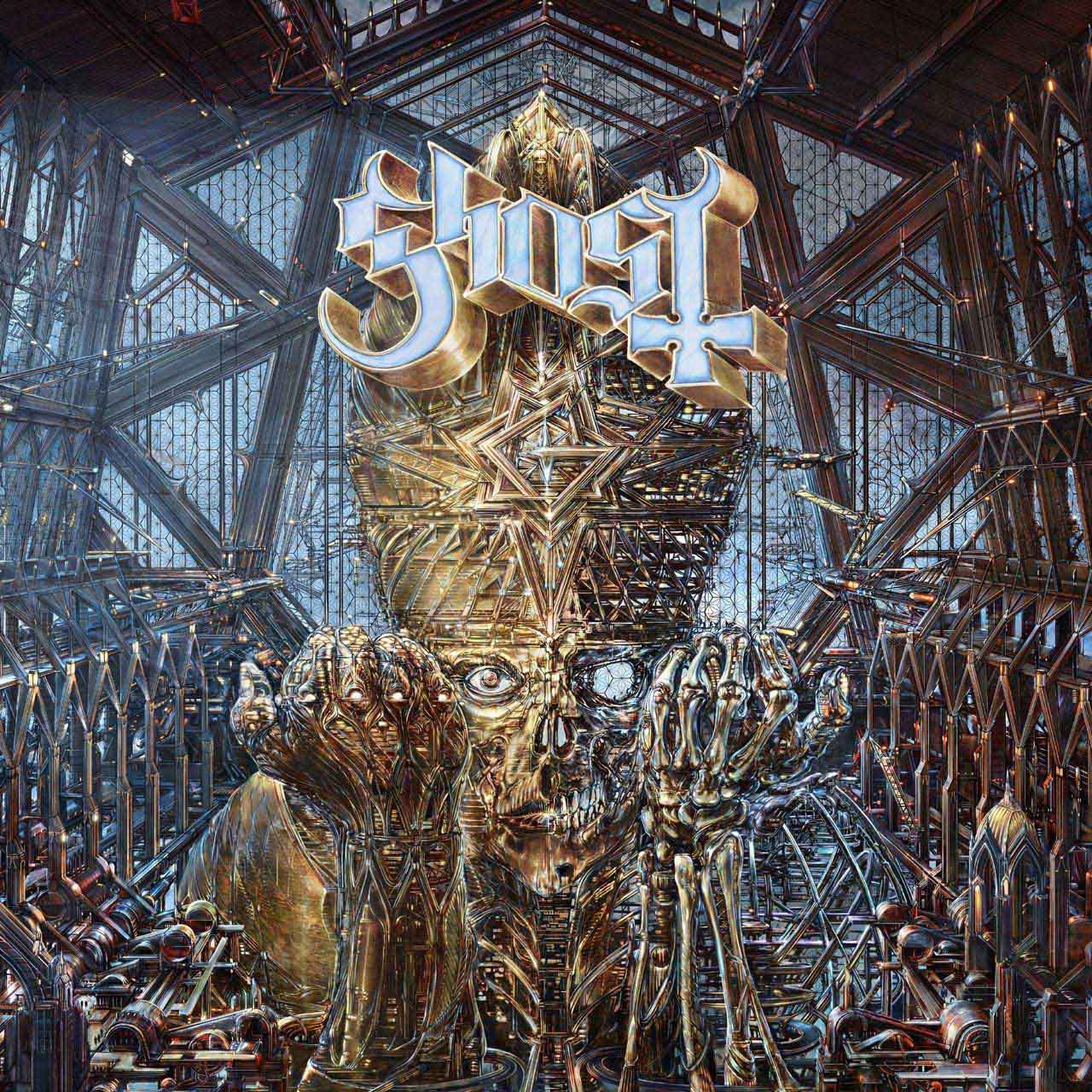
The centrepiece is Papa Emeritus IV in giant cyborg form, housed within an unwelcoming and monolithic cathedral. Gone are the beautiful stained glass windows and the curves of arches and paths. Instead, we have an industrial, almost clinical design with clear glass and metal beams arrayed in a series of straight lines and sharp angles. The Papa cyborg is two-faced, its left side (from our perspective) a mixture between human and machine whilst the right side is skeletal, lacking both the flesh and the wiring and mechanical touches of its opposing half. It’s almost as if the Papa is still under construction, an array of drones hovering about and busily working towards the completion of some cybernetic procedure of gargantuan proportions.
Overall, the piece is both visually stunning and emotionally evocative. The grandeur of the scale and colour palette is paired with its eerie, discomforting, and hopeless nature. The industrial and mechanical aspects are labyrinthine and desolate, whilst if one slowly looked from the very bottom of the piece’s centre up to the Papa’s chin it’s almost as if there is a motorway leading into the flames of hell. The record may not be out yet, but a cover like this is a brilliant way to build anticipation and a fine start to the year’s cover art – if the music is only half as good we will be fortunate indeed. See you next time.
– KD