A Gift to Artwork, taken from the Caligula’s Horse song “A Gift to Afterthought”, breaks down and analyses your favourite album artwork. The first time an album’s name appears, it will link to a large and (where possible) high-resolution image of the cover so that you can take a closer look. Read other entries in this series here.
Well, let’s face it, 2020 was an absolute train wreck – the less said the better. Thankfully we had music and artwork to help us get through it and, as we did last year, here we’ll present some of our favourite album covers of the year unranked and in no particular order. Get amongst it.
Caligula’s Horse – Rise Radiant
I know that I just said these are unranked, but this stunner from Caligula’s Horse is definitely my favourite from 2020. The colours on Rise Radiant really hit their mark – whether it’s the warm greens, the earthy browns or the striking blue, they each play their role. The cover also does a fantastic job of conveying three of the records motifs: tranquillity, power and the journey. The tranquillity of the quaint scenery and the trickling of the water (e.g. “Autumn”). The power of the regal stag and towering mountain (e.g. “Valkyrie”). The journey along the winding path up to the mountain’s peak (e.g. “The Ascent”). It looks amazing, it fits the band’s aesthetic and it is closely related to the record’s themes – hats off to Chris Stevenson-Mangos for this wonderful artwork.
P.S. If you want a more detailed analysis of this piece, check out this piece from mid-2020.

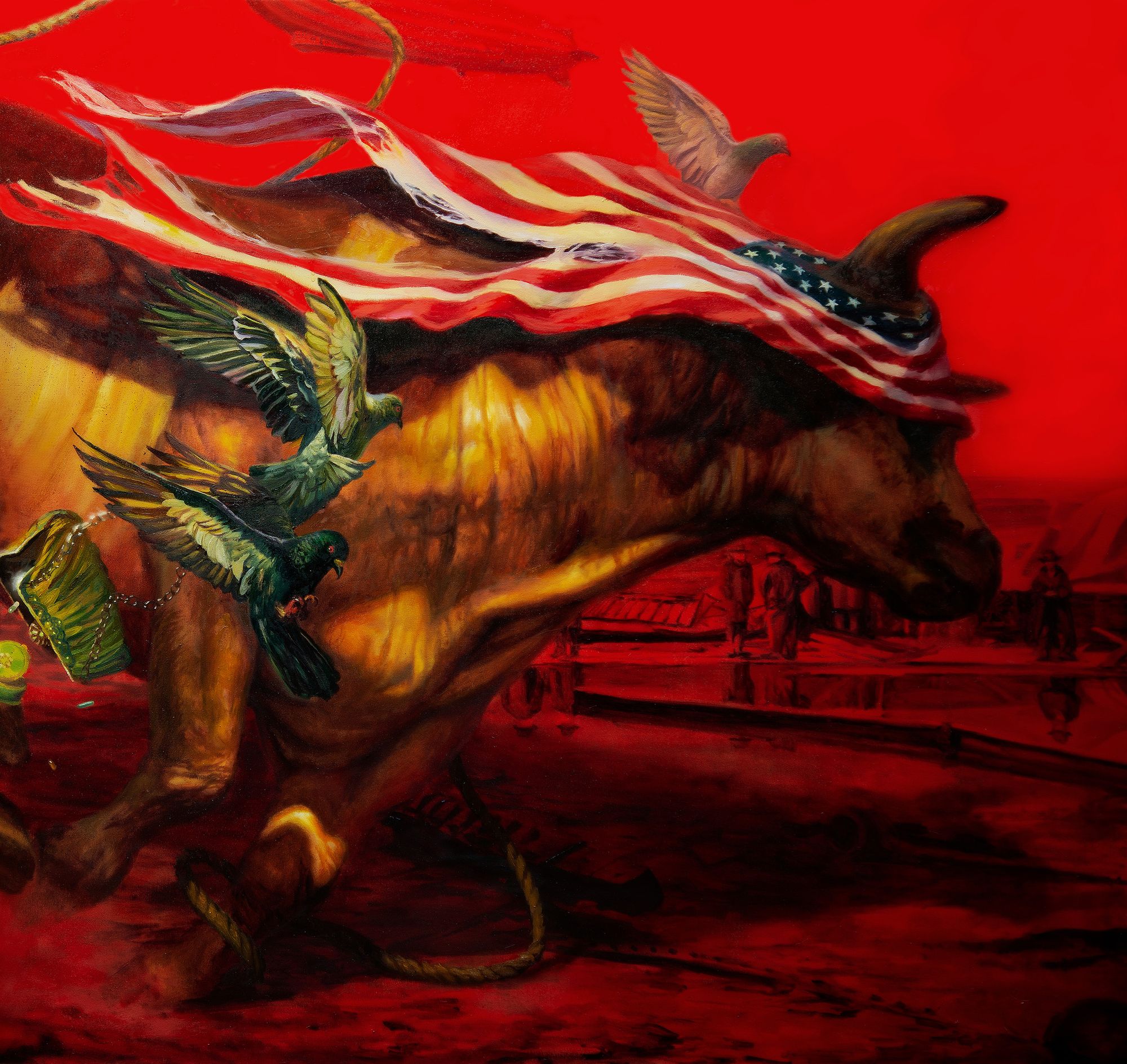
Protest the Hero – Palimpsest
Next up we have Protest the Hero and, to really appreciate this one, we’re going to need to see the whole thing. There is quite a list of animals and symbols on display; including (from left to right):
– A horse, perhaps symbolising the one word America most treasures: freedom
– An elephant, likely representing the Republican party
– Several pigeons, perhaps symbolising security or communication
– An aggressive monkey (perhaps a macaque or a baboon?) wearing Uncle Sam’s hat and holding a smoking gun
– A donkey, likely representing the Democrat party
– A pitbull, perhaps symbolising loyalty, service and the military /aggression
– A falling purse and pills
– An airship, likely representing the Hindenburg air disaster
– Last, but certainly not least, a rampaging bull, perhaps symbolising the MAGA army
The crazed monkey, perhaps symbolic of Donald Trump, seems to be calling the shots here, its pistol shot initiating the stampede as it rides atop and dominates the straining and fearful donkey, the elephant passive in the background. The bull has broken free of its rope restraints, charging aimlessly and blinded by the US flag / nationalism. The piece strikes a delicate balance between chaos and order, the bull and monkey running wild and the pigeons scattering while the background, pitbull and horse all appear calm and composed. Similarly, the piece is awash with motion and yet still at the same time. A political cover to go with a political record, and a damned good one too.
Zeal & Ardor – Wake of a Nation
As the proverb goes, simplicity is the ultimate sophistication. It’s hard to find a much simpler cover than Wake of a Nation – but it is this simplicity which gives it its profound impact. Two white police batons stand in the foreground, forming an inverted cross. Their colour embodies violent, murderous and racist white police officers and the placement their preeminent position in society (or perhaps their notoriety). These are juxtaposed with a plain black background, the colour symbolising the oppressed and murdered black citizens and the placement their unjust position in society.
Well, 2020 was a year where black deaths and black citizens did not fade into the background, but stormed their way into the world’s consciousness with a fury. A fury that was felt by Manuel Gagneux and channelled into Wake of a Nation, an EP dedicated to the BLM movement and centuries of state-sanctioned violence against black people. Zeal & Ardor’s mere existence is political – combining black metal, hardly the bastion of tolerance and acceptance – with blues/black spiritual music. Now they have a strikingly political cover and record to go along with it, with both the best they’ve released to date.

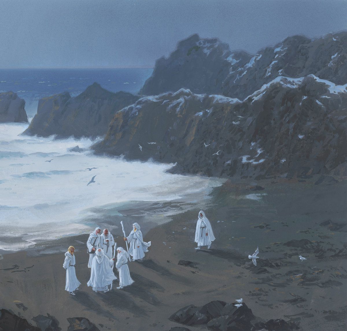
Dawnwalker – Ages
As with Caligula’s Horse, the moment I saw this cover I knew I’d be writing it up for the end-of-year edition. Nothing in particular stands out above the rest, but it wields an immense power all the same. Painted by Tolkien artist Ted Naismith, it depicts a group of seven old men standing on a beach before rolling waves, surrounded by a rocky outcrop as seagulls circle overhead. The hooded white robes, the staffs and the age of the people lends the piece a sense of mysticism – are they humans or gods? Further, there is no light. The world is immersed in shadow and the rocky peaks are hazy, their form lacking in clarity and ushering in a sense of uncertainty.
These thoughts tie in neatly with the album’s lyrical themes, that of a mythical world in decline, always a good sign of strong artwork. This is further hinted at with the album title, Ages. One gets the sense that much of what is depicted has lasted an entire age: the ocean, the stone, perhaps even these mysterious beings? But ages come and go, the gulls perhaps a warning sign as this council meets to discuss how to respond to some dire threat to the world. And just like that, Naismith has taken our minds to another world – with Dawnwalker doing a fine job to keep us there.
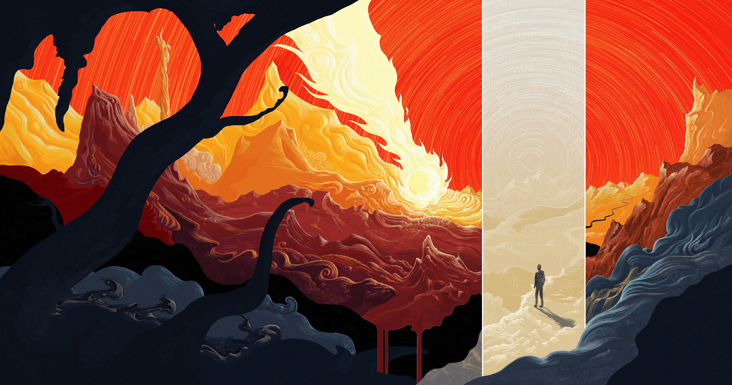
Dark Tranquility – Moment
Melodic death metal veterans Dark Tranquility may no longer count guitarist Niklas Sundin amongst their members, but he was still entrusted with the album artwork for 2020’s Moment and to great effect. The cover is a visual interpretation of the album’s concept – the identification and true understanding of a moment in time, a razor-sharp clarity that scythes through a swirling, ever-changing environment. In a fantastic interview with Heaviest of Art, Sundin reveals that the yellowy-white ‘beam’ running through the centre of the cover represents reality, where in the midst of a cataclysmic event the depicted protagonist uncovers a fundamental truth. With this knowledge of the beam’s significance the keen-eyed among us can hone in on its upper half, which has hidden the following passage:
“Burning from the inside
It lies and it waits
Burn the trail
Like dreams they slip away
Fire of insight
I see movement
I see patterns in every colour”
There may be more, but that’s all I can make out. The fiery colour choices really explode off of the piece, demanding our attention, and the passage reveals their importance. The radiating red sky and plummeting, infernal meteor indeed evoke a danger of cataclysmic proportions, ominous and threatening. The protagonist stands in the relative safety of blue ground/sky, looking out into the red/orange/yellow danger and impending destruction, further exemplified by the wax-like bleeding of a mountain into the void. But, we know they also stand in the beam of reality – their vision crystal-clear and forged from the “fire of insight”. The beam also reveals the beginning of a path, perhaps the trail, in the safety of blue that snakes its way through the danger and into the unknown. All in all, a striking cover with plenty of hidden easter eggs – just the way we like it!
Countless Skies – Glow
It’s not too often that an album cover perfectly encapsulates an album’s sound, its title and the band name – but that’s exactly what we have here. A vast, sprawling sky stretches out in each direction, unbound by the horizon and dwarfing even the sun. The piece simply oozes with warmth, the clouds glowing in hues of red and orange befitting of the powerful music with major keys and soaring melodies. The cover, and the album, certainly emphasises the melodic moniker of the band’s style, though this central feature is framed and defined by the darkness of its edges.
Both musically and visually, Glow, oscillates between the beauty and playfulness of Plini and the power and gravitas of Opeth. Whether it is the character’s journey through the clouds, the tranquil blue skies of daybreak, the radiant sunrise/sunset, the shimmering beauty of the stars or the dark and protruding edges, each component has a place. They each tell their own story and do it well, and their power only grows when considering how they come together into a whole. All great albums deserve great artwork, and Carl Ellis has delivered that here in spades.

Imperial Triumphant – Alphaville
Ok maybe I lied, maybe THIS is my favourite cover of 2020. Zbigniew M. Bielak (seriously, what is it with incredible polish artists?) really outdid himself on Imperial Triumphant’s latest offering, Alphaville (French for number one city). The cover absolutely screams Imperial Triumphant with its dense and dystopian urban landscape, art deco stylings, spiked helmet/building /centrepiece and the consistent pairing of black and gold. For an artist to capture a band’s aesthetic so completely on their first time working with them is truly impressive. The resplendent gold and monolithic central tower leave a lasting impression – this piece will not be mistaken for any other. Thankfully, as arresting as it is at a glance, there is a veritable treasure trove of details to leave listeners enthralled for hours.
This full-length version of the artwork reveals a labyrinthine construction that MC Escher would’ve been proud of. Bielak, like the band themselves, messes with our sense of perspective as buildings and plants both rise up and away from the page, perpendicular to one another and yet working either way. The upper half of the piece highlights the glory, the wealth, and the power of New York City with its towering buildings and shining gold. Above the face adorning the central tower is engraved a blazing sun, symbolic of this wealthy part of society. Yet, further still above the sun sit two symmetric female strippers, highlighting that not all that glitters is gold. The tower itself, while astonishingly conspicuous, is nonetheless terrifying. This duality runs through the entire piece, for each shimmer of gold there is the darkness of black.
The cover has numerous references to individual tracks, whether it be explicit, such as the “Transmission to Mercury” and “Atomic Age” signs in the lower half, or implicit, such as the central tower screaming “Excelsior”. But, if a single detail was to surmise the duality this record seeks to portray it is the person at the very bottom. Despite the opulence on display, they’ve jumped from a building, painted in gold and yet falling to their death all the same.

Heaven Shall Burn – Of Truth & Sacrifice
Next up we have the inimitable style of Eliran Kantor, whom we have covered numerous times in the past. We see a warrior, symbolising Sacrifice, falling to the ground as she is dealt a mortal blow, a spear protruding through her breast. She lays guarding her child, symbolising Truth, a naked toddler standing behind her shield and holding the spear with both hands. The message on Of Truth & Sacrifice is clear: how much are you willing to sacrifice to do the right thing? To protect Truth?
The artwork is done in the classical style, the woman not dissimilar from Athena, Greek goddess of wisdom and warfare. Her armour seems about right, while the spear and shield, whose engravings bear a resemblance to the Gorgoneion, are both major symbols of Athena. The subtlety of her expression is the highlight of the piece. Resignation, defeat, desperation, exhaustion and, most of all, strength are writ large across her face. Similarly striking is the child, not passive and cowering, but upright and seemingly pulling through the spear with all of his strength. Pulling it all the way through would lead to a quicker, less painful death. As they say, the Truth will set you free.

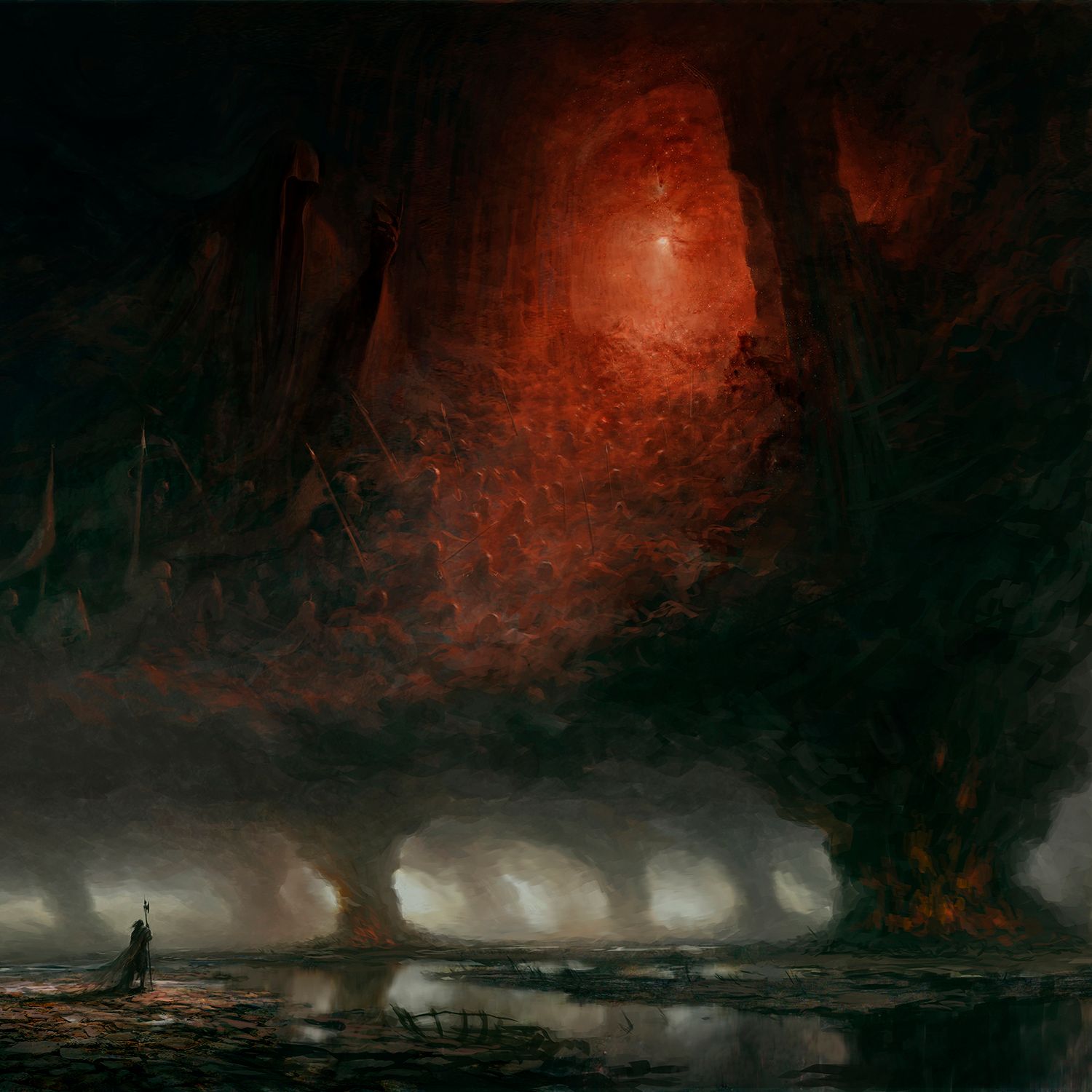
Nyktophobia – What Lasts Forever
Last, but least, we have Artem Demura’s fantastic cover for Nyktophobia’s latest, What Lasts Forever. Starting from the bottom, this Lewandowski-esque piece shows a lone warrior standing before a desolate marshland. The landscape is completely dead, not a single living creature or plant in sight, as large bonfires litter the scene and billow towers of smoke into the sky. The warrior stands as if in vigil, perhaps marking their respects as they look onto a field of funeral pyres. The thick smoke and brimstone coalesce into a dark cloud that consumes the entire sky. This acts as a natural border to the artwork, flipping to become the ground of its upper half as we see an army charging forth into a large cave with weapons drawn.
In the top left of the piece we see a a large hooded figure, perhaps the dreaded grim reaper, arm held out as if conducting the horde. This further suggests that the charging army represents the recently departed, while the dim and eerie red cave that they’re marching towards bodes ill for the place they’ve ended up in. A stunning piece, with the interweaving of the top and bottom panels in particular standing out.
And there you have it, a selection of some of our favourite album artwork from 2020. Now it’s over to you all: what were some of your favourites? What did we miss? Let us know! Beyond that, we look forward to bringing you some fantastic artwork throughout 2021.