A Gift to Artwork, taken from the Caligula’s Horse song “A Gift to Afterthought”, breaks down and analyses your favourite album artwork. The first time an album’s name appears, it will link to a large and (where possible) high-resolution image of the cover so that you can take a closer look. Read other entries in this series here.
Editor’s Note: A Gift to Artwork features a regular guest contribution from Luis Flores (@luis.hoa), who runs and regularly writes for the excellent Heaviest of Art. If you’re looking for more analysis and discussion of album artwork Luis’ Behind The Cover column is a must-read.
Welcome one and all to our end of year edition of A Gift to Artwork, where we briefly discuss some of our favourite album covers of the year unranked and in no particular order. Let’s get right into it and don’t forget to let us know what your favourite artwork from 2021 was!
Trivium – In the Court of the Dragon (Cover art by Mathieu Nozieres)
We’re kicking off with a bang – my personal favourite of the year, Trivium’s In the Court of the Dragon. I mean seriously, gladiators fighting desperately to the death, defiant amid their fallen comrades as the crowd bays for blood, horses rear, and a fucking dragon descends upon the arena in resplendent gold scales – what’s not to like?

Mathieu Nozieres’ renaissance-style piece truly is an epic work of art in every sense of the word. The dragon is gloriously depicted, capturing the very moment it lands upon the central podium, its wings still outstretched as it bows down to unleash a terrifying roar from its serpentine throat. The detail is wonderful, every scale, horn and tooth accounted for as it screams for our attention. Yet, the piece doesn’t rely on the dragon, its crown jewel, to carry the day. In fact, even if you were to remove it entirely, the painting would still stand as a powerful piece. The mounted warrior clad in gold and a regal blue, standing in the saddle of a rearing horse reminiscent of THAT painting of Napoleon Bonaparte, stands strong as another centrepiece alongside the dragon. The horse’s defiant pose and the way the warrior’s face is obscured by their helm evokes a sense of fearlessness and courage despite the terrifying creature that has landed in their midst – further lending a sense of power to the cover.
Whilst the dragon and mounted warrior demand the most attention, there are some neat details scattered throughout the rest of the piece which are similarly beautiful – as well as some easter eggs for fans of the band. While the detail of the piece is one of its undoubted strengths, the lack of detail in certain parts only enhances the piece. For example, the rearing horse’s hind legs seem to blend into the background, so too the crowd around the dragon’s head. This blurring effect makes it feel as if the movement of the scene has created clouds of dust, adding realism and dynamism to this fantastical scene.
Turning towards some easter eggs, the mounted warrior’s shield is embossed with the same fish sigil that appears on both Ascendency and The Crusade while a red banner in the top left bears the band’s own logo. Finally, taking a step back we see the piece is broadly centred around an X-shape. In the bottom-right we see a fallen spear and a struggling person roughly pointing diagonally from the bottom-right towards the top-left. One can roughly follow this ’line’ along the rearing horse and the dragon’s tail to find one ‘line’ of the X. For the other, we have the quiver and another spear in the bottom-left pointing towards the top-right. Again, we can roughly follow this trajectory and include the stance of the red-caped warrior and the dragon’s right wing to form the second ‘line’ of our X shape. This X-shaped design symbolises that this is the band’s tenth album, the gladiatorial theme perfectly marrying with roman numerals, whilst in a further nod the album’s opening track is titled “X”.
Regardless of whether you’re in it for the details or for the big pieces that immediately capture your attention, Trivium have crafted something truly special with the artwork for the tenth record – undoubtedly one of the coolest pieces from 2021.
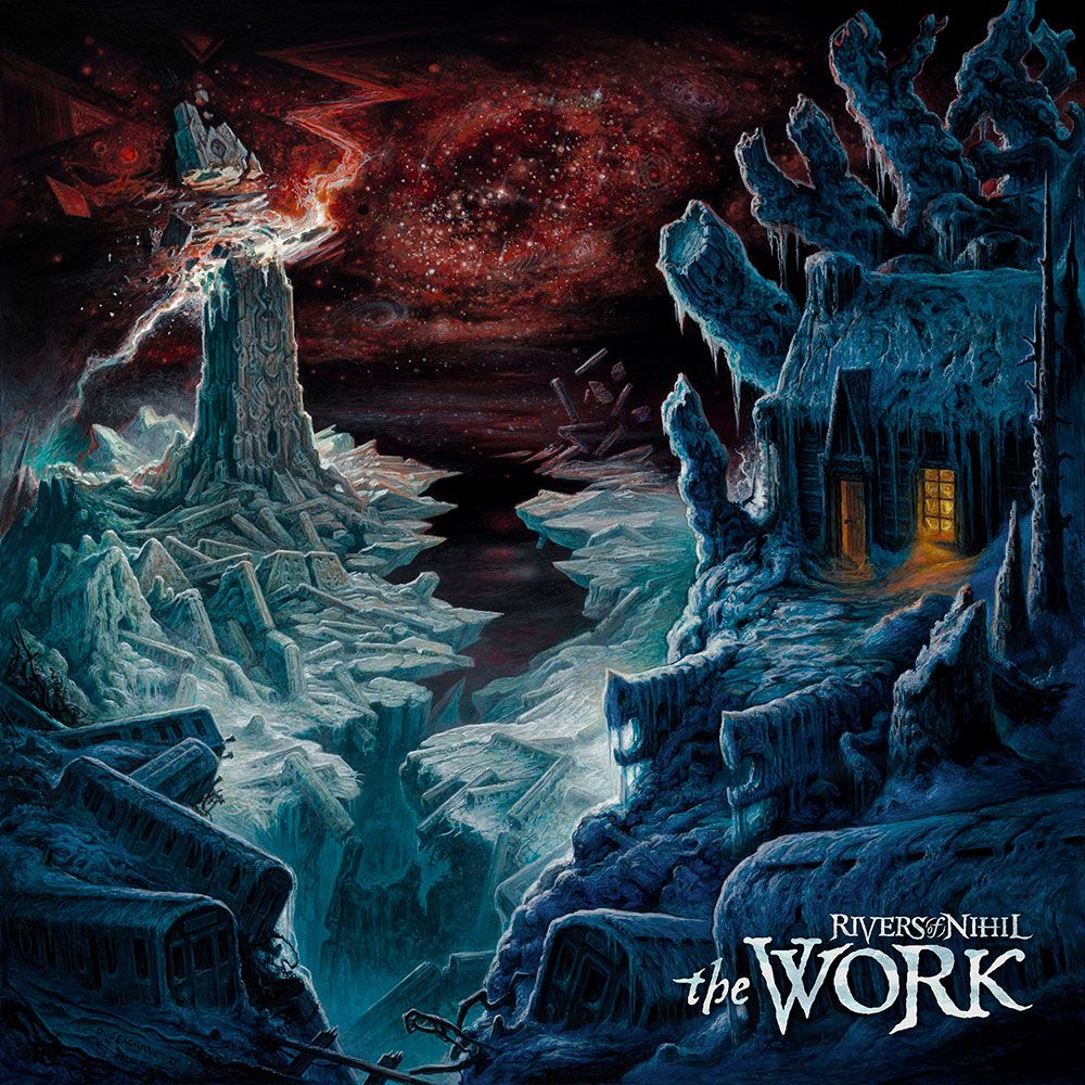
Rivers of Nihil – The Work (Cover art by Dan Seagrave)
Next up we have Rivers of Nihil and, while their record may have been polarising (Josh’s re-ordering of the tracks elevates it to a certain top-10 AOTY in my eyes) there can be no debate about Dan Seagrave’s cover art: it’s absolutely fantastic.
Our regular guest on this column, Luis Flores of Heaviest of Art, did a fantastic interview with both Adam Biggs from Rivers and Dan Seagrave on the artwork behind The Work and Rivers of Nihil as a whole – here is a brief excerpt:
”Biggs: I actually had the idea for this cover a long time ago, pre-dating any music we’ve written for the record. Ultimately, I had an idea of where this seasonal concept would end up and the themes I wanted to touch on for the end of it. As apocalyptic as the landscape may seem on ‘Owls’, you’d think there’s nothing past that. I wanted something that was a complete deconstruction of existence. It’s past your usual ideas of life and death and embodies a feeling of ego death. It’s basically the first album cover. We’re back where we started, but things have just evolved to an extreme extent that our space is beneath us and everything is frozen over. It’s so deconstructed that it’s almost surreal.”
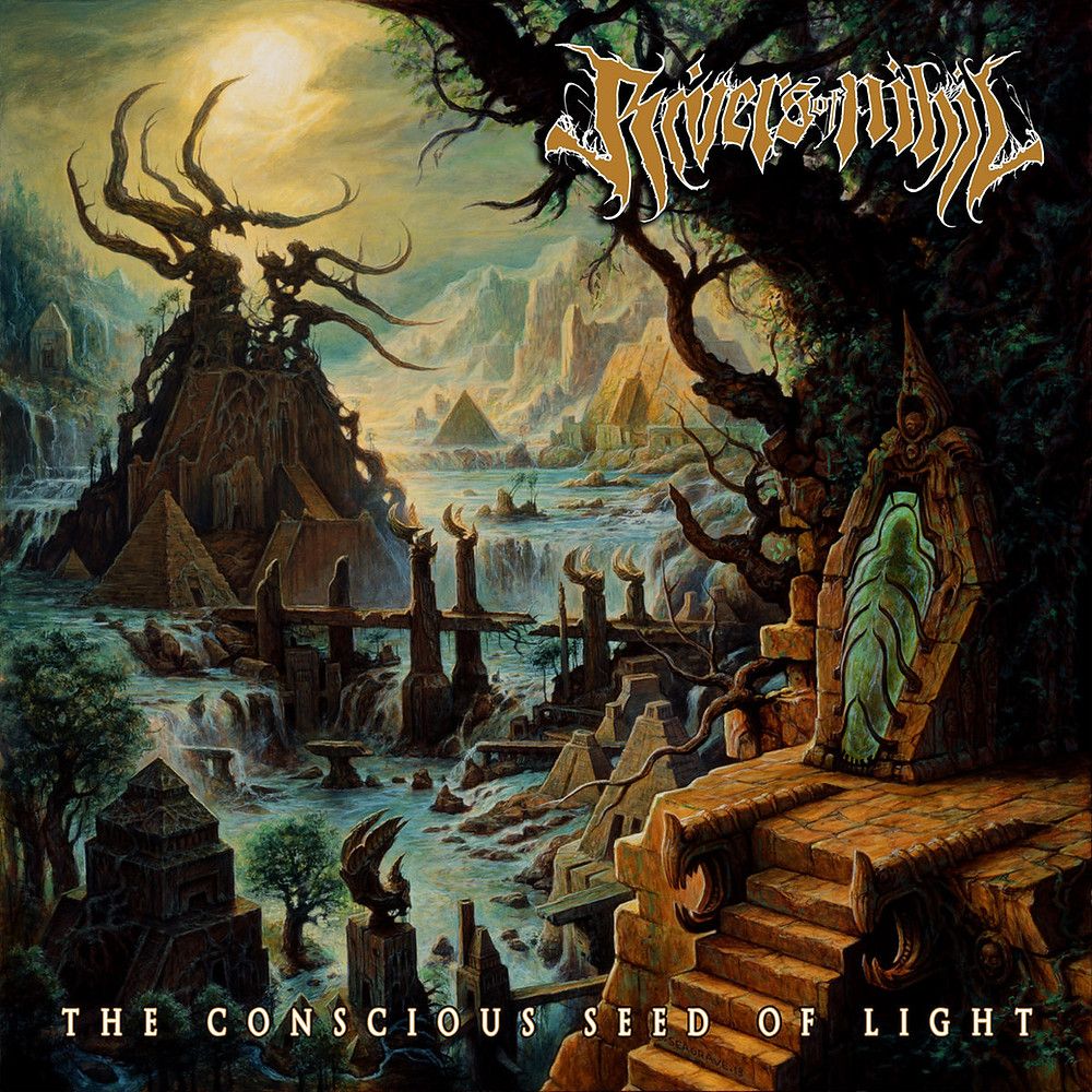
Comparing the artwork of The Work and A Conscious Seed of Light, the similarities are striking. Both are set in the same valley, with a monolithic (cough) structure dominating the left side and a homely structure ensconced in a tree on the right side. The detail that really makes this clear is the twin pillars jutting out on the right-hand side, jaws gaping wide at the top of the staircase. Millennia may have passed and Winter may have finally come, but it is unmistakably the same setting.
Homing in on The Work we see that the tower (which is relevant conceptually too, as evidenced by the tracklisting and lyrics) has been struck by a cosmic lightning bolt so powerful as to cleave it in two. Yet, the broken pieces seem to be falling upwards, as if being sucked into the atmosphere, adding to the deconstructive and surrealist elements mentioned earlier. The train graveyard which litters the scene, in both foreground and background, both left and right, suggests this train is well and truly off the tracks – the world descending into complete chaos and disorder. The dark, cold, and foreboding colour palette enhances this feeling as we’re gripped by frostbitten, depressing blues and violent cosmic reds.
The only place of safety is the cabin on the right, but even here there are details that suggest all is not well. For instance, the door is open – letting the cold in. The window, whilst glowing warmly with light, to my eyes reveals a giant Hellboy-ish figure staring out. Further, it is almost as if the cabin stands in the palm of the tree’s anthropomorphic hand, with each branch representing a finger, as if the tree could clench its fist and crush the cabin at any moment. All in all, a fantastic work of art to go along with a fantastic record – and a highly deserved place in our end-of-year list.
Terminus – The Silent Bell Toll (Cover art by Sebastian Thomas)
Next we shift gears to a completely different style and examine the most Eden record of 2021, Terminus’ brilliant The Silent Bell Toll. We’re smacked in the face with big, bold colours – ruby reds, emerald greens, gorgeous pale azure blues, and striking violets. It really is an eye-catching piece, one that you can’t help but stare at for a time.
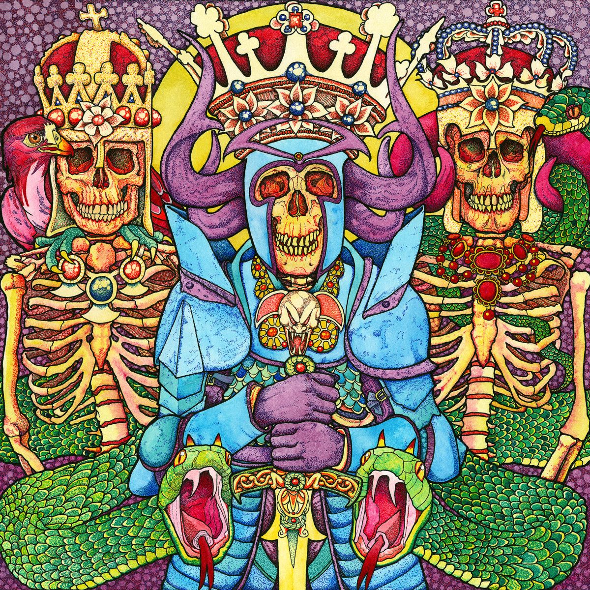
We see three skeletal figures, each wearing ostentatious crowns with beautiful gemstones and, paradoxically, flowers. Thus, from the outset we have two interesting juxtapositions: the new life of flowers in bloom with the death of skeletons and the power and might of royalty with the inevitability of death. Our central skeleton seems to be the monarch, as indicated by their sword and armour and the fact they have the largest crown. They’re flanked on either side possibly by religious officials, given the crosses adorning their two crowns. The monarch’s armour is stunning, the colours simply gorgeous as the scale detail fits neatly with the bordering plates and the yellow and red jewels offset the blues. Of course, we cannot forget the four animals on display either, as we have three snakes (perfect companion for some serpentine riffs, a la “Black Swan”) and a falcon staring out at the viewer.
The animals seem quite protective of the skeletons, wrapping themselves around their corpses and either patiently observing (the two in the background) or visibly warding off any intruders (the two in the foreground). In fact, the whole scene is designed to intimidate: both in terms of the wealth on display with the jewels and crowns, as well as physically with the horned helms, poised creatures, and dangerous weaponry. The sword for instance channels their serpentine guardians in its hilt, while the menacing skull at its pommel is truly terrifying. A lovely counterpoint to the beauty on display and a striking piece – well done to Sebastian Thomas for a gripping cover and to Terminus for a ripping record.
Archspire – Bleed the Future (Cover art by Eliran Kantor)
Ok ok, I promise I’m going to keep this brief – I’ve already spent enough words dedicated to Archspire and Bleed the Future to last for a decade. And yes, we already covered this record back in November, so let’s kick things off with Luis’ thoughts on the cover at that time and then I’ll briefly give my thoughts.
“In the words of Eliran, “The band wanted a shape-shifting reptilian alien. So, I designed one mid-morphing, with the top of the head disguised as a human.” It’s important to note that the morphing elements expand upon the style presented in Relentless Mutation, which also illustrates an extra-terrestrial transition. There’s a lot to look at here, beginning with a flat-faced, charcoal facial sculpture that is detailed with rich textures. One could almost feel the smooth edges and reptilian scales that comprise the core element. Beneath this, an entire shape-shifting sequence is underway, depicted through golden beings. It’s as if these beings are the building blocks for the alien’s new form as they interact with one another so gracefully, stemming directly from the foundation of the charcoal face. Amidst the golden formation rises a golden hand as well, which if you rotate the artwork 90 degrees clockwise, appears to show the alien disguising itself as human. The hand and the neighbouring charcoal fixtures help the viewer conceptualize the new form. There’s a running joke among the band’s fandom across social media that tag the protagonist alien as “flatface” given the facial characteristics, hence the #freeflatface hashtag that Eliran posted himself. All this is layered atop a gentle backdrop of blue and grey hues that differs largely from the darker use of atmosphere present in a majority of Eliran’s covers.
Tech-death is no easy listen, but it’s a rewarding one for those with patience and willingness to engage. The layers consistently unfold with each passing listen and in the same vein, Eliran’s artwork provides new depth after a deeper look. It can be rotated for a new perspective and it can evoke new meaning after identifying significant details that align well with the band’s lyricism. The vast and enticing details placed within the cover is ideal for putting a face to the band’s complex approach to composition. This is one you’ll want to own on vinyl and simply gaze at while Archspire’s musical mastery puts on a show. “
[Luis Flores, A Gift to Artwork // November 2021]
Overall, I echo Luis’ thoughts – it’s a killer cover, as is to be expected from an artist of Eliran’s renown. Flatface looks ghastly indeed, whilst the golden creatures to me feel like a neat personification of the Drip, in a very different way to what was depicted on Relentless Mutation but super interesting nonetheless. The lyrics describe “molten figures laying in the venom”, as we see the Drip slowly possessing the creature – each part of it working together, male and female together in a harmony that is quite antithetical to much of the events described in Archspire’s conceptual universe. A fantastic cover to the album of the year.
Stortregn – Impermanence (Cover art by Paolo Girardi)
Stortregn may have been around for a while, but they seemed to come from nowhere with Impermanence, one of the coolest records and covers of 2021. Here, we have a cosmic landscape painted by Paolo Girardi, with dozens of moons and planets hovering in the background around a vicious, swirling vortex. In the foreground, we have what looks like the skeletal remains of an enormous beast, its spine stretching off into the distance as ribs curl up on either side like talons.
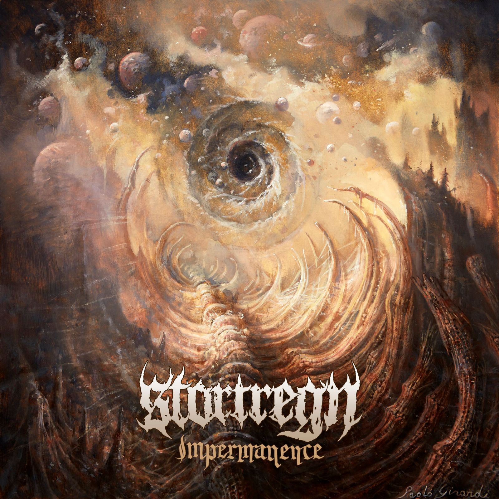
Technical death metal and space make for wonderful bedfellows (e.g. see our great deep dive from 2016) and Stortregn’s latest effort is no exception. The planets and moons add a sense of scale and mystery befitting the genre, while the bleak colour palette of browns and beiges is a fitting accompaniment to the shrieking vocals. Similarly, the power radiating from the vortex and the sheer scale of desolation and death before us instantly capture your attention and transport you to another place, as you wonder what is going on, what kind of creature once lived here, and what happened to them. As we have said countless times before, the best artwork fits hand in glove with the music it represents – and that’s the case here.
ORYX – Lamenting A Dead World (Cover art by Ettore Aldo Del Vigo)
Speaking of cosmic, what about this stunner from ORYX’s latest album Lamenting a Dead World, a giant surrealist painting titled “The Solitude of Judas” by Ettore Aldo Del Vigo. I came across this cover on Heaviest of Art’s fascinating interview with the artists involved, again here is an excerpt:
“Ettore: “Solitude of Judas” is part of a series called Sancta Sanctorum, which is a well-known Latin phrase whose meaning is “the most holy place”. It is an exclusive place, particularly reserved, to which only one person can access, as there are things of great value and great importance. In this case, my research is an introspective “journey” into the subconscious in search of my own Sancta Sanctorum where, through the theme of the transfiguration, the most hidden fears are faced, but also the most ancestral beliefs.
It reminds us of the fleetingness of life, but also the power of faith. In summary, Sancta Sanctorum is a journey beyond the flesh, which is only a shell, in search of profound truths and spiritual passages. It’s a cathartic explosion of the bodies where death does not exist, but on the contrary, there is rebirth, described in this case through spermatozoa released from the putrefaction of the flesh.”

Those themes come out clearly in this artwork, as we see crucified skeletons ripping themselves from Judas’ flesh and travelling off into the distance alongside shots of sperm in every direction: life, death, and rebirth all emanating from him. Judas’ posture seems defeated and sallow, as if he is contemplating what he has done and its consequences: the crucifixion of those that were once closest to him. The eye in the centre of his chest further evokes this sense of contemplation and reflection, of thinking back on what he had done: there can be no escape from that inward eye, no excuses, nowhere to hide. He may be alone in his cave, forgotten by the outside world, but he will always need to live with himself.
Despite the negative connotations surrounding Judas, and of course the ever-present symbolism of death in the piece, there are nonetheless signs of hope. Of course, there is the sperm shooting out from Judas’ body, but there is also the entrance to the cave: bathed in a warm and hopeful light. There can be redemption, there can be light at the end of the tunnel, there can be company with others if guided towards that light. A truly striking piece and one of the most unique covers I saw throughout 2021 – Ettore, take a bow.
Mastodon – Hushed and Grim (Cover art by Paul Romano)
Ok, so I may have been lying earlier when I said Trivium had my favourite artwork of 2021 – that honour may in fact go to Mastodon’s Hushed and Grim. Now I know what you’re thinking, ah I should’ve known they would save the best for last, but also what is so special about the Mastodon cover art? Well, you may or may not be aware that the cover art for Hushed and Grim is only one of nine (9!) panels created by Paul Romano – and when you see all nine laid out in all of their glory it truly is a sight to behold.
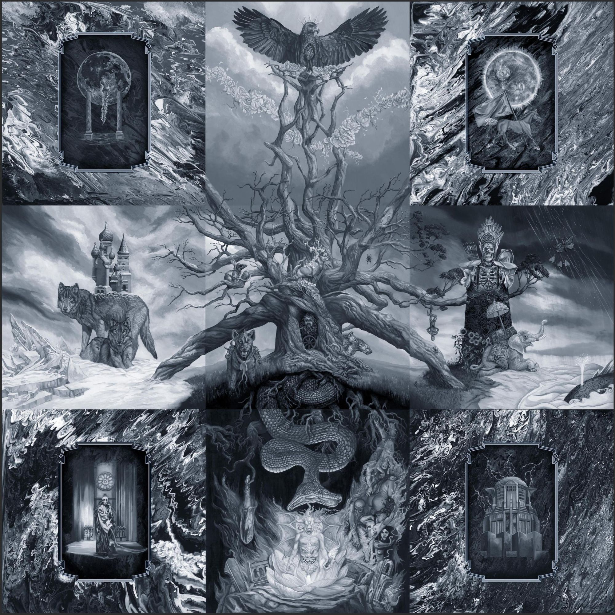
Mere mortals go out and design a single cover. Paul Romano decides to design nine pieces of art that could each legitimately stand on their own as a fantastic cover, and exceed all expectations when pieced together. It truly is a breathtaking collection and may just be the single greatest piece of album art I’ve seen in my time. We could spend (and perhaps one day should) 10,000 words analysing every detail and symbol and it would be worth the time, but today we’ll settle for pointing out some of the more important elements and leave you to pore over this stunning piece yourself.
The four corner pieces are each connected to one another in style, sharing a dazzling rippled background with a plaque insert depicting 1-3 key figures, symbols or motifs. The remaining five panels are then component parts of a single piece of art, centred on the Yggdrassil-style tree stretching out in all directions. A score of different creatures adorn the scene, including wolves, hyenas, a deer, an elephant, a snake, an eagle, and many more. The connection is perhaps closest between the central panel and the bottom-middle, with the tree’s roots acting as bounds to imprison and torture those trapped below in a hellish landscape, a giant serpent snaking its way through the root system looking to devour a demonic figure.
Crucially, the artwork carries a series of references to each of the band’s previous records. The horse (top-right) calls back to Remission, the whale (middle-right) and demon (bottom-middle) to Leviathan (for the demon, see the full artwork here), the cerberus-esque dog (middle) and the triple-headed nature of the demon (bottom-middle) to Blood Mountain, the russian turrets and city (middle-left) to Crack the Skye, the various animal predators (most panels) to The Hunter, the sun (top-right) to Once More Round the Sun, and the crowned skeletal figure with its quiver of arrows (middle-right) to Emperor of Sand. Thus, Paul Romano hasn’t just captured the essence of this record, but the very essence of the band and its entire discography. That it was achieved with such a monochromatic palette, one which doesn’t feel lacking in any sense but if anything is made stronger by such restraint, is all the more impressive.
In any case, I’m running out of superlatives for this work of art. Hushed and Grim is a wonderful way to see out the year in artwork that was 2021 – now let us know what some of your favourite pieces of art were, before you go and stare and lose yourself in the gorgeous artwork sampled above!