A Gift to Artwork, taken from the Caligula’s Horse song “A Gift to Afterthought”, breaks down and analyses your favourite album artwork. The first time an album’s name appears, it will link to a large and (where possible) high-resolution image of the cover so that you can take a closer look. Read other entries in this series here.
Editor’s Note: A Gift to Artwork features a regular guest contribution from Luis Flores (@luis.hoa), who runs and regularly writes for the excellent Heaviest of Art. If you’re looking for more analysis and discussion of album artwork Luis’ Behind The Cover column is a must-read.
Welcome one and all to another edition of A Gift to Artwork. This month we’ve got stunning colours from Noltem and the return of a favourite, Eliran Kantor’s brilliant cover for Archspire’s AOTY contender Bleed the Future, among others. Let’s take a look!
Noltem – Illusions in the Wake (Cover art by Anthony Hurd)
One sure-fire way to grab someone’s attention is with colour, and by Jove consider me grabbed by the stunning colours Anthony Hurd has used for Noltem’s debut record, Illusions in the Wake. The choices are mesmerising, drawing on turquoise and cyan blues, violet, magenta and lavender purples, and sea and chrysolite greens. They’re incredibly striking, both individually and collectively. The only clearly defined features in the piece are some trees scattered throughout the bottom-left / top-right diagonal and the dark mountains occupying the central and upper panels, with the remainder of the piece beset by smokes and mists cast in the most spectacular colours.
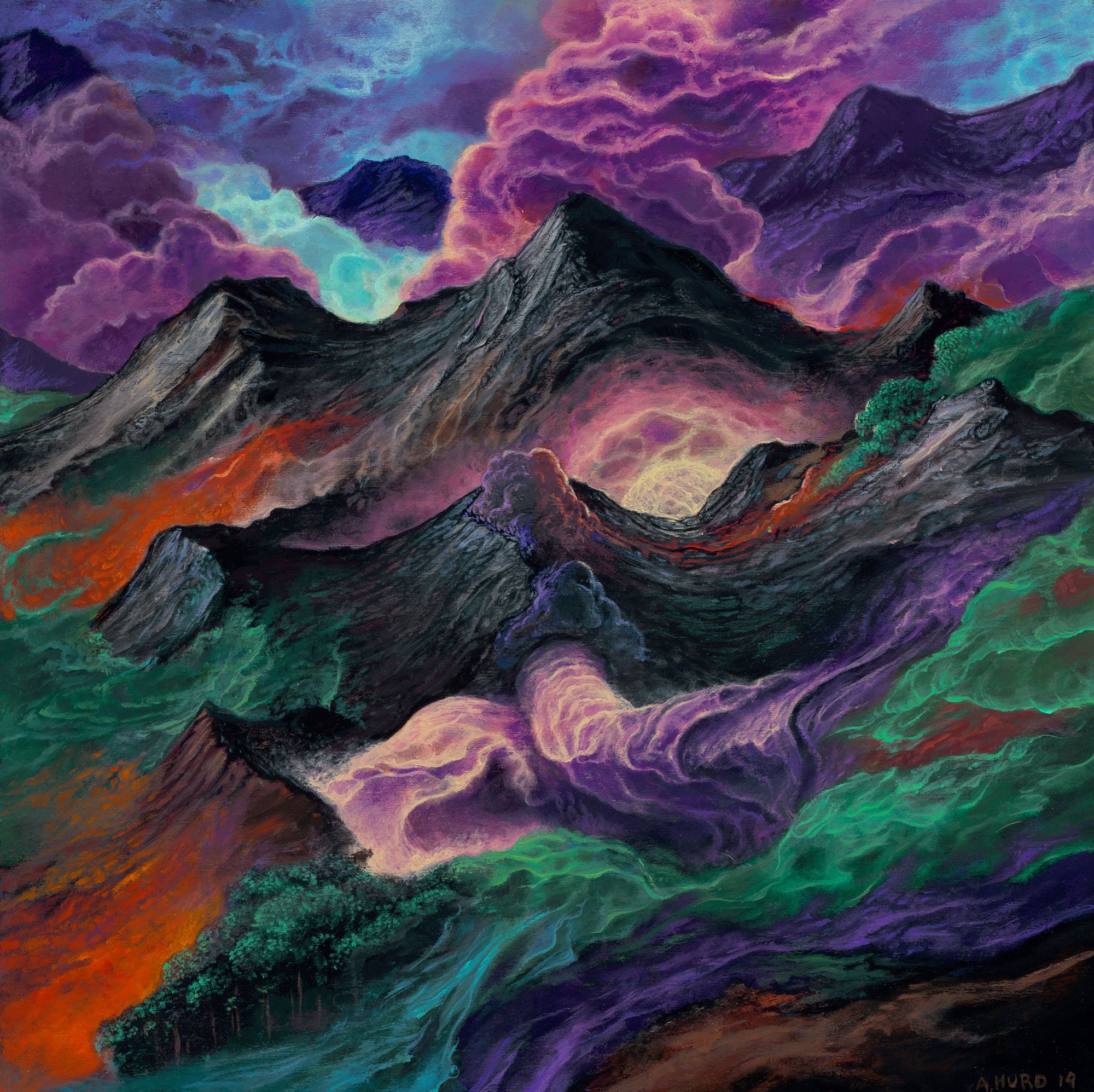
Just as Noltem’s music is built around atmosphere, escapism and connection – so too is this artwork. One could easily lose themselves in it for hours on end and see something different each time. Perhaps a nose-like shape in one mountain, or a brain glowing from the central valley. Perhaps apocalyptic fumes of poison and smoke or mystical powers of healing the land. This piece can be whatever you want it to be and is a fantastic accompaniment to the (excellent, by the way) music on show. In all likelihood, I would never have checked out Noltem, as atmospheric black metal is rarely my preference, but you can’t see a cover like this and let the music go unheard and I assure you, it is worth it.
– Karlo Doroc
Creeping Death – The Edge of Existence (Cover art by Tanner Caruthers)
If you’re on the lookout for a cover that screams existential dread then say no more, Texas natives Creeping Death have you got you covered (heh) with the artwork for their recent EP The Edge of Existence. The eye is immediately drawn north towards the colourful, swirling vortex being sucked into what appears to be a black hole. The circular pattern has an ouroboros feel to it as if to say the universe began from a big bang at a single point and it’s about to collapse back into that point. The frayed, serpentine swirls lend a wonderful sense of motion and inexorability to the piece. It is happening. It is happening now. There will be no escape. There can be no escape.
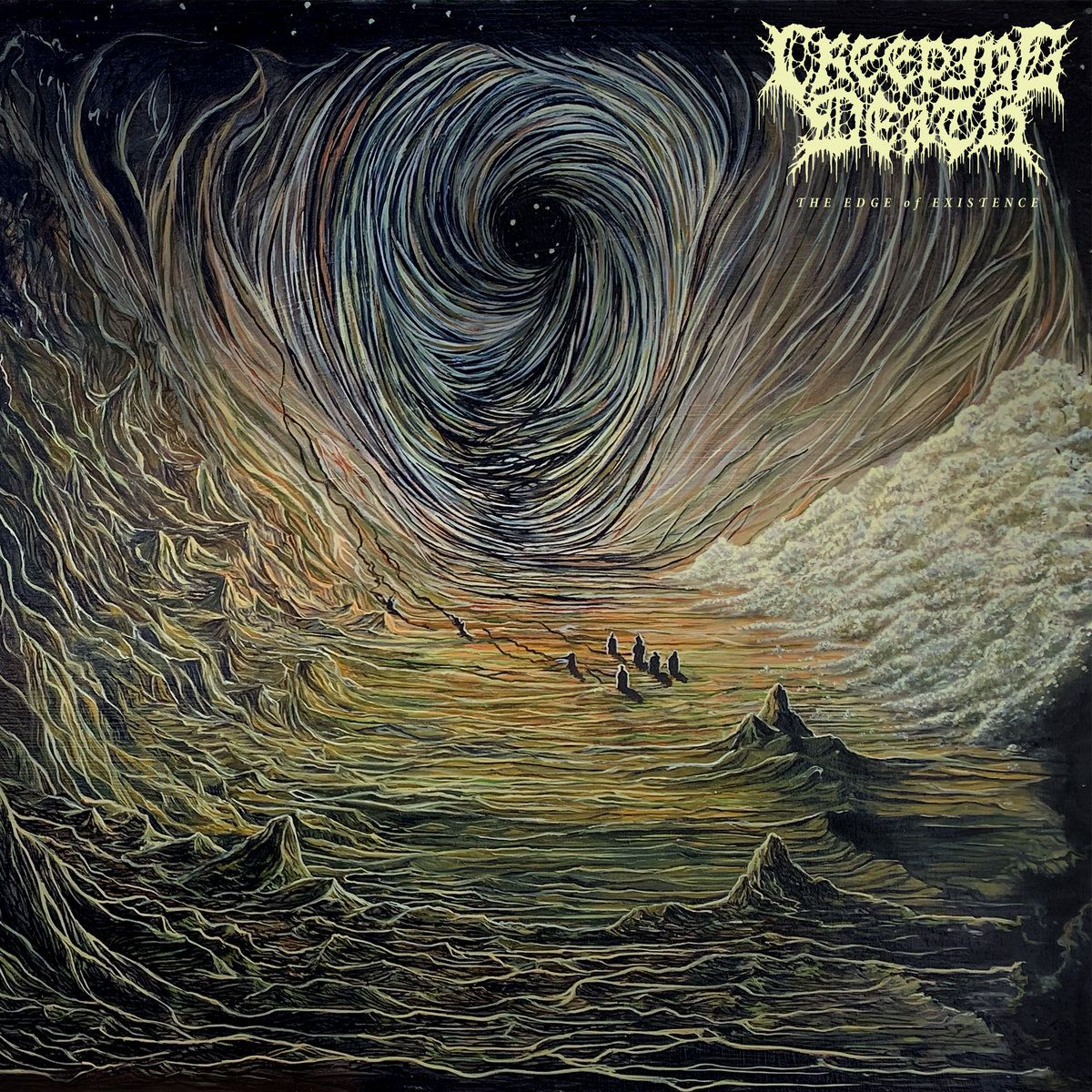
Turning our attention to the rest of the piece we see a landscape of mountains in the south and west, mounds of bright matter (perhaps some kind of resource, like spice?) in the east, and a group of dark, silhouetted people in the centre. The long lines of colour emanate from each of these figures towards the maelstrom, further highlighting this sense of inevitability and hopelessness. It matters not whether you are an individual, a member of a group, or a towering mountain – all shall meet the same fate. The dark colour palette further adds to this sense and the whole piece works wonderfully in concert with the dark and grimy brand of death/thrash that Creeping Death are known for. Like we always say, great art needs to fit with the theme and the music, and Tanner Caruthers hasn’t let us down here. The cover is quite clearly a visualisation of the Edge of Existence and we wouldn’t want it any other way.
– KD
Morgal – Nightmare Lord (Cover art by Joe Petagno)
The greatness of Joe Petagno is one that will forever be ingrained within the fabric of metal’s rich and illustrious history. There is no Snaggletooth without Joe, and though his achievements with Motörhead are legendary in their own right, we’d be doing a disservice to his work to simply focus on that. Beyond the iconic trio, Joe has worked with an assortment of quality artists over the years, including Angelcorpse, Mammoth Grinder, Krisiun, Incantation, Vader, Spirit Adrift, and Sodom to name a few. Decades from his glory days and yet his passion still burns bright for bands both new and old. Today, we highlight his contributions for Morgal’s Nightmare Lord, an astounding Finnish black metal debut that arrives seven years after the band’s inception.
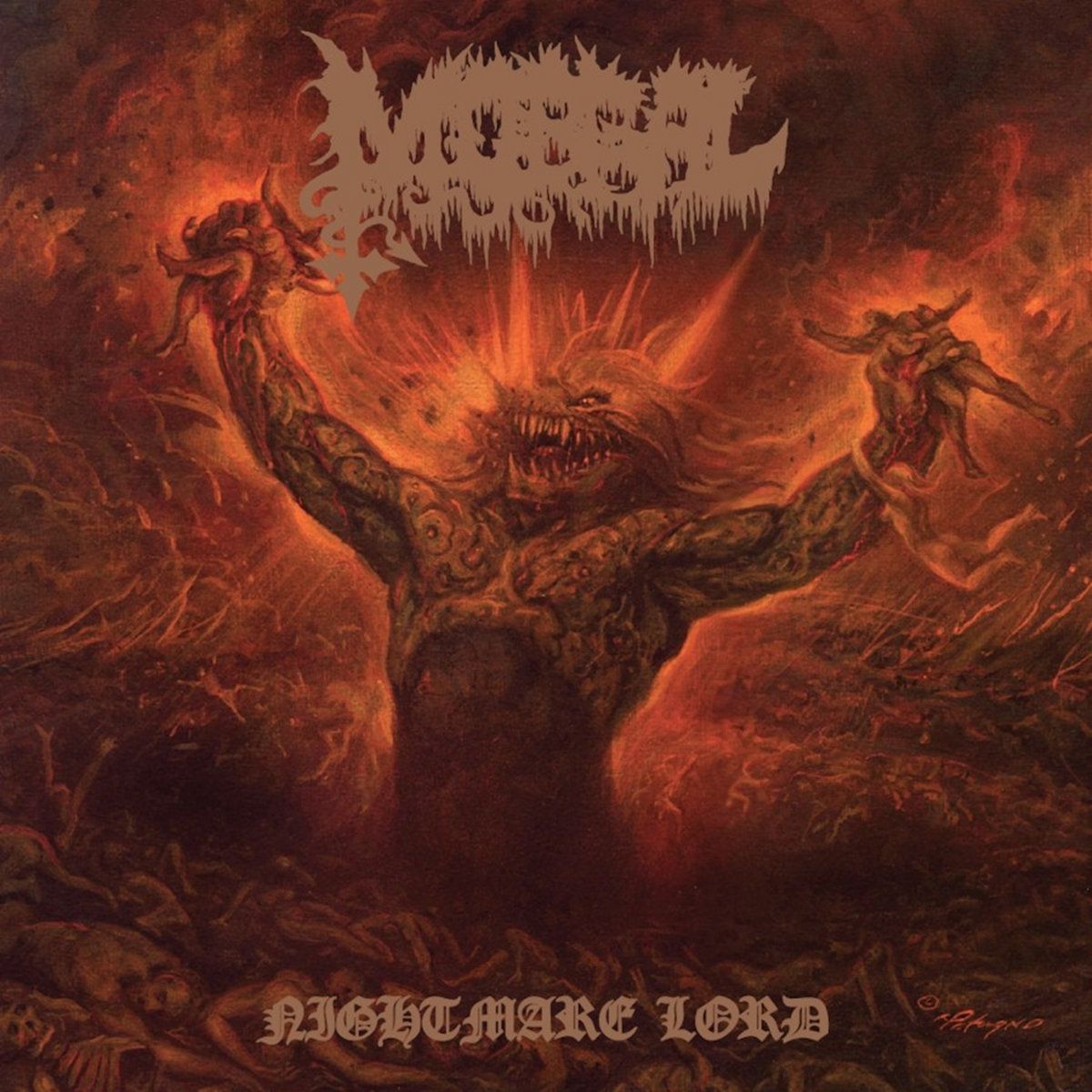
After several EPs, a demo, a split, and a live album, Morgal set their eyes on a full-length release and thus, Nightmare Lord was born. To capture the unbridled intensity of the record, the band enlisted the talents of the legendary Joe for a cover apt in representing the blood-curling nature of the black metal embodied within. Front and centre is a reptile-like beast, rising from a swirling sea of bodies with a devilish grin. Two poor souls find themselves stuck within a monstrous grip as their blood spills down the beast’s arms. A separate person is seen hanging from the left arm, just barely escaping the wrath by a matter of inches. A red smoke fills the skies and lifeless corpses line the floors of the deadly scene. The beast has taken full command of the hunting grounds and with a size and structure of immense magnitude, no one dares cross its line of sight.
There’s not much to dissect or analyze here, and rightfully so. It’s bold and it’s violent, as intended to be without any real need to incorporate pretentious meanings or details that don’t serve a particular purpose. It sports Joe’s signature approach to atmosphere with a masterful use of red and orange hues that coalesce well as a gradient. Piercing eyes, a vicious set of teeth, and a victorious pose all detail this beast of a protagonist, making it very well the Nightmare Lord Joe set it out to be. What you see is what you get and Joe and Morgal get right in your face with this deadly audiovisual pairing.
– Luis Flores
Archspire – Bleed The Future (Cover art by Eliran Kantor)
Artist extraordinaire Eliran Kantor has had a great year with numerous covers under his belt, including Helloween, Atrae Bilis, Craven Idol, and Obscura to name a few. For as great as those are, there’s something about Archspire’s Bleed The Future that sets it apart and ranks it high among Eliran’s otherwise Baroque works. The follow up to 2017’s Relentless Mutation was highly anticipated and as expected, it delivered with conviction on both the musical and visual ends, the likes of which sport Eliran’s Bleed the Future painting.
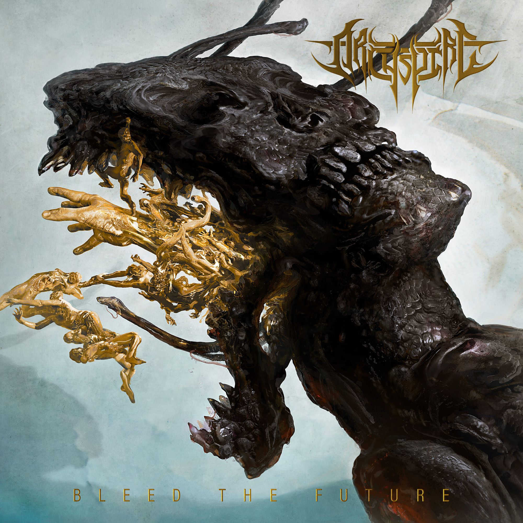
In the words of Eliran, “The band wanted a shape-shifting reptilian alien. So, I designed one mid-morphing, with the top of the head disguised as a human.” It’s important to note that the morphing elements expand upon the style presented in Relentless Mutation, which also illustrates an extra-terrestrial transition. There’s a lot to look at here, beginning with a flat-faced, charcoal facial sculpture that is detailed with rich textures. One could almost feel the smooth edges and reptilian scales that comprise the core element. Beneath this, an entire shape-shifting sequence is underway, depicted through golden beings. It’s as if these beings are the building blocks for the alien’s new form as they interact with one another so gracefully, stemming directly from the foundation of the charcoal face. Amidst the golden formation rises a golden hand as well, which if you rotate the artwork 90 degrees clockwise, appears to show the alien disguising itself as human. The hand and the neighboring charcoal fixtures help the viewer conceptualize the new form. There’s a running joke among the band’s fandom across social media that tag the protagonist alien as “flatface” given the facial characteristics, hence the #freeflatface hashtag that Eliran posted himself. All this is layered atop a gentle backdrop of blue and grey hues that differs largely from the darker use of atmosphere present in a majority of Eliran’s covers.
Tech-death is no easy listen, but it’s a rewarding one for those with patience and willingness to engage. The layers consistently unfold with each passing listen and in the same vein, Eliran’s artwork provides new depth after a deeper look. It can be rotated for a new perspective and it can evoke new meaning after identifying significant details that align well with the band’s lyricism. The vast and enticing details placed within the cover is ideal for putting a face to the band’s complex approach to composition. This is one you’ll want to own on vinyl and simply gaze at while Archspire’s musical mastery puts on a show.
– LF
Crystal Coffin – The Starway Eternal (Cover art by Lenkyn Ostapovich)
There’s a little extra something about concept album covers. Rather than assigning an aesthetic, matching a mood, or establishing some iconic representation of the musical contents, concept albums have an opportunity to do some specific visual storytelling, highlighting characters or narrative elements, depicting significant scenes, and lending shape to specific themes. Lenkyn Ostapovich has taken up such opportunities with the cover of Cyrstal Coffin’s latest, The Starway Eternal, as well as on the group’s 2020 release The Transformation Room. It’s certainly a weighty responsibility, creating this kind of window into the musical world, but the relationship between artist and concept is especially interesting as Ostapovich is intimately involved in the songwriting process as one third of Crystal Coffin. It’s a layer that’s not always present or even possible, but it does make the artistic choices a little more interesting and involved.
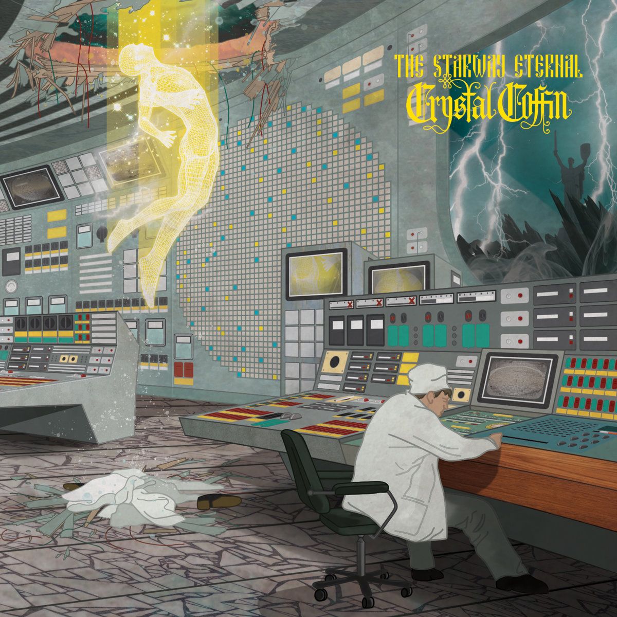
While I loved the folksy, almost stained glass feel of the cover from The Transformation Room, the modernized context of The Starway Eternal (taking place in 1986) also works well with Ostapovich’s distinct style. The pragmatic, simple, mid-century modern designs of this control room are period-perfect, looking straight out of an early Bond movie. The clean lines of the setting play into the art style, while the details in the geometric flooring, wood accents on the console, and gauges, screens, lights and switches give an authentic feel to the album’s setting. The technology here isn’t just central to defining the events of the record, but they also hint at the greater presence of technology on-album with synths and even some new wave sounds.
Additionally, the strong sense of place here makes the unusual and supernatural elements of the scene stick out just that much more. While contrasts and interactions of the spirit and earthly worlds are more common with royal and religious art, here they feel more on par with a horror flick. I assume this is taking place as the Chernobyl meltdown is taking place, the window offers a look at sinister, dark skies peppered with lightning and smoke while a shadowy figure celebrates in the distance. The grays, teals, and turquoises give the lemony transporting figure an extra pop, the ascending celestial body depicted with a geometric wireframe that presents a stained glass glow in a new fashion. The composition is well balanced, each quadrant presenting important clues: the shoes and clothes left behind Earth-side; the plant worker immersed in their work, operating at the edge of their seat; the beaming figure seemingly between worlds with a human form but an otherworldly presence; and the chaos of the outside world flanked by a mysterious presence. It’s the kind of thing you’ll want to pore over while listening, and it definitely adds some zest to the experience.
– Jordan Jerabek