A Gift to Artwork, taken from the Caligula’s Horse song “A Gift to Afterthought”, breaks down and analyzes your favourite album artwork. The first time an album’s name appears, it will link to a large and (where possible) high-resolution image of the cover so that you can take a closer look. Read other entries in this series here.
For most of us, Judas Priest being fucking metal was evident upon first listen: Rob Halford’s heavens-scraping vocals, Glenn Tipton and K.K. Downing’s serpentine twin guitar attack, racing tempos and sinister themes. Still for others of us, Judas Priest being fucking metal was evident upon first sight. The tone was set before anyone ever heard a note and before anyone’s eyes were blinded by the glare from Halford’s chrome studs and glossy leather. It’s as though we’ve always known the iconic covers of Sad Wings of Destiny, Killing Machine, British Steel (R.I.P. Rosław Szaybo), Screaming For Vengeance, and Defenders of the Faith. Priest’s striking album imagery is unmistakable, unforgettable, and undeniably metal – a product of effective design. While most of Priest’s album art is fantastic (let’s just forget about Point of Entry for a second), Doug Johnson’s work for the group has always been my personal favorite; he develops this union of function and aesthetic appeal in a way that few others can.
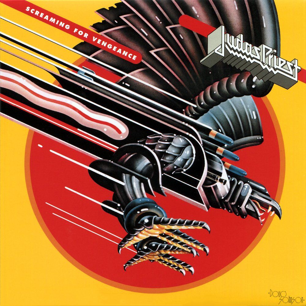
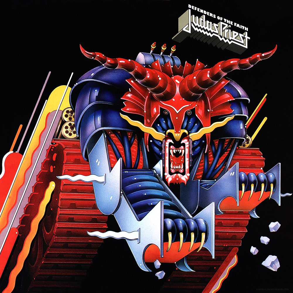
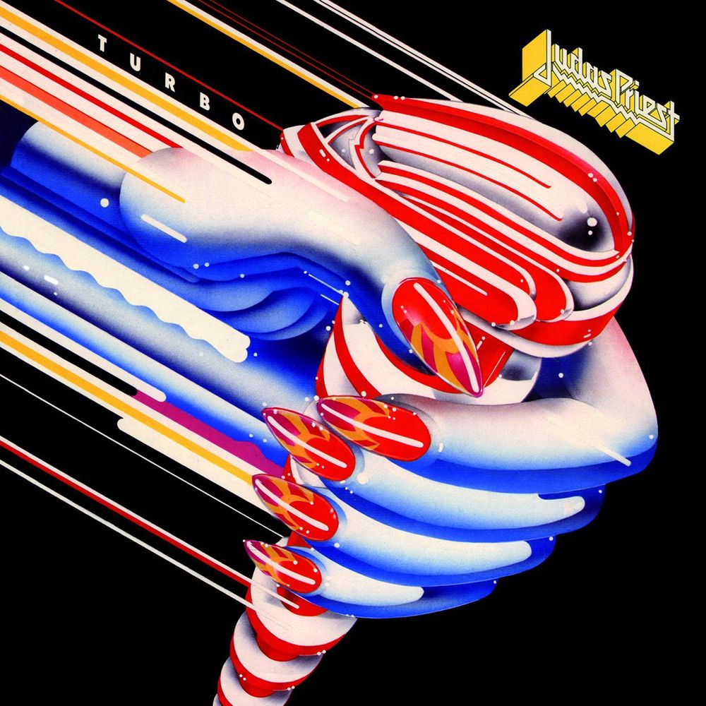
What I love most about is work is that all of Johnson’s designs are iconographic, clean, and detailed without turning his covers into a “Where’s Waldo” of hidden elements. The simplicity of his covers make them quick to process with character-like silhouettes that are not only recognizable from a distance, but they’re also images that implore scrutinous eyes to scan details where feathers span, treads fade, and fingernails glisten. It’s direct and potent, but also playful and fun. Even at a glance, it’s easy to distinguish Johnson’s work from the rest of the Priest discography, ideal for a band as these designs are as easy to spot in record bins as they are on t-shirts across the parking lot. Whether it’s the blazing yellow of Screaming for Vengeance, the vicious maw of the beast on Defenders of the Faith, or the Turbo shifter that could easily double on a pinball machine’s backglass, they all make an immediate impression.
Johnson’s style is art deco and retrofuturistic in a way that kind of picks up where Szaybo’s eerily antiseptic covers left off. But instead of the emotionless, static drones found on Stained Class and Killing Machine, Screaming’s “Hellion” and Defenders’ “Metallian” have expression, ferocity, and motion. His work has also come to inform much of the Priest aesthetic post-Turbo. Painkiller and Firepower portray similarly futuristic weapons. Angel of Retribution and Jugulator depict cutting-edge hybrids of human and machine. Essentially, Johnson ushered in the new visual language of Judas Priest that blends sci-fi, fantasy, and technology.
Screaming For Vengeance (1982)

Johnson’s first cover marks a distinct break from Szaybo’s muted palettes and intimidating realism, introducing a more fantastical, psychedelic vibe that parallels the group experimenting with their sound (which really carries over these three records) – fresh, modern, and polished. Screaming for Vengeance’s vibrant yellow and red are retina tickling and attention grabbing. Themes covered throughout the album are reenforced by color psychology, relaying confidence (“Riding On the Wind”), enlightenment (“Take These Chains”), power (“Screaming For Vengeance”), desire (“Fever”), and love (“Pain and Pleasure”). These stimulating, energetic hues convey a sense of power and intensity as they offset the sleek and stealthy blacks of the screaming eagle Hellion that streaks across the cover. Every line is crisp and geometric with repeating patterns that imply a sort of nature and logic to his illustration (as well as being aesthetically pleasing). The Hellion’s glossy, polished look enhances the retina-burning effect (the glints and streaks of white) and tracing artifacts (love that squiggle) that give the cover a strong sense of motion and momentum. He crystallizes the soaring leads of “The Hellion” perfectly in this image: the climb and divebombing creature, it’s smooth, blurring, windswept forms. Screaming also features the first time the Priest logo gets the skewed, isometric style, complementing the three-dimensional geometry of Johnson’s style.
Defenders of the Faith (1984)

Where Screaming zeroed in with a descending attack, Defenders rises with palpable might. The aesthetic is largely the same on his second cover, right down to the signature angular motion and isometric perspective. Here, The Metallian frozen mid-pounce with rubble in tow is hefty and wide, eyes beady and jaw agape. The tank-like treads and broad, tiger-like musculature convey a newfound physicality, dread, and violence that Defenders brings in spades on tracks like “Jawbreaker,” “The Sentinel,” “Eat Me Alive,” and “Some Heads Are Gonna Roll.” This idea carries on in the sharp, pointed shapes (fangs, blades, armor) found throughout the image, too, with thinner lines and a slightly greater depth of shading, creating something more complicated and difficult to understand. Still, eyes will be drawn drawn toward the beast’s beady-eyed stare and gnashing fangs as an instinctual, inescapable fear response. Further, The Metallian’s robust design reflects the slower, grinding tempos of “Heavy Duty,” “Love Bites,” and “Rock Hard Ride Free.” You can interpret its heft, power, and momentum. With Defenders, Johnson evolves his mechanical design from a covert eagle form with light munitions to an ambiguous bestial creature that has a complete lack of subtlety. Equipped with a samurai-esque helm, pauldrons, gatling guns, and missile payload that combined dwarf the armament found on The Hellion, Johnson evokes excess and extreme prejudice. It’s so completely over the top, I can’t help but feel Doug tossed on the serpentine wrist and elbow blades after the fact to further up the ante. Yet, the ridiculousness of it all keeps a beat with Defenders’ bravado and attitude.
Turbo (1986)

Turbo (not so coincidentally) delivers a sense of motion and speed, charging forward, creating a rhythm to Johnson’s pseudo-triptych. As a nod to Priest’s synthier, pop-forward leanings, Turbo is in full-on machine mode this time around, abandoning the animal hybrids in favor of something that’s comparatively plain-faced and basic. He jazzes things up here and there with some detailed bits that include a shifter that looks like an over-designed Power Rangers or Ant Man helmet (still give the dude major props for creating something that looks fast from a vantage point where speed is really hard to comprehend) and some glitzy fingernails, but there’s still a kitschy, velvet Elvis kind of feel present. He doesn’t make the best use of the streamlined elements he worked into his previous work, but he still manages to create something that feels sleek and modern. The (quite literally) white-knuckled hand is humanoid, resembling something closer to the chromed Szaybo era than the wild fantasies of his previous two covers. The disembodied hand is mysterious, feminine, and feels like metal’s version of Duran Duran’s Rio cover. Though the concept is pretty on-the-nose, Johnson takes the light-hearted and carefree vibe and knocks it out of the park. The hard, sharp, and violent features of Defenders have been abandoned for smoother, softer curves that may or may not be a response to the PMRC’s attack on the band (and metal at large) for being offensive. Turbo exudes the ideals of freedom, loves lost and found, and a rebel nature. I’ve always had this narrative in my head that this cover was supposed to portray some broken-hearted soul who steals their ex’s whip to start anew, and even if that’s not what Johnson was going for, his Turbo art is a worthy entry in a long line of albums with an automotive focus.