Album art in the modern age is in a precarious position, but it’s no less important than it’s ever been. For many of us, these visuals have been relegated to a tiny square, requiring a number of pinches, pulls, and slides to explore the details of an album’s cover. Streaming services like Spotify and Pandora complicate things further by distancing us from the complete album art, detaching us from the cohesive package of an album, and compressing artwork into a imperceivable or cropped version of itself. Nearly gone are the tearing of cellophane, the smells of cardboard, paper, and vinyl. No packaging, no lyric booklet, no insert, and in my opinion – no fun.
That’s not to say album art can’t be enjoyed on a screen (a word on that soon). But as some of us still like to support our brick and mortar record stores, as vinyl continues to “resurge” in popularity, or as some of us only have CD or cassette players in our shitty cars – there’s a good portion of us still relishing the physical art. So I ask, if you’re reading this on a phone, take note of the artists, albums, and words and take this a step further. Seek out high resolution versions of the album art (Bandcamp is actually pretty good about this), or better yet, track down some physical copies and really experience it.
Visual art oftentimes says a lot about what’s happening on record. It can give us a vantage point that sounds alone cannot create. Musicians take time to choose something to visually represent their sound much as they do a guitar amp, a set of strings, an engineer, or a producer. With this in mind, these recordings have identities that develop alongside this artwork, and function as part of what we experience every time we press play. So whether they’re simply eye-catching, thought-provoking, or enhance the musical product we enjoy, they help to create the worlds in which these albums exist.
Here are some of our favorites from the year:
Bell Witch – Mirror Reaper (Mariusz Lewandowski)
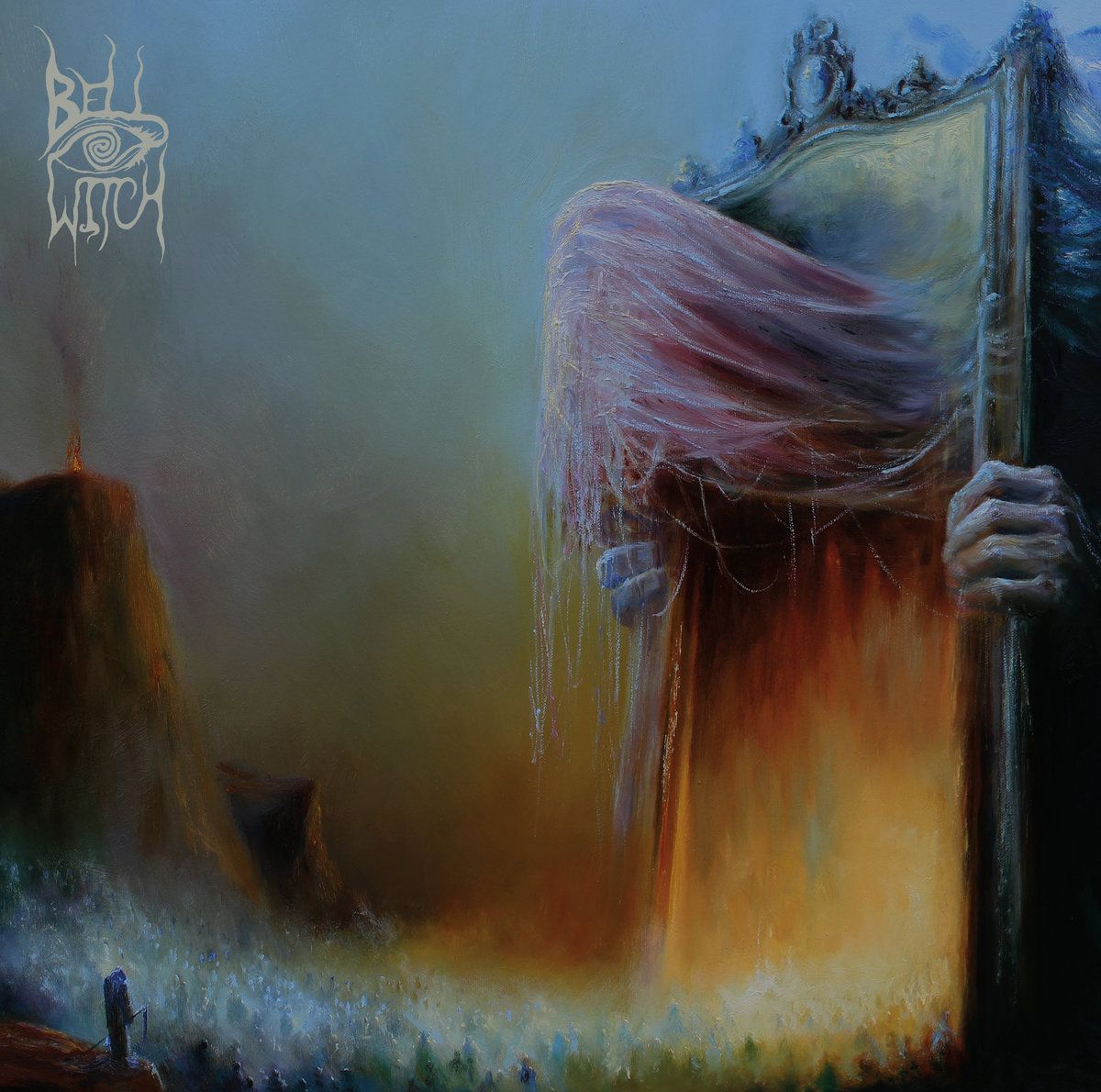
As a personal rule, I never buy band shirts featuring artwork from albums that I have yet to listen to or verify as quality. Though I should amend the above statement to “almost never”, if I’m being honest. That’s because I purchased a shirt with Bell Witch’s Mirror Reaper cover art on it as soon as it was available for order. Thankfully, I was not even remotely disappointed by the music, as the album is an atmospheric, bleak, sparse and fundamentally incredible funeral doom record. But I honestly couldn’t care less about whether or not the music was good, because this artwork, created by Polish artist Mariusz Lewandowski, is some of the best that I have ever seen. It fits the music of the album perfectly, is striking in style, texture, and color, and is detailed enough to encourage hours of staring. In short, it’s everything metal album art should be.
Let’s be real here: There are tons of creature features on metal album art. Little that is presented here could be categorized as “new”. Paolo Girardi pedals a similar aesthetic (which can be seen in his masterful, gritty artwork for bands like Power Trip, Artificial Brain, Bufihimat, Firespawn, and even Bell Witch’s previous full-length album). One could also point to Nick Keller’s exceptional work with Disentomb, Beastwars, and Altarage. But great metal art doesn’t necessarily need manic originality to succeed. What Lewandowski captures here is the stark, overwhelming, towering essence and presence of the unknown. Of mysterious places and destinations. Of death. Fitting, as the album this artwork emblazons is about these very topics. The creature on the front (outside of looking like a mid-stage Dark Souls boss), is the obvious centerpiece of the work, and is odd in a few distinct ways. What exactly does it represent? Why are its hands holding the outside of the mirror, while his head protrudes from the inside? Who are the figures at its base, marching solemnly toward (or away from) that titanic mirror? All of this general oddness and discombobulation only serves to heighten the intrigue and pull of the piece, making it extremely difficult to remove your eyes from once you’ve spotted it. It all looks so… unusual. Yet it feels right, especially within the context of the record. The piece itself is a sort of a mystery, and that makes it both intriguing and consistent with the music it is visually interpreting. The color scheme doesn’t hurt, either. The purples, blues, oranges, and shades of brown also create an absolutely stunning combination that is much less harsh to look at than many metal covers, creating ample highlights for the eyes to explore. It’s a smorgasbord of a piece, and one of the best that I have ever seen on a metal album.
At its very worst, album artwork can detract from the music of the band utilizing it. If it feels divergent in theme or style from the music, it can often create a thematic disconnect, leaving listeners confused by the artwork or in some cases skipping the album entirely. At its best, art takes the themes and concepts present within an album and both visualizes and transcends them, detailing part or parts of an album’s content with the vitality and verve of raw imagination. Lewandowski’s work does all of these things impeccably well, and is in my mind the indisputable album artwork of the year. Bravo. More, please.
–Jonathan Adams
Necrot – Blood Offerings (Marald Van Haasteren)
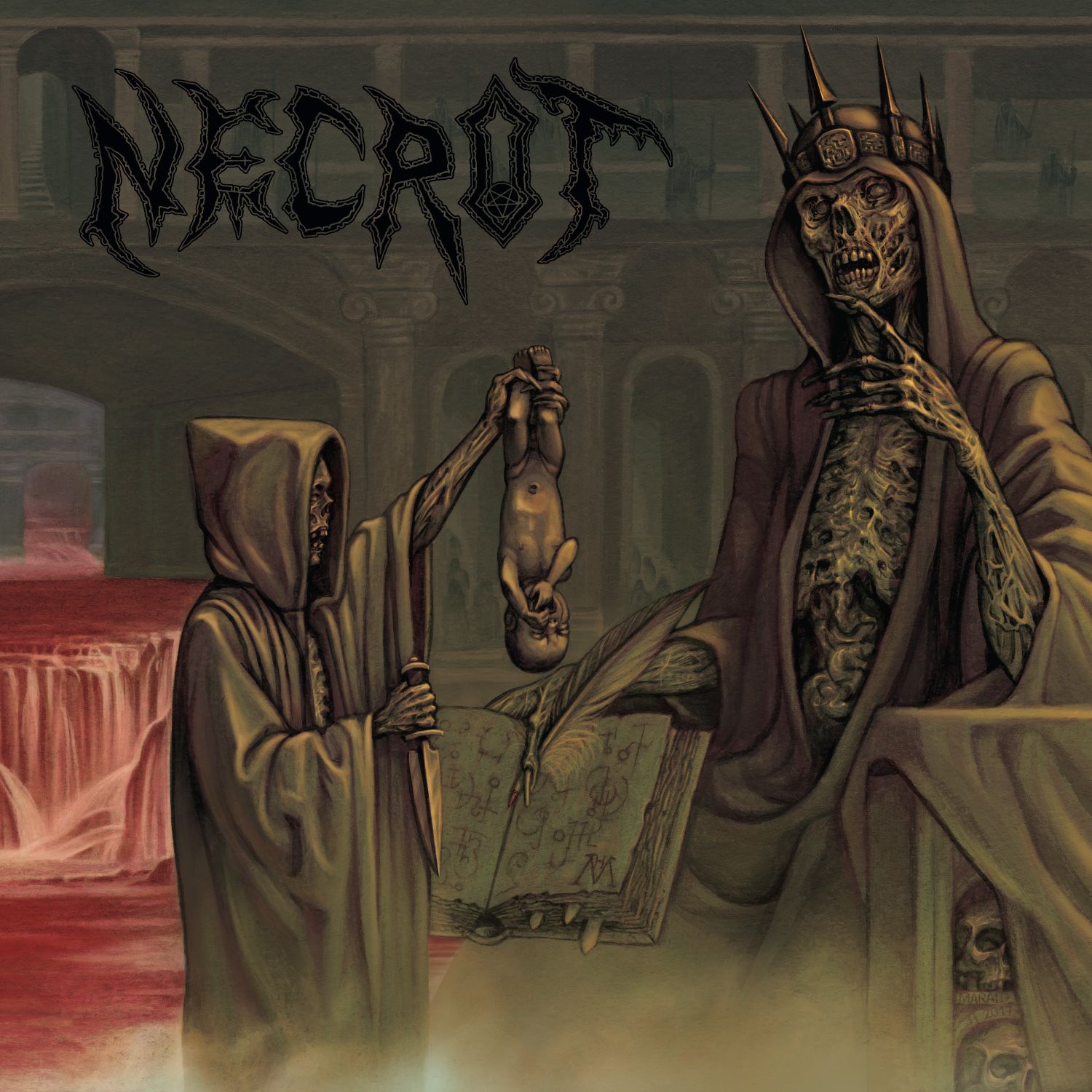
Upon first sight, before you ever press play, you damn-well know Blood Offerings is going to be death metal of the old-school variety; rarely is album art so emblematic of it’s contents. Marald Van Haasteren (who has previously collaborated with Bolt Thrower) was a no-brainer choice for bringing that late-’80s/early-’90s vibe to the next level. If it wasn’t for the small “2017” etched into the throne, we’d be obligated to assume this piece was from decades past. Appropriately, Blood Offerings has an authentic, classic sound fitting for its archetypal artwork.
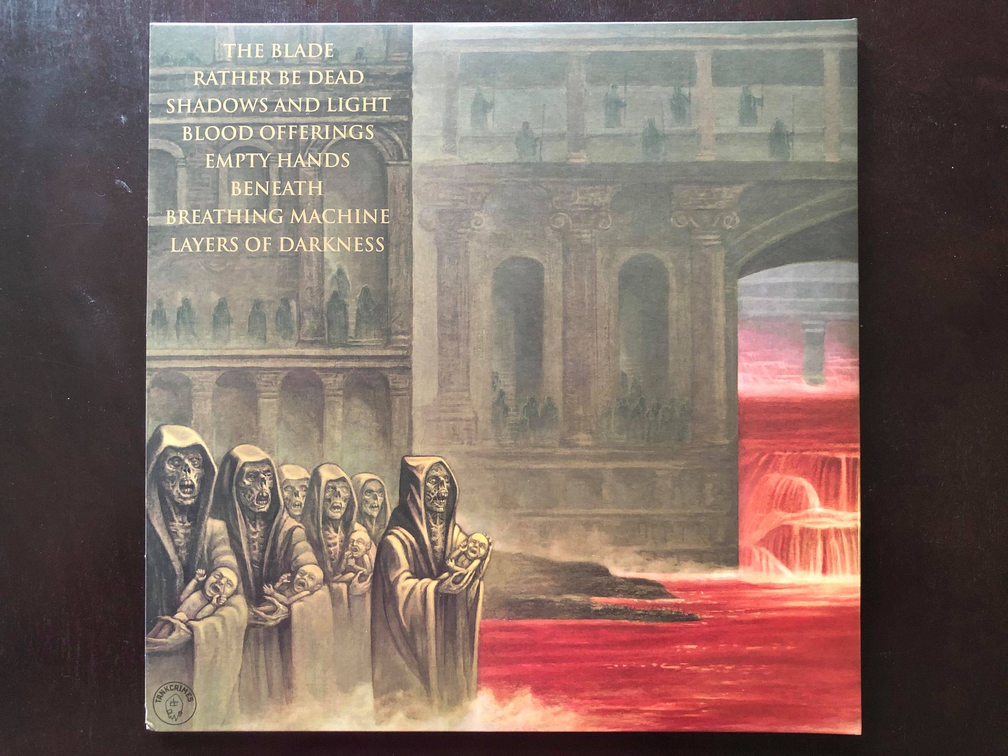
The cover’s abundant bloody flowage looks like a byproduct of Necrot’s churning riffs that feel like they pulverize and grind in a dismal underground. Their huge, cavernous sound similarly spills over to the back panel, where the labyrinthine depths mirror the twists and turns of the record. The art is every bit as dark, grimy, and disgusting as the record sounds, appropriately depicting the sinister elements found across the album.
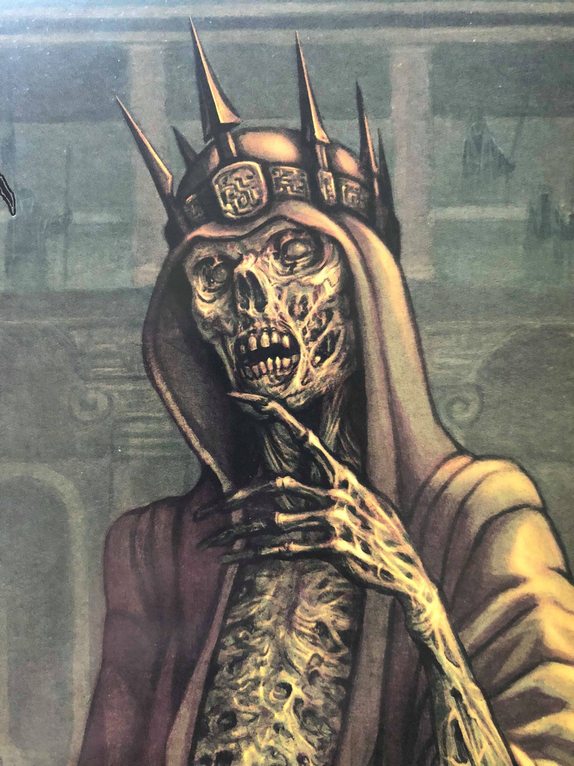
Van Haasteren’s painting pays tribute on a number of levels, specifically in how it captures a few elements of Ed Repka classics. There’s the offset, highly-detailed “primary” figure – in this case, this fuckin’ badass zombie cult king complete with tribute-bearers who hold a certain resemblance to another dungeon cult (Scream Bloody Gore). His mummified flesh, sticking to his bones like dusty beef jerky really couldn’t be any more “death.” Coupled with the wincing infants, Blood Offerings has the exact kind of striking imagery that seeks immediate disapproval from traditionalist minds worldwide. It’s the icon that a record of this caliber deserves.
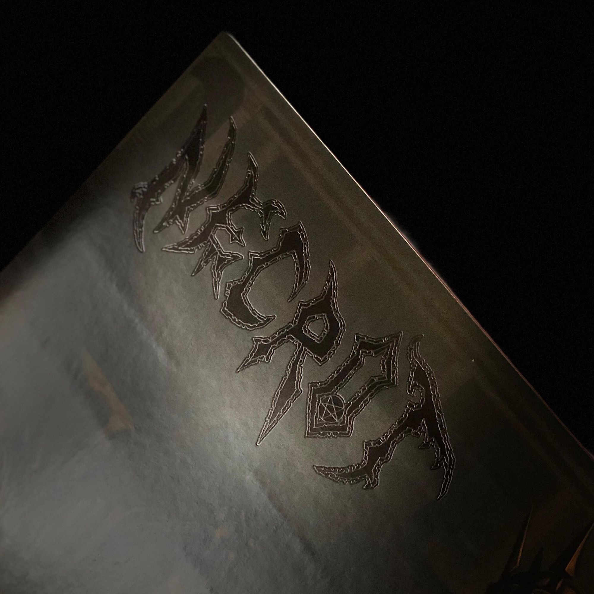
This layout gives ample room for the debossed logo which is stamped in a deep, glossy black. It’s well-proportioned, and lends a tasteful and authentic touch to the sleeve. The structure also helps to create depth that runs from the cover over to the back panel. The deep background is rich with detail (some of those dudes scored some great balcony seats for this sacrifice), like a scene that Bob Ross might’ve painted if he heard these riffs (fuck, these riffs…).
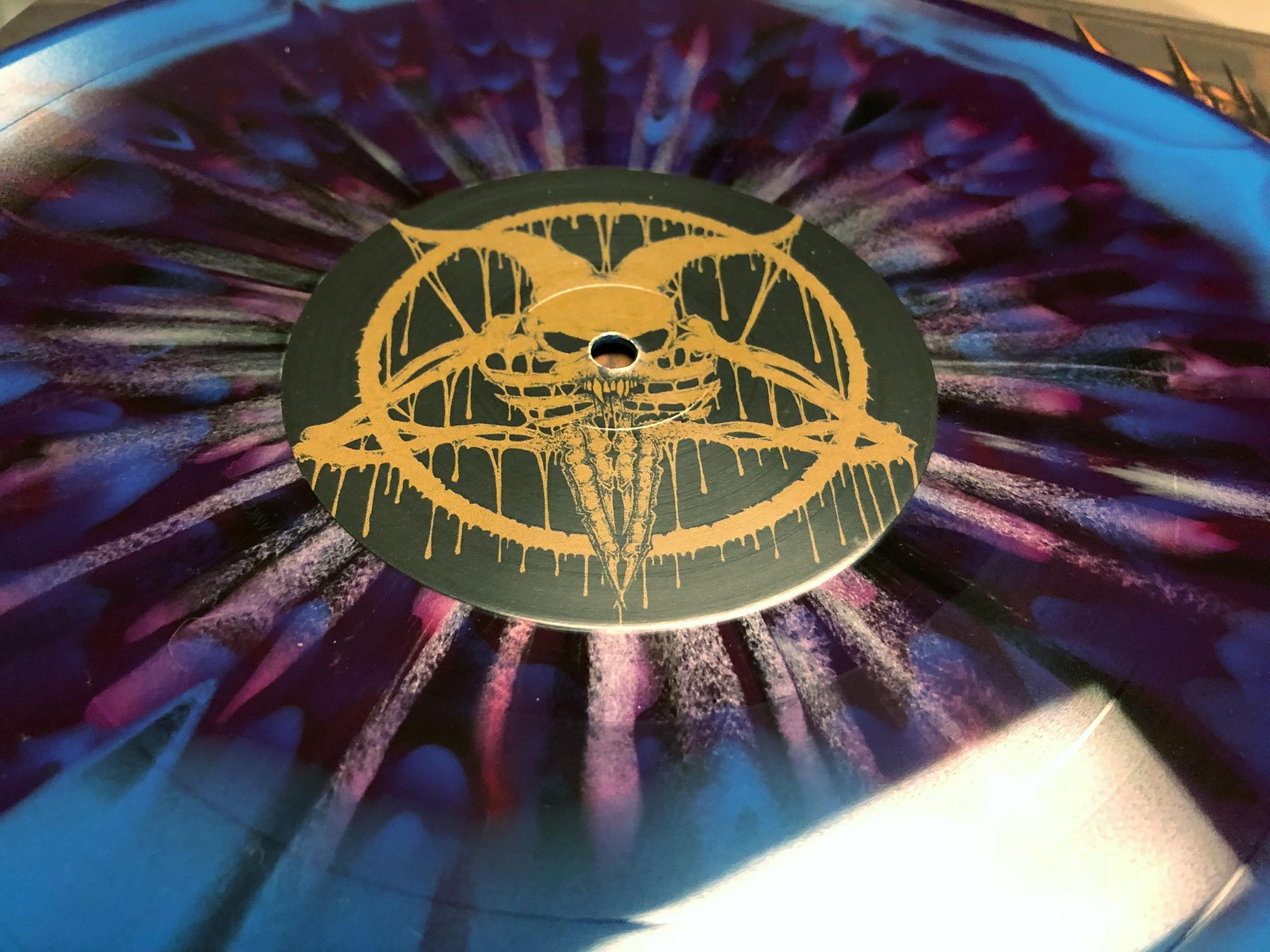
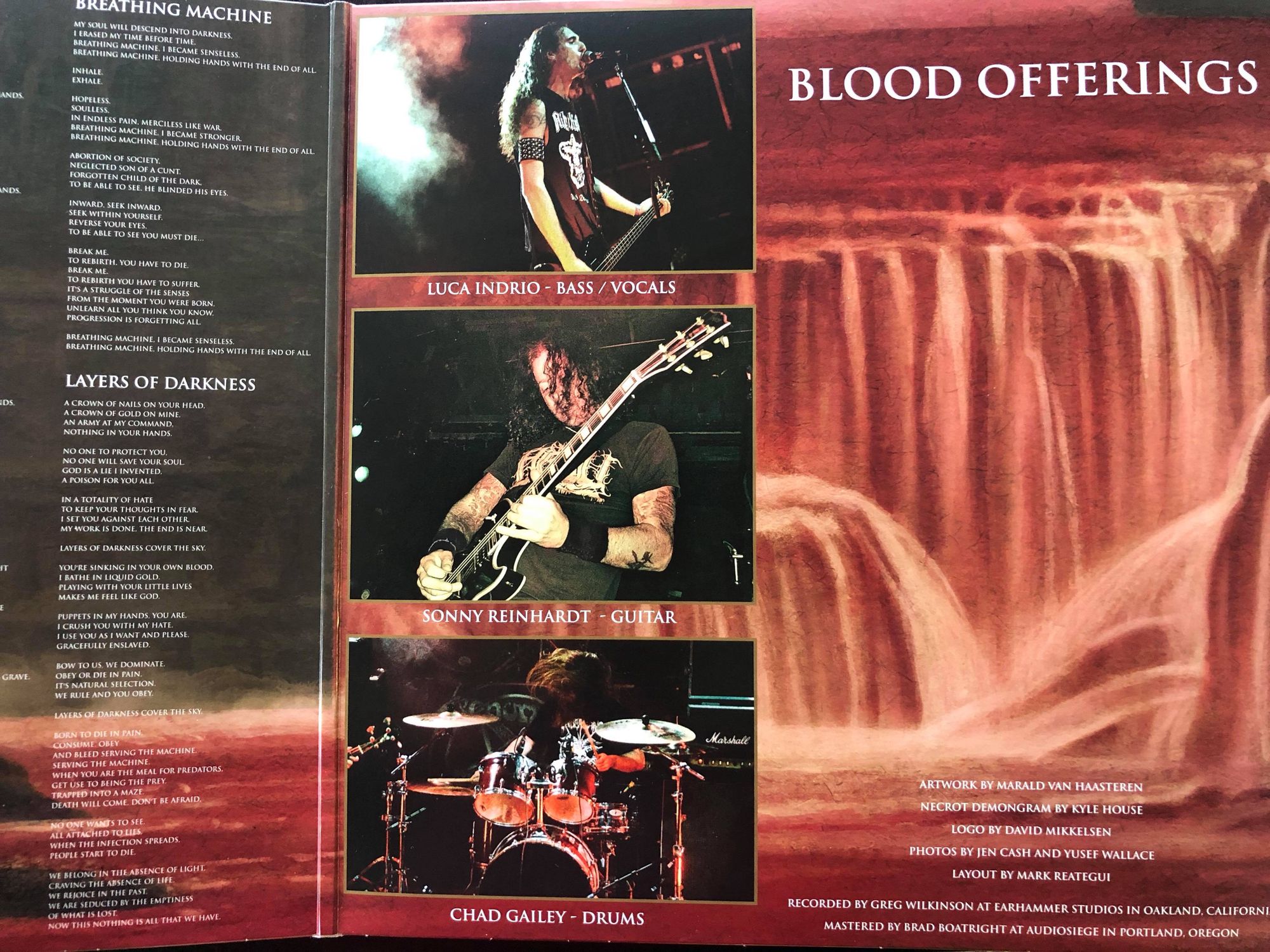
Overall, it’s tonally more muted than Repka’s work, but still follows the limited color palette convention – organic olives, browns, and reds dominate the scene. There’s not much in the way of eye-zapping neons in the package (unless you picked up the blue/purple vinyl), reinforcing the grim and dark sonicscape where Blood Offerings takes place. Moving the album title from the cover to the inside of the gatefold was a wise decision – it lets the artwork speak for itself, undisturbed and clean. Besides, what could say “Blood Offerings” more than an undead sacrificial cult? Also of note is the choice to use live photos instead of a posed group promo photo. There’s something about seeing the band in their element – natural, sweaty, giving no shits, pouring themselves into their craft. Throughout, authenticity reigns supreme, inside and out, on record and in packaging.
–Jordan Jerabek
DVNE – Asheran (Eli Quinn)
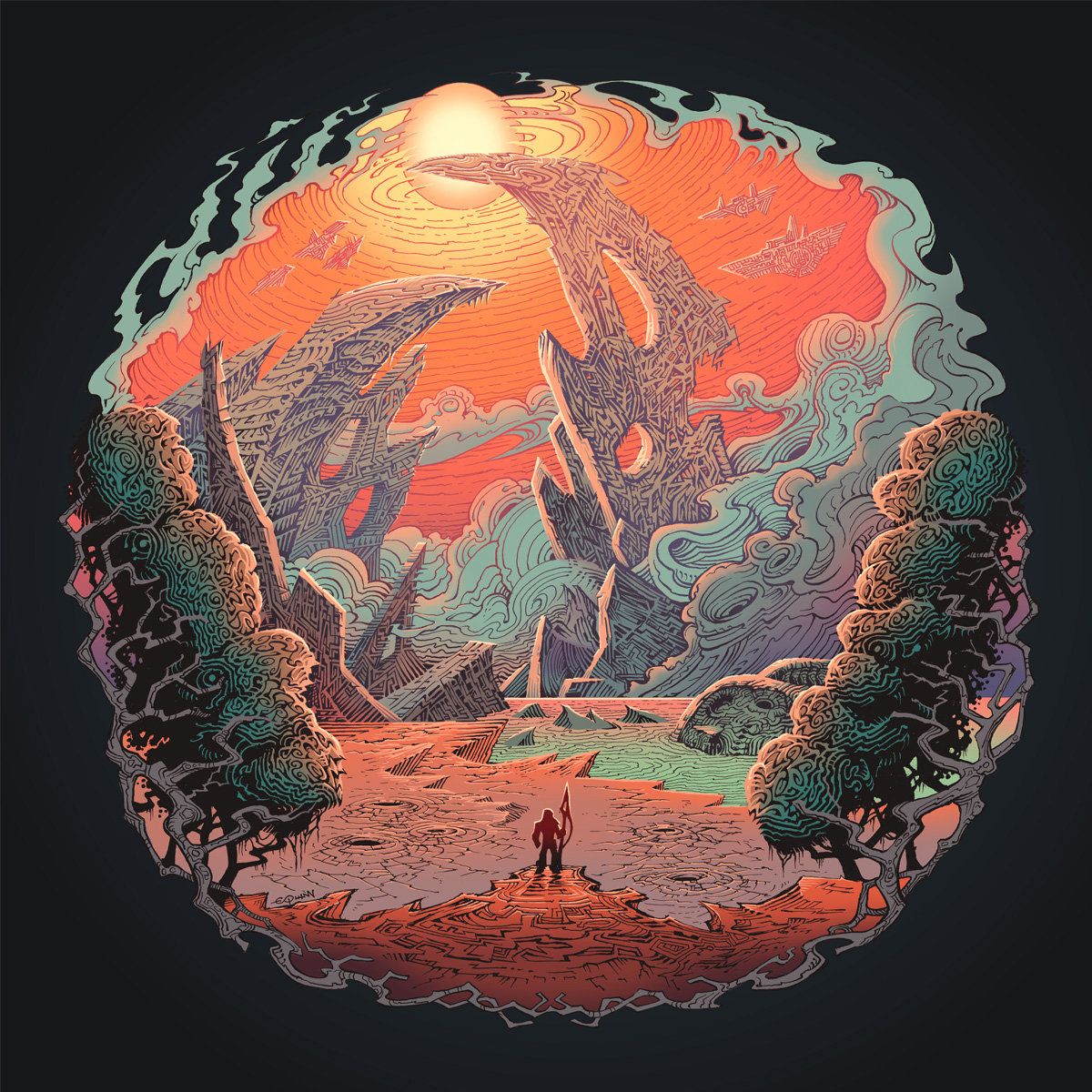
DVNE have already had quite a few mentions here at Heavy Blog for their fantastic progressive stoner release Asheran. We’ve talked about how great the music is here and here, whilst Eden dove deep into the record’s sci-fi concept with one of his trademark *prognotes. However, one facet of this record has yet to receive the proper Heavy Blog treatment, and that is its artwork.
For those unfamiliar, here is a crash course in the record’s concept, for it’s central to understanding the artwork. Two races, one wholeheartedly embracing technology (the Asheran) and the other scorning it, engage in genocidal conflict to decide which race would forever rule their planet. After much bloodshed, a ‘chosen one’ steps forth and saves the planet… by ushering in the destruction of both races.
Conflict is thus the central theme, and it is writ large across the cover. Three star ships have landed, perhaps so that the Asheran can set foot on their home planet, or perhaps because they’ve been shot down from the sky. Certainly, the one in the foreground appears as if it has crashed to earth, a symbol of the conflict’s beginnings. Still, the destruction will not end soon, several other star ships still flying freely, ready to bring further violence and chaos to the planet. Just as the Asheran conflict with their enemies, so too is there conflict between the cover’s bleak reds and its greenish blue hues. Further, the location of the lone humanoid symbolises the conflict between man and nature, and that between man and technology. Behind that lone figure are trees, the only other signs of life, whereas he looks out onto barren wastelands and the carnage of war. He is nature’s champion, its harbinger of justice. Yet, he is also the lone living creature facing up to giant metal ships, a symbol of the annihilation and excesses that technology can bring. Finally, we know how it ends, the sun rising highest above all else, it’s pulses of light radiating power throughout the sky. It is nature that is highest, nature that is strongest, and nature that shall prevail.
Thus, the cover does a brilliant job of capturing this far-reaching concept in a single image, whilst simultaneously letting you know exactly what kind of genre this band belongs to. Take a bow, Eli Quinn.
–Karlo Doroc
Couch Slut – Contempt (Leandro De Cotis)
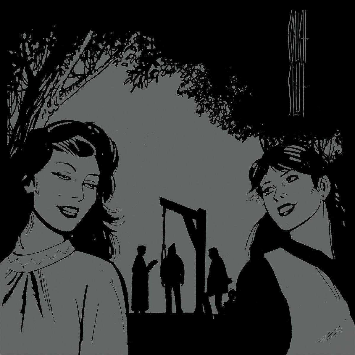
Borne into the very spirit of metal and hardcore is a spitting-in-the-face-of-convention nature that seeks to undermine comfort and disrupt the standard. Thus, ugly, disturbing music is often accompanied by dirty, off-putting album artwork. Couch Slut’s debut release hit both of these nails on the head with their striking debut, My Life As A Woman. Again, the band recruited Leandro De Cotis to develop the visual concepts for their latest masterwork, Contempt. Eschewing the bold, in-your-face approach, De Cotis’ artwork mirrors the band’s sonically broader, more subversive, and less predictable nature without toning down the intensity. Content-wise, there might not be anything that better represents 2017 at large.
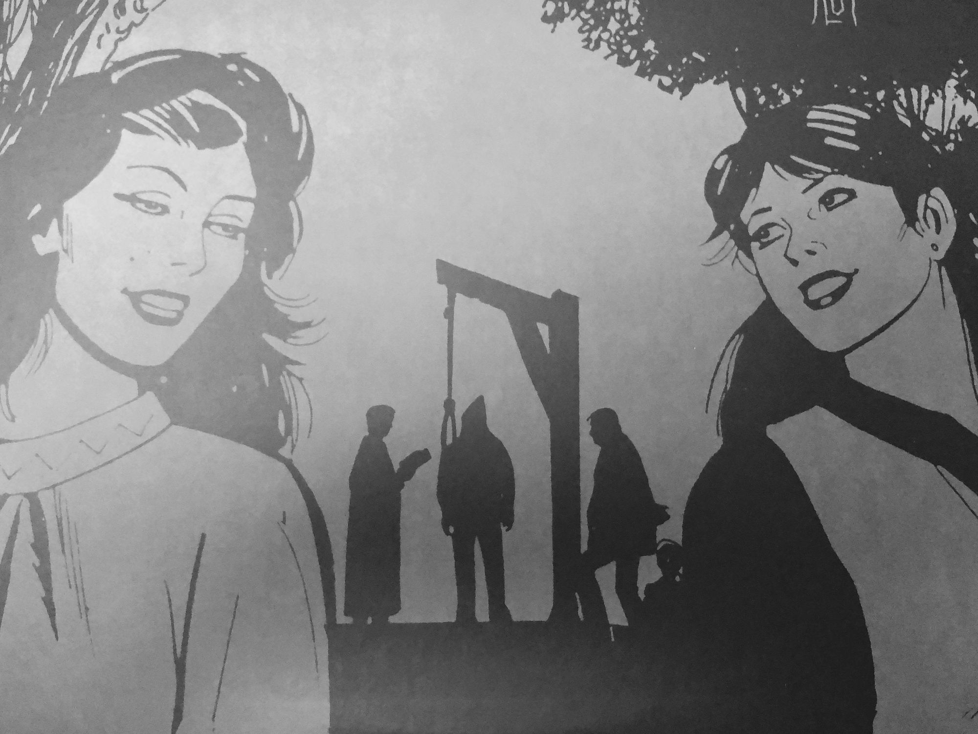
What I really love about Contempt’s artwork is how De Cotis’ comic style misleads with its simplicity. Because of their simplified nature, comics allow us to more easily project ourselves and others into the scenes we view, making dissecting this stuff all the more fun. The smiling pair of women is an instantly warming image. Something about their garb hints that these women may be undermining a Salem-esque witch hunt – but nonetheless, it’s a fun representation of sadism. Upon closer (or wishful?) inspection, the overweight hangee’s distinct coif brings to mind a very 2017 figure worthy of some justice. Regardless, their smiles in relationship to this heavy scenario scream absolute scorn for whomever is about to be punished. At a time when long-overdue sexual misconduct wrongs are starting to get righted, there’s something in the retribution Contempt conveys that speaks powerfully, and kind of prophetically.
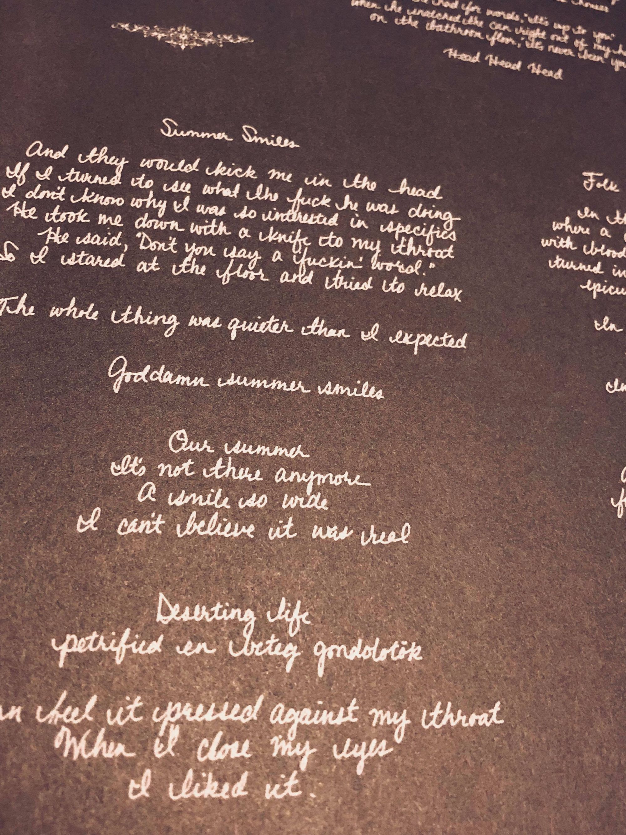
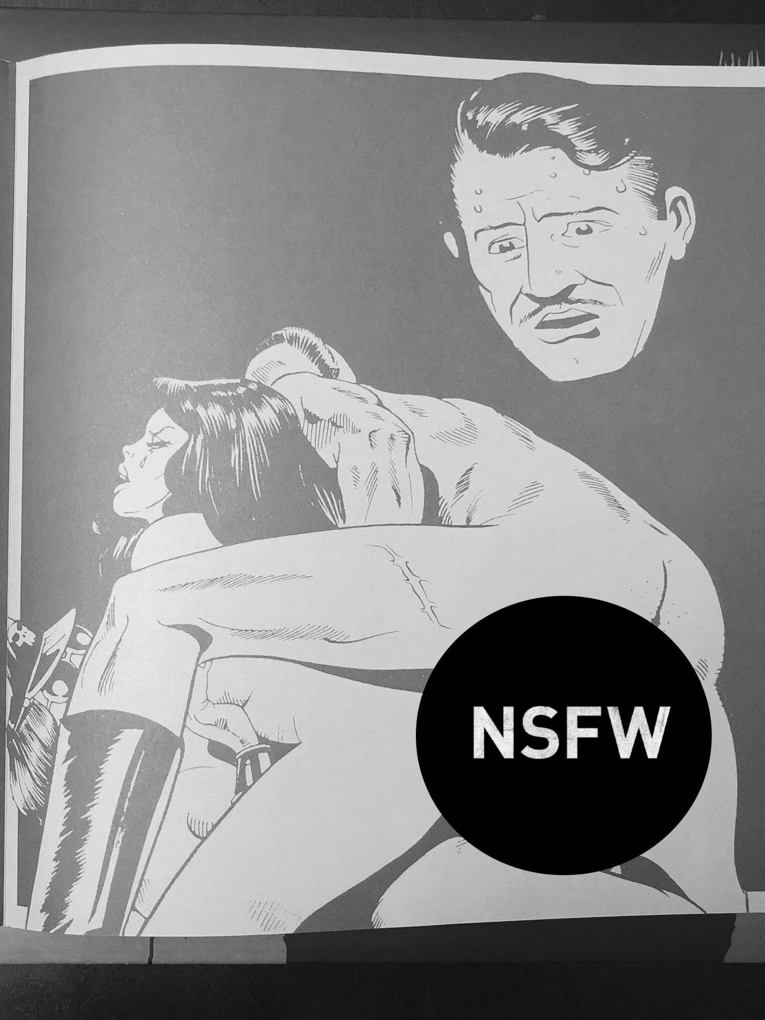
The grey-on-black scheme subdues and almost mercifully softens the blow of his stark scenes. The darkness and grit is embraced in lieu of a color scheme that screams for more attention, and in many ways, it helps to draw the eye toward the details of his illustrations and encourages deconstruction. Whether it’s the worry on the face of the disembodied head as it looks upon a (Big Black-inspired?) graphic sex scene, or the deep focus of the user oblivious to the duo falling from a building on the back of the sleeve, the themes of the record are fleshed out visually with equal might. Similarly, Megan Osztrosits’ handwritten lyrics lend an unsettling human touch, like unexpectedly obscene calligraphy. Legibly scrawled, the irony of easily reading words that shouldn’t be makes you wonder if you’re the butt of a joke as you read them.
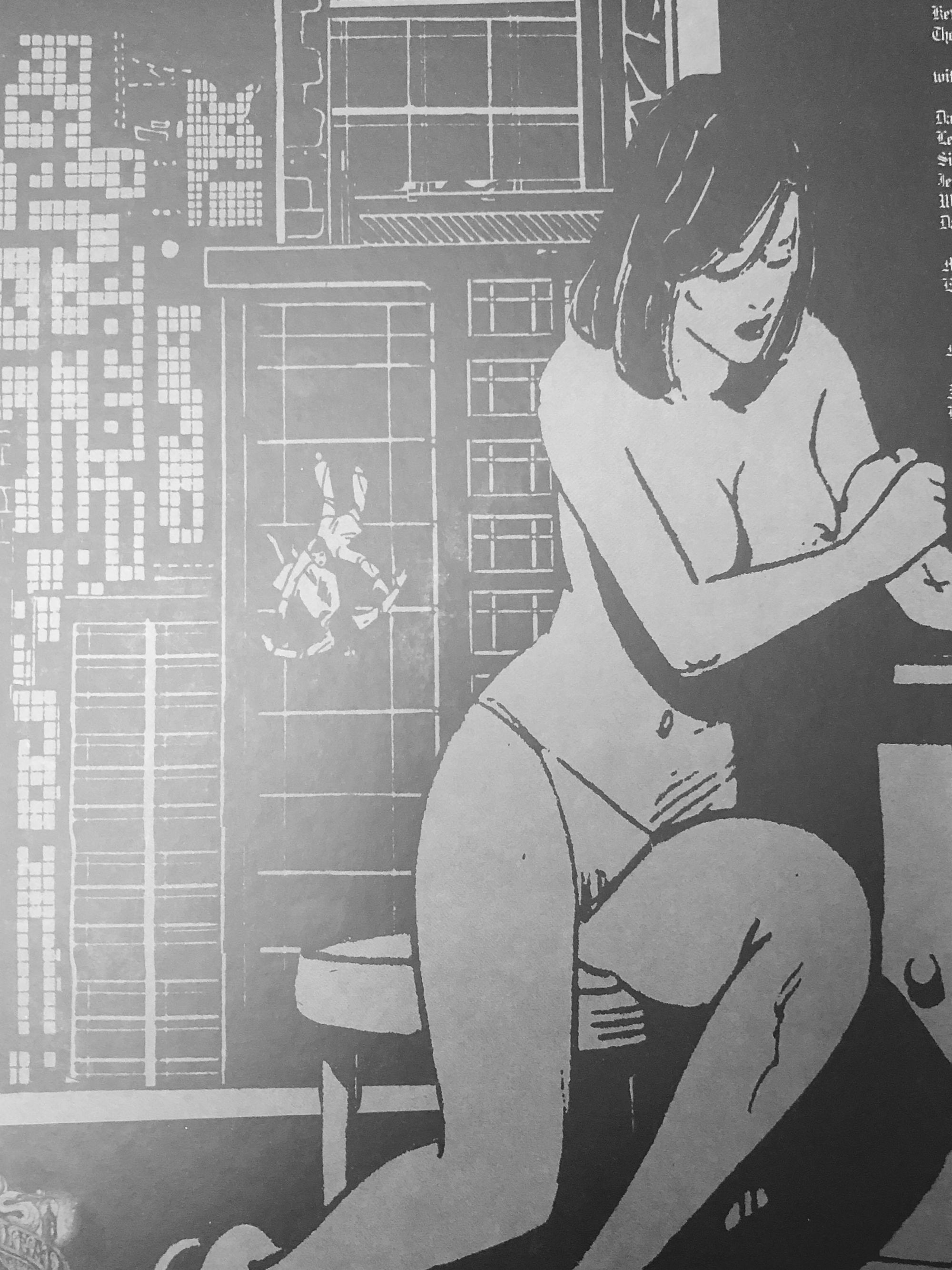
Years from now, we might look back at Contempt as an accurate and concise snapshot of the world at 2017. With its clean lines and pseudo-friendly cover, it pairs deceivingly well with its gritty contents, more so than most gruesome monsters or fuzzy photographs do. De Cotis’ work would be stellar as standalone visual art, but in tandem with the themes of the record, it’s all the more impactful and agitating.
–Jordan Jerabek
Caligula’s Horse – In Contact (Connor Maguire)
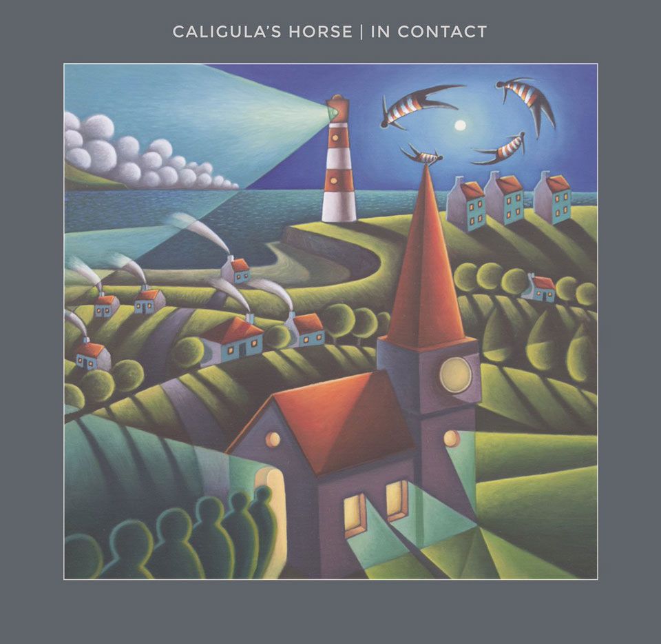
The relationship between an album and its artwork is a delicate one. The approaches to it are delicate as well and there’s an ongoing discussion around the conflict which they suggest: should album art reflect the content of the music, stand as its own piece or even subvert expectation? At the end of the day, Your Mileage May Vary and there’s really no point in trying to quantify something as untenable as how we feel when we experience art, especially when two different media are involved. However, it’s safe to say that the best kind of artwork somehow manages to shake all three of these options and create something more subtle, a connection between the graphical art involved and the music that is harder to pin down.
That’s what the artwork for In Contact manages to do. The album itself is one which we’ve heaped praise on and for good reason; it’s one of the best albums of the year. Its themes revolve around personal growth, community, education, social struggle and more. What the artwork does is cleverly circumvent specific images or direct allusions to themes from the album and instead appeals to two things. One, it opens a hardline between it and the theme of community hinted at throughout the album. This is visible in the object which takes up the forefront of the piece, the place of communal gathering (whether it be a church, a city hall or something else). People enter into its well-lit spaces and stand in the center of their town, occupying the social space which it signifies.
In the distance, shapes whirl in the sky and the landscape otherwise hints at the fantastical. This is the second thing to which the album art appeals to, the faint sense of the dream-like, of hope and of impossible places which runs through the album. The artwork, like the music itself, doesn’t tackle it straight on but rather hints towards it; everything feels slightly hazy but it’s hard to put your finger on exactly what makes you feel that way. That also servers the purpose of blurring the lines between the community portrayed and that incandescent, reverie-like feeling, creating the sense of a collective dream, a state or a place to which we all aspire, together.
Thus, the artwork is more than a companion to the album but rather sheds more light on the themes contained within it. By looking at what the music is trying to express and choosing to comment and interpret it rather than to represent it directly, the artwork is a whole new aspect of the music. It shines a light on the subjects at hand from its own perspective and thus both stands on its own and amplifies the album at the same time.
-Eden Kupermintz