A Gift to Artwork, taken from the Caligula’s Horse song “A Gift to Afterthought”, breaks down and analyses your favourite album artwork. The first time an album’s name appears, it will link to a large and (where possible) high-resolution image of the cover so that you can take a closer look. Read other entries in this series here.
Editor’s Note: A Gift to Artwork features a regular guest contribution from Luis Flores (@luis.hoa), who runs and regularly writes for the excellent Heaviest of Art. If you’re looking for more analysis and discussion of album artwork Luis’ Behind The Cover column is a must-read.
Hello all, it’s time to take a look at some more gorgeous cover art. This month Luis dives into the latest artwork adorning the covers of Absent in Body and Egregore latest records, while Karlo discusses Iomair and Meslamtaea. Let’s take a look!
Meslamtaea – Weemoedsklanken (Cover art by Maya Kurkhuli)
I first came across both Meslamtaea’s music and Maya’s artwork when Luis wrote about the phenomenal cover artwork for 2020’s Geketend in de schaduw van het leven. I’ve been keeping an eye out for them ever since and earlier this year the collaboration between band and cover artist was rekindled with Weemoedsklanken. While Luis has again beaten me to the punch, publishing a fascinating interview with both parties in January that touches on the thematic links between each of their collaborations, the piece’s beauty warrants further attention.
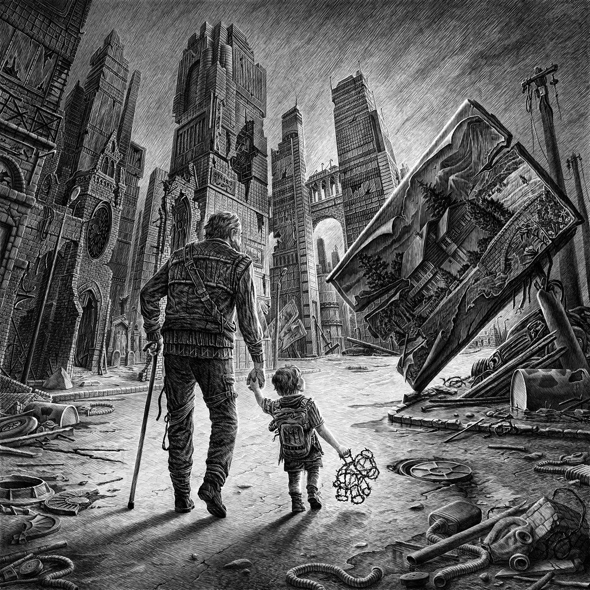
Once more we have a post-apocalyptic setting, a bleak world of black and white in which society has completely collapsed. Littered throughout the bottom third of the piece are clues as to what has caused such devastation: barrels lay broken with nuclear symbols emblazoned upon them while a discarded gas mask lays crumpled on the ground. A nuclear disaster, or perhaps more specifically a nuclear war, has destroyed life as we know it. Nuclear technology, a remarkable example of human ingenuity and scientific advancement, has brought about human destruction. This theme extends to the background as well, as we see towering buildings reaching high into the sky – incredible feats of human engineering – yet powerless to stop humanity from destroying all it has created. The builds lay in ruins with windows shattered, bricks toppled, and entire sections completely obliterated.
Front and centre in the piece are two figures: a young child and (likely) their grandfather. They walk together, holding hands and looking in the same direction – their love for one another is obvious. Even amidst such tragedy, they carry on with and for one another. The grandfather’s gait is unsteady as he is aided by a walking stick, while his cargo pants have straps akin to bandages across his thighs. Despite this he perseveres for his grandchild’s sake, the child holding the mesh outline of what was once a teddy bear, the skin and stuffing destroyed. It is a truly depressing detail, the complete loss of innocence and all that is comforting, as the black-and-white colour scheme continues to reinforce the bleak nature of the music and setting.
Finally, the object of our two protagonist’s attention is a fallen billboard showing a picturesque country scene with a lovely home set against gorgeous mountains, trees and grass with a river running through. It’s the naturalist background that contrasts so sharply with the jungle of concrete, glass, metal, and plastic of the crumbling city. It’s a reminder of a better place in a better time. A place that is now dead at a time where such devastation cannot be undone. It is a picture into a world that has been lost, a world that cannot be recovered. It symbolises the hopelessness of our protagonist’s situation and yet, despite this, it also hints that maybe there will be a better place and a better time to come. Either way our protagonists keep on walking, hand-in-hand, with their hopes resting in nothing other than their love for each other.
– Karlo Doroc
Iomair – Fishing For An Apparition (Cover art by Marie Cherniy Art)
Progressive folk metallers Iomair’s are new to me, but even if Calder’s glowing write-up for them in April’s Editor’s Picks wasn’t going to catch my attention their cover artwork for Fishing For An Apparition certainly was. The artwork certainly depicts what it says on the cover: we see a figure, wearing a military-style hat, paddling a boat downstream with a fishing rod protruding from his tiny boat’s bow. In the water await several ghostly, transparent outlines of people – the apparitions our protagonist is fishing for.

Beyond this focus on the main features, two things stand out about this piece. First, the colour scheme. It’s fairly uncommon to find such pastel blues and purples, and this immediately allows the cover to stand out. The smooth, almost glowing ochre shade of the boat really stands out among the water and sky, helping to funnel our attention towards the fisherman. The bright sky and radiating sunlight, and particularly the way the latter catches the plumes of smoke or cloud in the top-right, together with the rest of the colour choices give the artwork a warm and gentle feeling despite the ghostly theme.
The second standout feature, the one which grabbed my attention most, is the blurred boundary and shifting perspectives around where the water ends and the sky begins. Throughout the piece what appear to be great plumes of smoke drift up from the water, their reflections playing with our perspective and making it seem like the water’s edge is a lot closer than it actually is. It’s a lot of fun and the symmetry between each plume and its reflection further adds to the warm feeling imbued by the pastel colours. Several apparitions stand calmly among the clouds, chatting with one another or going for a casual stroll, lending a further sense of peace to the scene. Not the usual fare for a metal record, particularly one as energetic as Iomair’s, but that’s precisely why it stands out.
– KD
Absent In Body – Plague God (Cover art by Dolen Carag & Colin H. van Eeckhout)
The macabre photograph that fronts Absent In Body’s debut album, Plague God, was a definite grower. What initially appeared to be a simple sight of a tentacled skull designed for shock purposes became more complex upon multiple visits, deeper engagement, and full album listens. For those unaware, Absent In Body is a newly formed unit comprised of Iggor Cavalera (ex-Sepultura, Cavalera Conspiracy), Scott Kelly (Neurosis), Mathieu Vandekerckhove (Amenra) and Colin H. van Eeckhout (Amenra), with the latter playing a key role in the cover’s creative direction. Eeckhout, also known as CHVE, was ever so intentional in what he sought out for the album’s visual identity, an identity that was meticulously created by sculptor/skull carver Dolen Carag and photographed by longtime Amenra confidant Stefaan Temmerman.
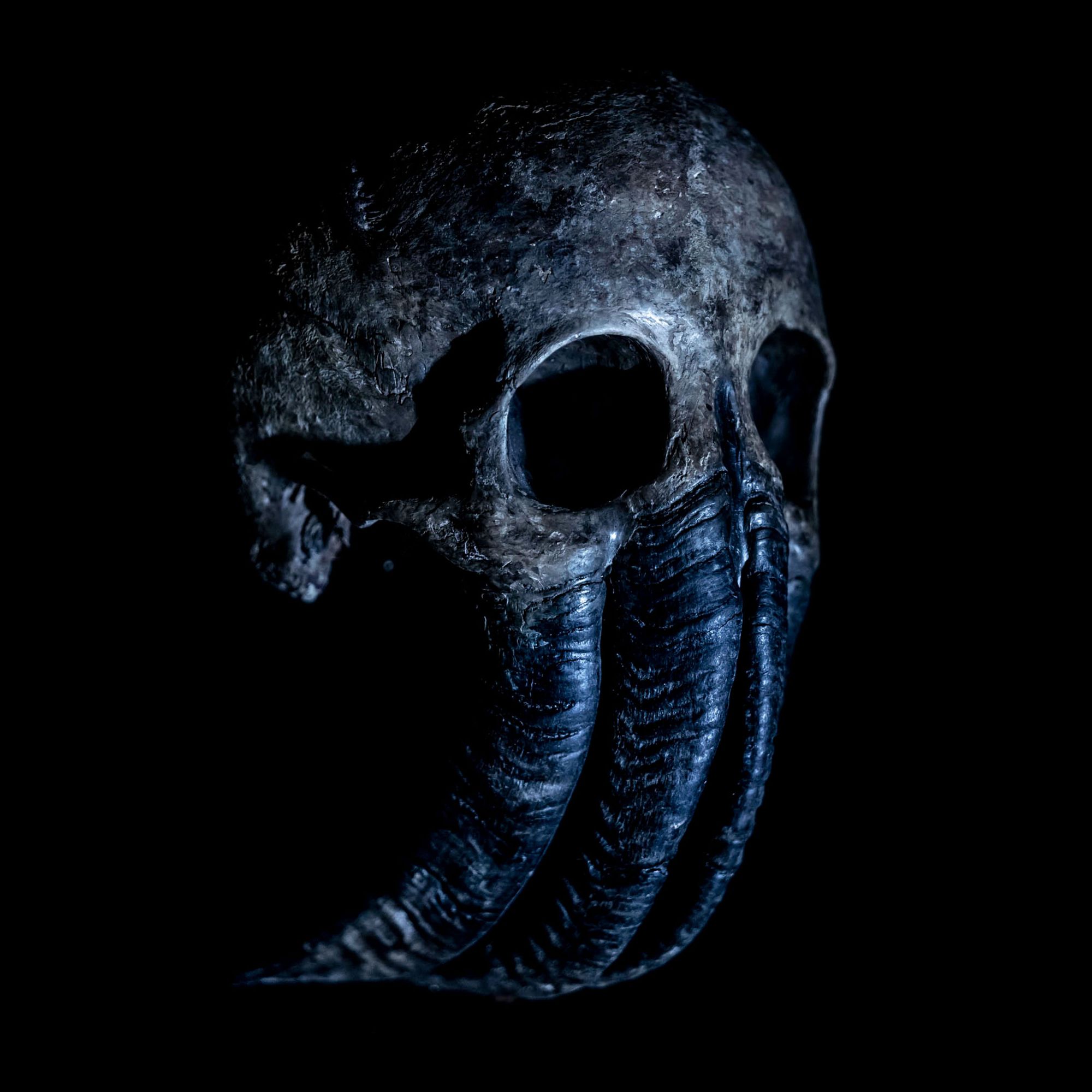
Stefaan Temmerman has already mastered the art of capturing Amenra throughout the years and now expanded that understanding to Absent In Body, lighting up the figure strategically and exploring Carag’s craftsmanship in ways that coalesce seamlessly with the otherwise sinister nature of the music. Upon first glance, it’s evident that this is neither a human skull nor one of any other mammal. It’s reminiscent of Lovecraft’s Cthulhu if anything, but as the release cycle continued beyond the initial announcement, the band shared the cover from different perspectives that recontextualized it all. CHVE’s vision was quite something and, despite appearing straightforward at first glance, it is clear that a lot of thought has been invested into every inch of this piece. As striking as the cover photograph itself is, it only scratches the surface of the larger being that Dolen and CHVE built entirely for the record. Elements of this comprehensive endeavour can be found throughout the Plague God physical release, as well as the band’s and CHVE’s Instagram pages. It serves as a proper entry point to a constantly unfolding body of work. I won’t even get into the spine chilling creation that CHVE orchestrated for “The Half Rising Man” – you can see that for yourself.
– Luis Flores
Egregore – The Word Of His Law (Cover art by Karmazid)
Leave it to artist extraordinaire Karmazid to develop worlds within worlds, as evident on Egregore’s latest album, The Word Of His Law. The cover’s warm colour palette complements the cosmic horror layered throughout this perplexing work of art, which sports his signature approach to detail layering. It also makes it quite beautiful, despite the many horrid sequences transpiring within. Consider it fitting for Egregore’s downright mesmerizing death metal.
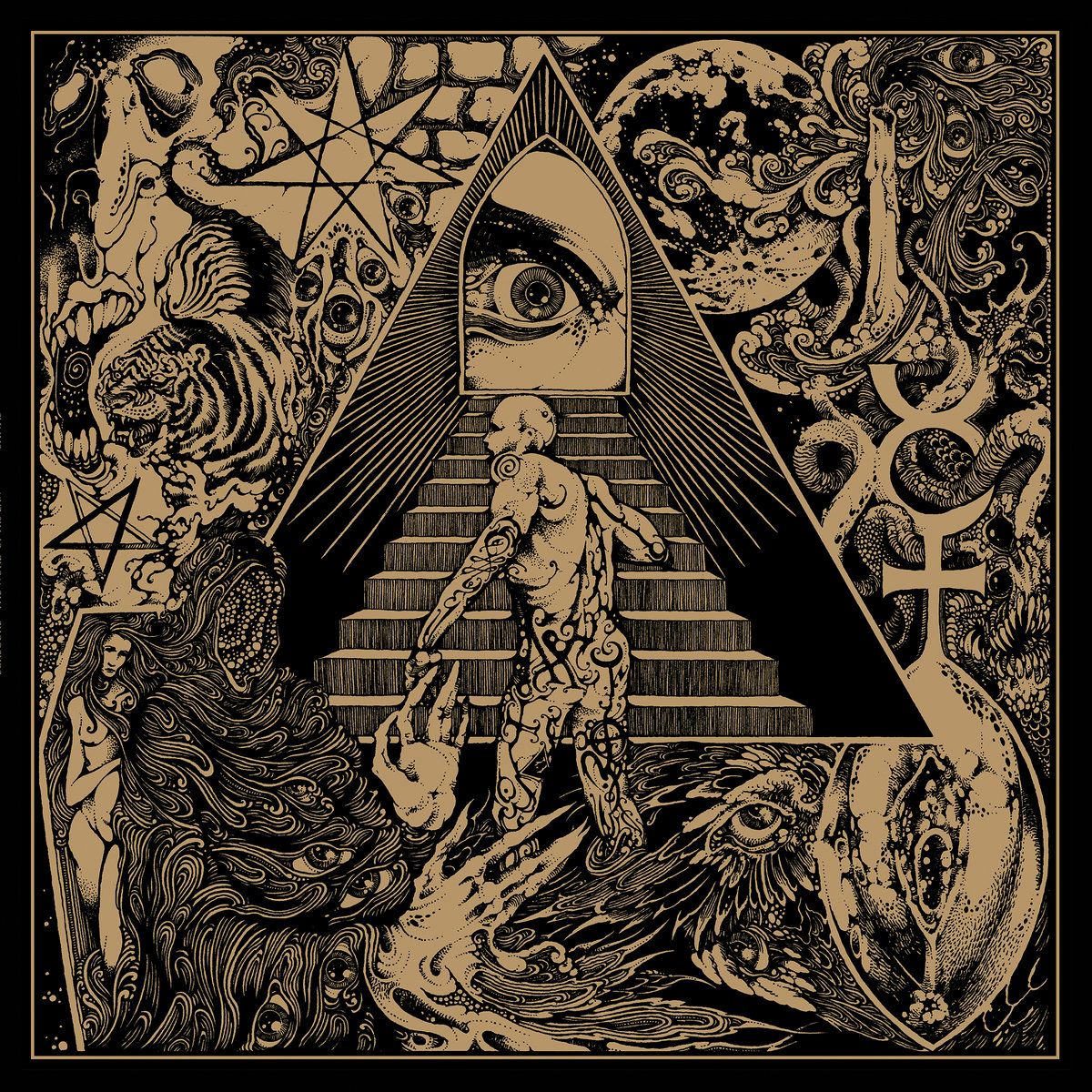
What personally makes The Word Of His Law so astounding is how much is encapsulated into the one squared image. A glaring eye stares down into the viewer as a protagonist figure with sigils engraved across his body attempts to walk up a staircase, all while a faceless wizard of sorts watches from beneath through the eyes layered across his cloak. As much as this may sound like a word salad to you, it’s a general description of only half of what is occurring within this cover illustration. There are multiple scenarios with multiple figures and environments all seamlessly layered into one bewildering being that sparks great curiosity in those with a keen eye. This is a work of great patience and dedication meant for the physical medium. What else would you expect from the master?
– LF