A Gift to Artwork, taken from the Caligula’s Horse song “A Gift to Afterthought”, breaks down and analyses your favourite album artwork. The first time an album’s name appears, it will link to a large and (where possible) high-resolution image of the cover so that you can take a closer look. Read other entries in this series here.
Editor’s Note: A Gift to Artwork features a regular guest contribution from Luis Flores, who runs and regularly writes for the excellent Heaviest of Art. If you’re looking for more analysis and discussion of album artwork Luis’ Behind The Cover column is a must-read.
What’s this, back-to-back months of A Gift to Artwork? Crazy as it may seem, your eyes are not deceiving you as we make up for a lost month earlier in the year before resuming our usual bi-monthly schedule. This time around we’re bringing you a rapid round-up of several covers from bands I’d never really heard of before, including Cara Neir, Keys of Othanc, Wax People, delving and more. Just goes to show that, even in an era where digital reigns supreme, great artwork is still an effective way of catching potential listeners’ attention. Now let’s get to it.
Keys of Orthanc – Of the Lineage of Kings (Cover art by Stephen Graham Walsh)
If you set on crafting Tolkien-inspired black metal, it’s essentially a requirement for your album covers to resemble the same awe-inspiring nature of the author’s visions. Canada’s Keys of Orthanc understand that quite well and since their 2018 inception, the duo have excelled at delivering exquisite works of art for their records. Whether it be Ted Nashmith or Silvana Massa, Keys of Orthanc enlist great talent for covers that serve as an extension of the conceptual storytelling present throughout their compositions. Today’s subject, Of the Lineage of Kings, is no different.
Of the Lineage of Kings, which arrived on February 5th via Naturmacht Productions, sports an enthralling illustration by fantasy artist Stephen Graham Walsh. This acclaimed talent has an extensive list of accolades that include partnerships with Magic The Gathering, Wizards of the Coast, Harper Collins, Parthenon Rise of the Aegean, and so much more, making him the ideal partner for a black metal work with the same thematic scope.
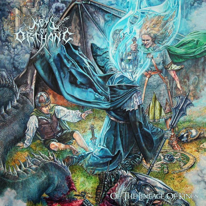
The cover painting, titled ‘Eowyn Slays The Witch-King’, is vastly layered with detail. Upon first glance, Walsh’s vibrant color palette entices viewers and encourages a deeper look. There are slayed dragons, castles in the background, a looming storm, a wary knight, and an invigorating scene that depicts Eowyn slaying the Witch-King of Angmar. The facial expression on Eowyn’s face is one of might after a hard-fought victory. Now, I’m no expert on the Lord of the Rings universe nor do I have a lot of knowledge on its lore [editor’s note: insert Eden’s tears here], but the painting here is glorious in every sense of the word. Regardless of whether you’re familiar with the shield maiden or not, the painting resembles the triumph of good over evil and is symbolic in its own right.
It’s important to note that ‘Eowyn Slays The Witch-King’ wasn’t commissioned by Keys of Orthanc, but licensed. However, it’s as if the audiovisual elements were crafted in unison, existing as one cohesive entity. Walsh’s color use adds a standout value to Of the Lineage of Kings and encourages an in-depth listen. Needless to say, this is one you’ll want to bask in physically. Lose yourself to the unbridled rage of Keys of Orthanc as you sit and wonder at Walsh’s artistic prowess.
– Luis
Cara Neir – Phase Out (Cover art by Gerardo Quiroz)
So apparently never hearing of Cara Neir is on me. Phase Out is their sixth record, the duo having formed more than a decade ago. The bandcamp tags tell you all you need to know in terms of the genre wizardry on display here: “8-bit, punk, black metal, chiptune, cybergrind, lo-fi, nintendocore, noise rock, pixelcore, post-hardcore, screamo, skramz, Dallas”. Based on that description alone, if I was given a selection of covers to choose from and I had to pick the one most likely to represent them – you’d be hard-pressed to think of a better example than what we see here. Gerardo Quiroz has done a great job of capturing their sound as we see a pixelated, old school video game design with fantastical heroes and a quest-laden landscape.
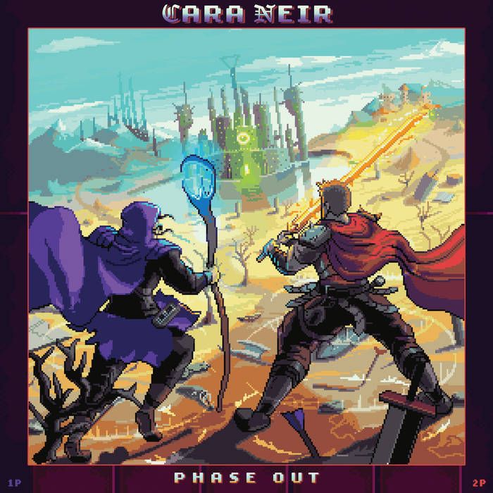
What initially jumped out at me with this cover was the wizard-like figure. The staff, deep purple robes, and hood had my mind jumping straight to Skeletor. The handful of flowing locks prying out from beneath the hood quickly put an end to my speculation, but nonetheless, my interest was piqued. We see two ‘players’, a mage/wizard in blue and warrior in red, who seem to be playing co-op. Ahead of them lies barren land with fallen weapons, shards of armour and what is almost certainly not what was intended but I can’t unsee: a half-buried fish head, jaw agape (just to the left of the mage’s staff’s base). In the distance we see an alien fortress with oddly shaped towers and a creepy central eye staring out at the players. Farther into the background, on each side, appear to be further settlements amidst mountain ranges – one thing’s for sure, our players don’t seem to have reached the last level just yet.
What I love about this piece is that it’s simply a bit of fun. The video game aesthetic brings the nostalgia, while bright and contrasting colour choices allow it to leap from the screen begging for attention. The weapons, the stances, the pixelated nature – everything just works. The fact that it ties in so neatly with the band’s adventurous sound is just the cherry on top.
– Karlo
Gonemage – Mystical Extraction (Cover art by Thespianpixels)
You might be wondering, huh, this art style looks kind of familiar. I could’ve sworn I saw something similar… earlier in this very column. Well, you’d be right! Gonemage is a side project stemming from one half of Cara Neir, with Mystical Extraction its debut release, and it’s easy to see the continuity in the cover artwork.
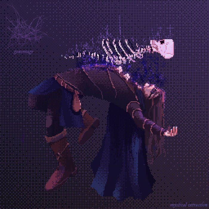
Again we have a pixelated, video-game style image. It appears as if the mage from our earlier cover is having a spell cast upon them, as their skull, vertebrae, and ribcage are being ripped out of their body. The imagery and accompanying colour palette are much darker than the Cara Neir cover, and with good reason. The adventurous, fun, and genre-hopping nature of Phase Out is replaced by the darker, largely black-metal focused Mystical Extraction and this is reflected in the cover art. Again, the cover art perfectly captures the genre: 8-bit black metal, symbolised with pixels, bones, and an unreadable logo – it couldn’t be more fitting.
– Karlo
Wax People – Wax People (Cover art by Caroline Harrison)
Next up we have the lovely work of Caroline Harrison, probably most famous for designing one of Heavy Blog’s t-shirts Pyrrhon’s album covers and many other pieces of merch and design across the metal community. This effort for Wax People’s self-titled debut is suitably strange given the clarinet-driven, math metal foursome’s sound. The piece is weird, unstructured, and crazy – just the way they would’ve wanted it. We have a person lying on their side with shrubbery or moss growing all over them. The background is awash with a beautiful patchwork of reds, oranges and blues, a concoction of colour that really leaps from the screen.
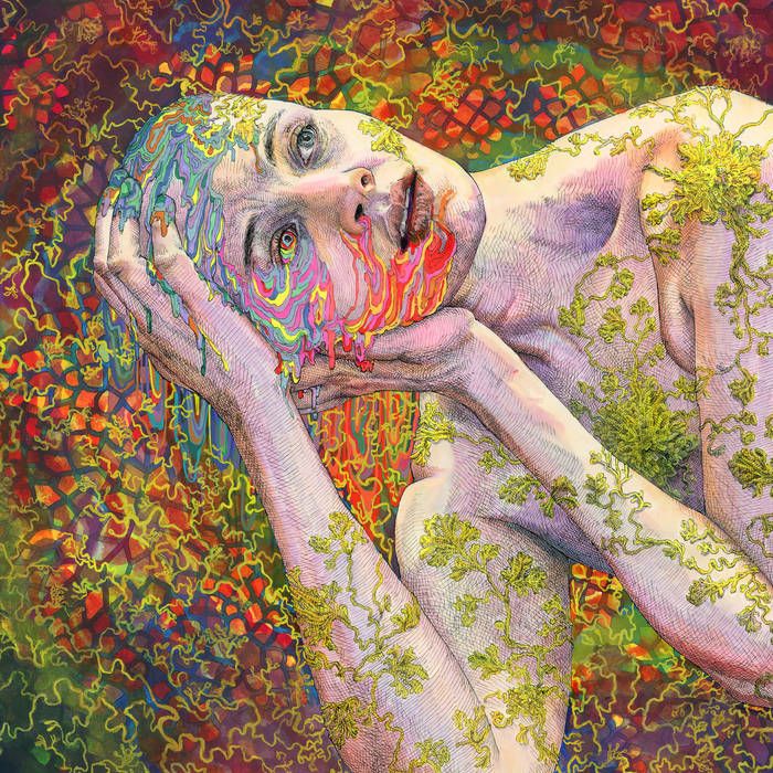
Turning our attention more closely towards the person, we find that most of their face is oozing with bright, fluro liquids. Quite literally, we seem to have a wax person melting away in a delectable stream of raging reds, pretty pinks, tantalising turquoise, and yummy YOLO sharp yellows. The person’s expression is stunningly real, their gaze resolute, yet hopeless, wondering what their life has come to. They seem resigned to melting away, despite their best efforts at keeping themselves together in the face of adversity.
It’s always nice to see friends of the blog doing great things, and Caroline has done a fantastic job here. The piece is vibrant and eye-catching. It’s chaotic and at first glance makes absolutely no sense, yet on closer inspection it is a perfect fit for Wax People. It shouldn’t make sense, but it does, and it looks awesome whilst doing so.
– Karlo
Atvm – Famine, Putrid and Fucking Endless (Cover art by Harry Jenkins (IneptAliens))
Speaking of artwork that doesn’t make any sense, check out this bonkers piece from Harry Jenkins. This surrealist cover to the bizarrely named Famine, Putrid and Fucking Endless depicts several totemic, monstrous figures with wonderful shades of pink, red, green and blue. The colours fit incredibly well with the comic book aesthetic, with the mustard smoke a particularly nice touch.
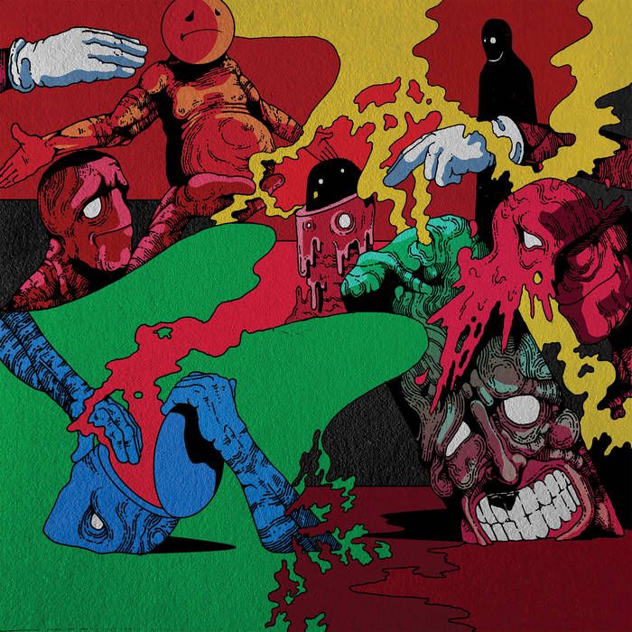
While the colours catch your attention, it’s the surreal nature of the artwork that holds it. In the bottom left we have the blue figure opening up his own head, as a maroon-pink fog seeps out, only to blend in and become one with the background. Above him we see a sad-faced emoji with a beer belly that puts most dad bods to shame, the legless creature being held up by a pupil-less figure reminiscent of a docile Red Skull. On the opposite side we have a creepy, shadowy figure lurking in the background, the oddly shaped eyes lending it an evil demeanour. And of course, one can’t look past the two figures in the foreground, a pink creature’s head seemingly being sliced open and spilling over onto the grimacing, animate Moai look-alike.
This cover gives Cara Neir a run for its money in the fun department, and probably just shades them too. A great piece from Harry Jenkins, one as remarkable for its ability to hold your attention as it is for grabbing it.
– Karlo
delving – Hirschbrunnen (Cover art by Artourette)
Another album born out of lockdown, here we have a side project from Nick DiSalvo of Elder, with a debut record titled Hirschbrunnen. The name is based on a stag fountain near DiSalvo’s home, and that is precisely what we have beautifully illustrated on the cover. This lovely piece by Artourette is really quirky, and quite possibly my favourite of the bunch we’ve covered today.
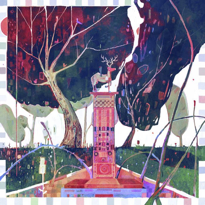
The stag statue takes centre stage, standing regally atop a colourful pillar adorned with shifting shapes and swirling patterns. Branches and little jets of water abound left and right while bending, curving trees occupy the background. Flowers spring from the grass and parkland in between as birds stand perched atop branches and even the stag himself. The watercolour nature is striking, the hues of purple, pink, and green giving the piece great warmth. That such warmth and quirkiness is represented in the music too will come as no surprise, with delving’s floating melodies and doses of psychedelia a perfect accompaniment to this lovely cover. A great way to cap off today’s column and we look forward to coming back in a couple months’ time with another batch of great artwork.
– Karlo