A Gift to Artwork, taken from the Caligula’s Horse song “A Gift to Afterthought”, breaks down and analyses your favourite album artwork. The first time an album’s name appears, it will link to a large and (where possible) high-resolution image of the cover so that you can take a closer look. Read other entries in this series here.
Editor’s Note: A Gift to Artwork features a regular guest contribution from Luis Flores, who runs and regularly writes for the excellent Heaviest of Art. If you’re looking for more analysis and discussion of album artwork Luis’ Behind The Cover column is a must-read.
Apologies for the delay in bringing this column to you in 2021, but rest assured the time has not gone to waste. For today marks a special day for A Gift to Artwork as we welcome, for the first time, a guest contribution from Luis Flores, founder of the excellent blog Heaviest of Art. Luis shares our passion for heavy music, beautiful artwork and thoughtful analysis – so much so that he has agreed to sign on as a regular contributor to this column moving forward. Please make him feel welcome. If you’d like to see more of his great work, do check out his Behind the Cover column, where he interviews band members and cover artists alike to dive deeply into the concept and creation of the artwork we love.
Today, we’ll be covering the new record from hardcore band God’s Hate and Radiohead’s 2016 release A Moon Shaped Pool. Without further ado, let’s let Luis take it from here – welcome aboard.
Radiohead – A Moon Shaped Pool (Cover art by Stanley Donwood)
Before we get into it, I’d like to thank Karlo, Eden, and the team at Heavy Blog for having me on A Gift To Artwork, a great feature that highlights the genuine connections that stem from great album covers. We all have those covers that immediately speak to us, so it’s always great to put a pen to those reactions.
For my selection, I went with Radiohead’s A Moon Shaped Pool, which is somewhat of an unorthodox choice given the genres we cover at Heaviest of Art. Stanley Donwood, who alongside Thom Yorke has illustrated all of Radiohead’s album and single artwork since 1994, was responsible for this one and yet again he captures the soothing nature of the hymns embodied within. It’s quite simple, even by Radiohead discography standards, until you look into it a bit further. Upon first glance, I saw it as just a mere black and white image of crashing waves. The moon obviously controls the tides and the album title coincided, so it made sense at first, until I received my vinyl copy.

These aren’t actual beach waves, but pond waves created using art in artificial ponds while listening to the album’s recording sessions. The wind and rain shifted Donwood’s enamel paint throughout the pond, creating this wave-like effect that was later captured on canvas. Now, there’s no way in hell you’d be able to tell unless you had some part in seeing it come together, which the band and the artist graciously shared in the leadup to the release. They resemble waves, as intended, but the way in which they were created represents the conditions that made it so and the vibrations that ran through Donwood’s mind as he crafted it.
As unique as the creation for it was, the cover for A Moon Shaped Pool stands for so much more. It’s truly an extension of the melancholy engrained. The texture, the calm black and white, the detail, and really the depth hiding among the simplicity of it all is truly where I found myself intrigued after getting past the first glance. Once the needle hits that crisp white vinyl record, the journey begins and you can’t help but animate the cover in your head, imagining the paint moving alongside the elegance of Yorke’s piano. Could the empty white center represent the moon itself, while the conditions that made the paint waves surrounding it represent the cycle of life itself? Who knows, but a viewer’s interpretation is what makes artwork so powerful. To some, it may just be distorted paint in a pond, but to others, myself included, it’s a canvas that begs for immersion. It’s been five years since this release, and listening to ‘Daydreaming’ or ‘Glass Eyes’ while gazing at this Donwood wonder remains a spiritual experience.
– Luis
God’s Hate – S/T (Cover art by Marc Nava)
Metallic hardcore act God’s Hate has come out swinging with their sophomore self-titled LP, both musically and visually. Californian artist Marc Nava, best known for his tattoo artistry, has really worked up a treat with this cover. The visual accompaniment to God’s Hate’s sonic punch to the face, the cover depicts a terminator-like samurai ripping out two uzi submachine guns and blasting away into a horde of onrushing demons and monsters. If that ain’t badass I don’t know what is, so let’s dive in!
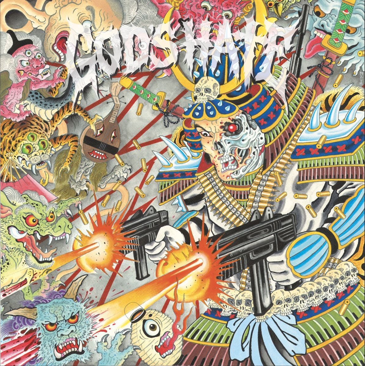
First off, our samurai terminator (let’s call him mad dog) looks angrier than a kvlt black metal elitist being told Lil Nas X is the future of satanism. Mad dog seems really worked up about the throng of demons charging towards him, and when you throw in the fact Ramsay Bolton would be proud of the way half of his face has been ripped off you can see why he may not be having a great day. It’s definitely a hard situation to find yourself in, but as the record says – when life is hard, be harder. In keeping with this sentiment, mad dog looks more intimidating than the prospect of a family holiday with the in-laws. Two katanas are strapped to his back, bullet belts adorn his torso, spikes protrude from his helmet and shoulders while he’s also wearing a belt of skulls around his waist. Charming stuff, not to mention the automatic weapons, samurai armour and the fact his two-faced head is a mixture between blood-spattered human skin and red-eyed cyborg. Speaking of which, I wonder who would’ve had the bigger shock – mad dog at having half of his face ripped off or the assailant realising they were dealing with a terminator-esque cyborg as their insides were peppered with bullets?
Turning to the demons, in the bottom left we have a fire breathing cycloptic egg (a true Heavy Blog icon) dodging mad dog’s attack as a horned feline has its mind blown into more pieces than that of a working-to-middle-class conservative realising trickle-down economics is a lie. Scanning up we see a green dragon with the crazed eyes of someone who has just missed the Mcdonalds breakfast cut-off, a creepy (crawly) tiger-spider hybrid and a super sad folk guitar (possibly a Japanese biwa) with a bird of prey’s lower half. Seriously though, that biwa looks like my partner whenever she’s forced into listening to extreme metal – it wants nothing more than to be put out of its misery. Other notable creatures include King Parrot’s vocalist Youngy looking typically shit on the liver in the top-left, understandable as his body seems to have been replaced by an umbilical cord, as well as a more typical blue Japanese oni in the top-right.
All-in-all, the cover is fantastic. Its aggression and themes are a fitting accompaniment to the record’s beatdowns and rallying cries. The moment you see the cover you know what you’re going to get – heavy fucking music. The clean and chromatic depiction of mad dog brings the iconic artwork of Judas Priest to mind, yet the chaos and horror that accompanies it allows it to stand out in its own right. Beyond the nature of the creatures adorning this cover, the Japanese influence extends into the style of the artwork as well, through the flowing, curved lines, the pastel colour choices, and the dimensionality of each character. The influence of tattoo art is also evident, as Nava applies his well-honed skills to a different medium with fantastic effect. A fun and entertaining piece of art, and we can’t wait to cover a fresh batch of killer covers for you next time!
– Karlo