A Gift to Artwork, taken from the Caligula’s Horse song “A Gift to Afterthought”, breaks down and analyses your favourite album artwork. The first time an album’s name appears, it will link to a large and (where possible) high-resolution image of the cover so that you can take a closer look. Read other entries in this series here.
2019 saw A Gift To Artwork evolve into a regular bi-monthly column, with a couple bonuses along the way, and it’s only fitting that we end the year by looking back at some of our favourite pieces of 2019. We won’t be covering any of the art we’ve already brought to you from 2019 (which you can find here and here if you’re interested), instead focusing on new content for you to enjoy as we enter the holiday period. We present the below unranked and in no particular order, and hope you’ll enjoy these beautiful pieces of art as much as we have.
Dreadnought – Emergence
We’re kicking it off with straight fire here as Dreadnought continued to bring some of the best damn artwork to the table in 2019, courtesy of Mark Facey. Their previous covers have all been fantastic, to the point that we should really have written about them already, and Emergence sees them take those aesthetics to another level. The elemental concept suite continues as the band brings fire to life, but as Eden pointed out in his review, it is a fire contained rather than a blazing fury. Instead of its licks dancing in the night’s sky, clambering atop one another in their skywards reach, we see these flames circling in unto themselves. The flames depicted move inwards, a mini-maelstrom of self-contained heat enveloping the central figures. Like the music itself, the artwork depicts us turning inwards towards the nameless and the faceless. Towards the self. That ever-shifting sense of identity as elusive as it is alluring, composite in nature and so difficult to pin down. It flickers and it adapts, but ultimately it is still definable… still fire.
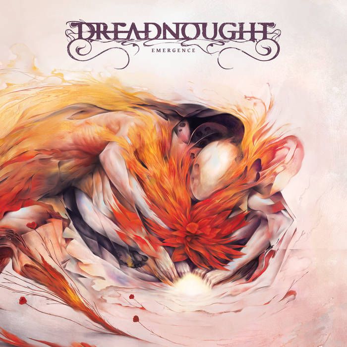
As we shift our lens from the conceptual to the aesthetic we can take in the stunning colour palette, an eye-catching display that lends itself well both to instant gratification and careful consideration. The array of red and orange hues stand so vividly against the pale background and the charcoal darkness that serves as a cloak for the central figures. That darkness is itself paradoxical, for rather than obscuring it reveals another figure within. All hands lie together in the centre, keeping the embers stoked as what appears to be a stunning flower blossoms within them, a handful of offshoots visible in the lower left-hand side of the piece. And so we come full-circle, back to the conceptual side. Fire, life, introspection and emotion. Dreadnought has, once again, delivered in spades creatively, musically, and visually; emerging triumphant with one of the best records of 2019.
Wilderun – Veil of Imagination
From one cover with flowers to another, this effort from Adrian Cox is certainly conspicuous. At first glance it appears to be a melting skull blooming from its cap, a beautiful juxtaposition of life and death evoked in a, dare I say it, Salvador Dali-esque fashion. Metaphors liberally spill from the cover: death breeds life, there are two sides to every coin, beauty can be found in everything, I could go on. But these are just a veil through which to interpret the artwork, what really stands out is the sense of imagination it conjures in the listener. The skull could be interpreted as melting wax, perhaps a vase in which to hold a world in bloom. Looking beyond the foreground we see exactly that, flowering fields stretching beyond as far as the eye can see amid tranquil blue skies.
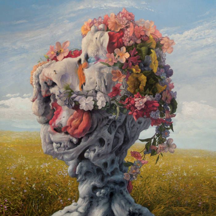
Like the music itself, Veil of Imagination’s cover art presents an interesting combination of ideas in a package that takes some acclimatising to. But if you invest enough time into it there is a beautiful bounty to be enjoyed, and enjoy it we shall.
Druids – Monument
Another great record and another great cover by Mark Facey, the same artist that crafted the cover for Dreadnought’s Emergence. It’s not really stoner, let alone progressive stoner, without some weird as fuck cover art now is it? Well, Druids, Facey & co. have delivered on all fronts with Monument and it really is a sight to behold. The colours are vibrant and distinct, as we have a gorgeous blue to go alongside the palette of reds, oranges and charcoals that we’ve seen before. We have an ethereal hooded figure centre-left, enclosed within an unsettling, somewhat claustrophobic red room. The room has an odd geometry and texture to it as is (prog much?), and the disconcerting atmosphere is only embellished by the wide, staring eyes that dot its expanses. Our central figure is forever watched, not a single movement missed in this Orwellien dwelling.
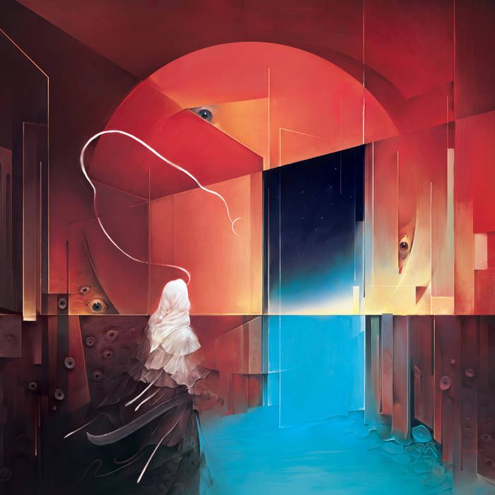
Just before them lies a portal to the outside, the bright blue haze seeping into the room as the figure drifts effortlessly towards the outside world. Particularly striking is the way the whites of the figure’s top-half segues into charcoal and then into pitch black as you move down their body, the transition seamless. Visually appealing and symbolically powerful, it is but a snapshot of the wonder on display. Yet another example of a great cover backing up fantastic music (it really isn’t a coincidence that all of the albums featured today are musically incredible too) and at this rate I don’t think Mr. Facey will have much difficulty finding new clients.
Baroness – Gold & Grey
The production on Baroness’ Gold & Grey has certainly caused controversy, many deeming it unlistenable while others think it fantastic in spite of its sound (we loved it enough for it to land a spot in our Top 25), but the same certainly cannot be said of its artwork. Wow. Band leader John Baizley has forged a formidable reputation as one of the most distinctive artists in the heavy music scene, his inimitable artistic style as much a trademark of the band as their music. And when you look at the breathtaking cover of Gold & Grey it’s easy to see why and, as we did with Dreadnought, we can only kick ourselves for not having really dived into Baroness’ cover art before.

In a fascinating interview with Revolver, Baizley details how their fifth record marks the end of an era, the last of their chromatically-themed albums. Further, he reveals that Gold & Grey alludes to each of their previous covers and that each cover can be broadly decomposed into the the earthly, physical bottom half and the more ethereal and conceptual top half. I’ll leave it to you (or perhaps to a future A Gift To Artwork post ;) ) to really dig into the treasure trove of symbolism we have on display here, but there is one thing I can’t help but dig into (see what I did there?) immediately.
In the bottom-left and centre of the piece we can see a handful of flower petals or little bulbs, just above the birds along the bottom, and in the hand of the left-most female. Upon closer inspection we see they’re actually teeth! It seems an odd inclusion, but it’s not the first time we’ve seen teeth adorn their artwork and it’s never been more fitting. Teeth are a huge symbol of personal identity. They’re as unique as your fingerprints and their location in the body, internal and yet often on display or requiring to interact with (external) stimuli, makes them a brilliant metaphor for the duality of self. The tension between who we are and who we show. The contrast of gold and grey. Further, scientists can examine teeth that are hundreds or even thousands of years old and estimate, with eerie accuracy, the diet, location and living conditions of the teeth’s owner. They identify not only the self, but one’s history too. Finally, teeth represent periods of transition. From growing our first teeth, to losing them and growing our adult teeth, to losing those too – they symbolise periods of transition and rites of passage. Like the one Baroness are about to embark upon; out with the colours and in with the new. Let’s hope the artwork (and music) is just as good.
Illyria – The Carpathian Summit
While there are some incredible pieces of art we’ve seen throughout 2019, this one just might be my favourite. The cover is taken from “Morning In A Pine Forest”, an absolutely stunning piece by Ivan Shishkin, a renowned 19th Century Russian landscape painter, while the bears were added by his contemporary Konstantin Savitsky.
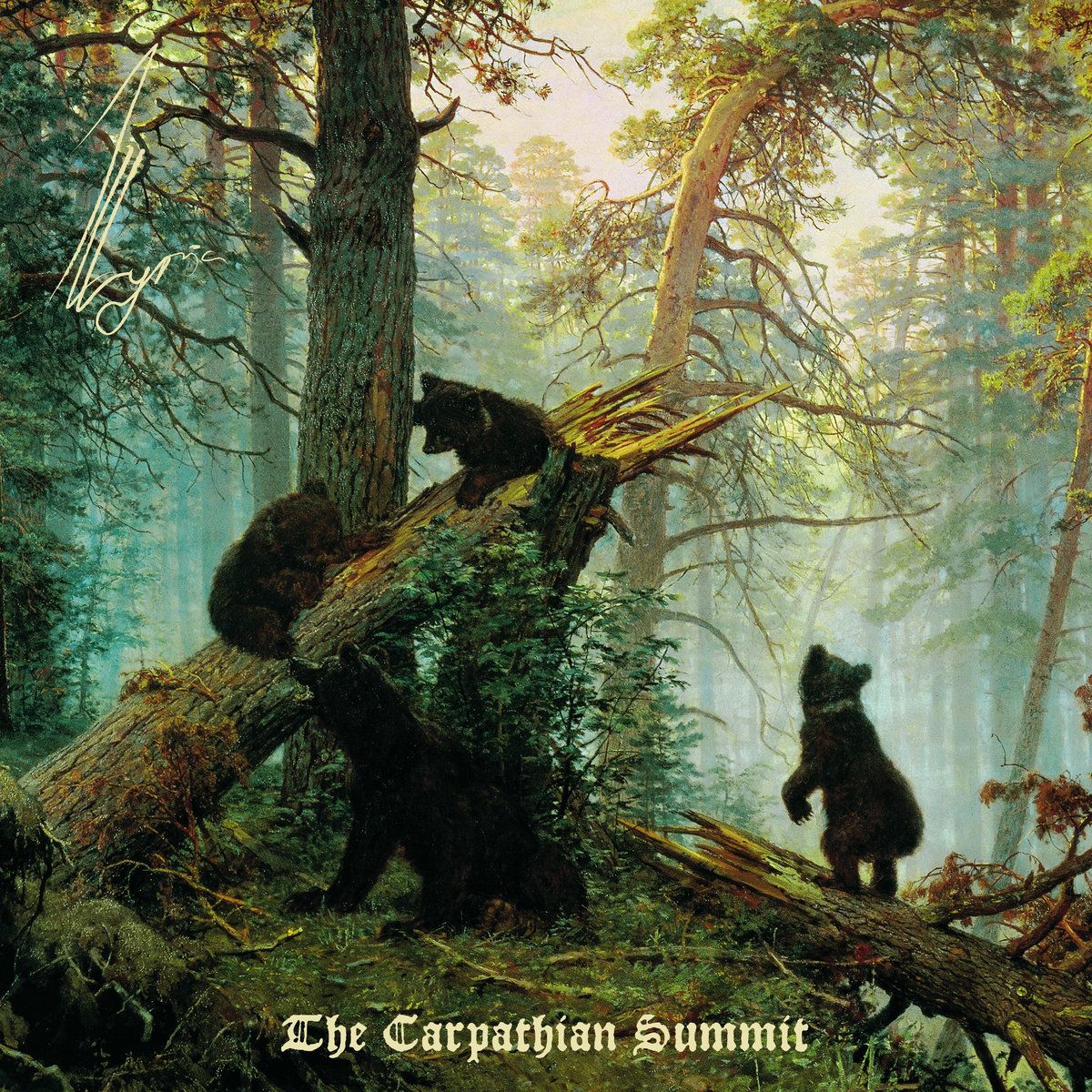
It’s truly a breathtaking sight as morning mists begin to clear and the sun’s rays break through the clouds and foliage to wrap the scene in its warm afterglow. A pair of bear cubs play on a broken trunk, their sibling standing up straight on his legs and staring wistfully into the heart of the forest. While the cubs play without a care in the world mother bear lounges peacefully in front of them, relaxed as she keeps a watchful eye over her beloved cubs. It truly is a magical piece of art that catches your attention – and even if Illyria’s music wasn’t great (which it is!) their name would stick in my memory after seeing such a beautiful work of art. It’s not often a band chooses from artwork in the public domain to adorn their next cover, but you can see why Illyria have gone down that route with a stunning piece that both stands on its own feet, fits in with their sound and embellishes the creativity they’re bringing to the blackgaze scene.
Elder – The Gold & Silver Sessions
Here at Heavy Blog we’re big fans of Elder’s artwork and have written about their beautiful LP covers in the past. With their mid-year EP, The Gold & Silver Sessions, the band looked to change things up musically and artistically. The record was released as part of Blues Funeral Recording’s PostWax project, which encourages participating artists to try things outside of their usual wheelhouse. As such the band deviated from longtime cover artist Adrien Dexter in favour of Max Löffer and recorded a jam session independent of the pressures associated with following up their acclaimed LPs.
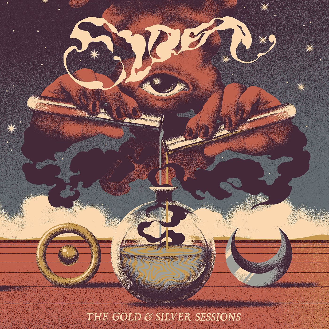
The context behind this record is borne out within the artwork itself. Gold and silver have often been associated with the sun and moon, respectively, and we can see those symbols either side of the glass ball. The bottom half of the image shows red plains and bright white clouds, as if it’s a sunny day, only for the top half to reveal the night sky. And so it is with this release. It’s the moon to their full-length sun, a different side to their sound but nevertheless them. The pouring of gold and silver from vials conjures images of alchemy and the mixing of metals. Gold is famous for being incorruptible while silver is symbolic of purity as Elder proudly announce that this is who they are. It’s a wonderful piece of art and it’s capped off by the ethereal red and black shroud. Is it a product of this alchemy, given it appears to be emerging from the glass? Or is it the creator of it, for it is the shroud’s hands that are pouring in the gold and silver? Whatever the answer is, we can’t wait to see (and hear) what they do next.
Fit For An Autopsy – The Sea of Tragic Beasts
The Sea of Tragic Beasts was very nearly my personal album of the year as Fit For An Autopsy pushed the envelope musically, lyrically and creatively. The cover artwork is no exception as we see a suitably misanthropic and haunting scene before us, a disfigured skull bleeding into a forbidding landscape. The colours are almost exclusively dark pastels, lending a sullen gloom to the piece in each domain. Whether it be land, sky or sea, each threat of light or vibrancy is immediately dampened by blacks, greys and browns. Blues, reds and greens are forced into a dull submission, keeping the image suitably dark. The one exception is the bloody stream of tears stretching from the hollowed eyes of the skull and into the body of water below, its bright crimson offering a stark reminder as to the subject matter at hand: this is a record of pain, death and injustice.
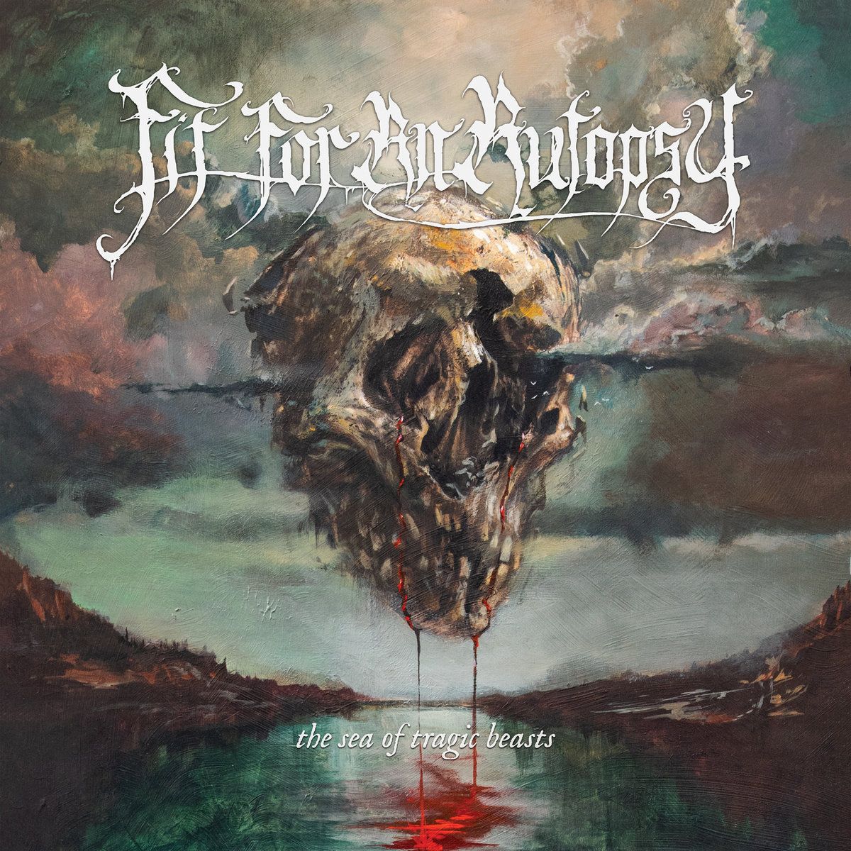
At various times the record touches on the dire consequences of climate change, warfare, rising inequality and sinister politicians. The first two are clearly borne out in the cover as well, with the floating pool of blood eerily reminiscent of the Gulf of Mexico oil spill (FUCK BP FOREVER) and the lifeless landscape a symbol that’s impossible to ignore. Looking closer at the skull we can see there appears to be a jet stream of clouds, akin to an arrow or a bullet, piercing through the (from our perspective) right eye socket and through to the other side. Warfare, whether it’s being waged upon the environment or upon ourselves (that distinction is becoming increasingly moot) is killing us. Thus, The Sea of Tragic Beasts perfectly encapsulates its thundering sounds and grim themes with Adam Burke’s beautiful cover, one the best of its ilk that we’ve seen this year.
We Lost The Sea – Triumph & Disaster
“Triumph & Disaster is a post-apocalyptic view on the collapse of the world told like a children’s story and illustrated through the eyes of a mother and her son as they spend one last day on Earth.” So say We Lost the Sea, creators of one of the best albums of 2019. I fell in love with this artwork the moment it was revealed, it’s so different from much of what we typically see. Designed by their guitarist Matt Harvey, the cover is just one aspect of the artwork for the record. Accompanying the music was an illustrated children’s story, more details of which you can find here, and it’s definitely something we’ll be covering in more detail next year. For now we’ll be focusing on the cover art in isolation, and what a poignant scene it paints.
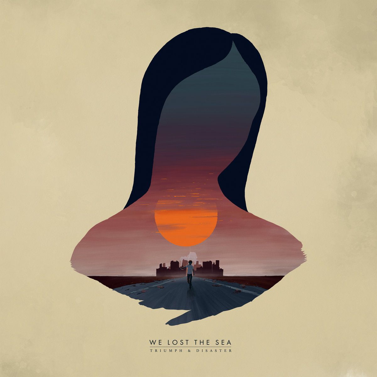
Within the silhouette of our loving mother we see a setting sun, the visual symbol of the apocalyptic aural world they’ve depicted. Night is falling, dark shades of blue descending upon a world that will see no further light. The sun is an orange eerily similar to what hovers over their native Australian state of New South Wales, burning in an inferno of bushfires consuming an area the equivalent of Maryland (yes, the entire state) or Belgium (yes, the entire country). The haze that constricts the sun serves as the smokescreen, while the beginnings of a mushroom cloud are visible just below the sun and behind the shadowed city. Stretching into the foreground lies a lonely road, the mother’s son its only inhabitant as he walks by rotting animals and litter surrounded by a barren landscape. He is only a child, his innocence encapsulated by the piece of string that he’s holding, as he walks home with his balloon (the sun) in tow. He is undeserving of the world he has inherited. The world that will kill him. It’s a story of love and loss. Of beauty and despair. Of triumph and disaster, and it’s told as wonderfully through its cover as it is through its incredible music.
Cattle Decapitation – Death Atlas
What is it with climate change themed records and incredible cover art? Longtime Cattle Decapitation cover artist Wes Benscoter brings us their best collaboration to date as a skeletal Grim Reaper holds an infernal earth atop his shoulders. It’s all in the name, Death Atlas, referencing the Ancient Greek Titan Atlas (incidentally the son of the Titan Iapetus, so go listen to them) who, as punishment for waging war against the Olympian Gods, was sentenced to carrying the sky and heavens on his shoulders. The ancients represented this with the celestial sphere, so it’s actually a misconception that he held the terrestrial Earth on his shoulders, but I digress. With track names such as “the Genocide”, “The Great Dying”, “One Day Closer to the End of the World” and the title track, it’s quite clear what Cattle Decapitation’s message is on this record and Wes bore it out expertly on the cover.
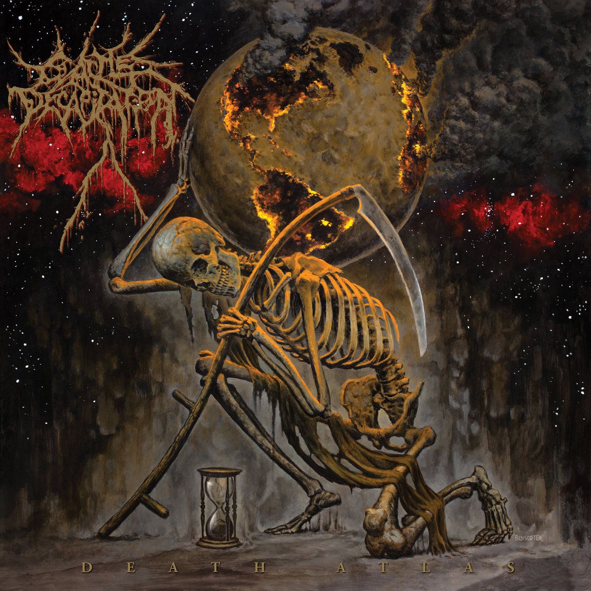
My favourite part about this cover is the simplicity of symbolism. While dense layering and hidden messages (Baroness being a prime example) are incredible and can provoke hours of thought, there is something to be said about a picture that drives home a message with ruthless efficiency. This cannot be misconstrued. The message is clear, it is easy to understand, it is deafeningly loud and it cannot be ignored. The Grim Reaper, the personification of Death (Atlas), is unmistakable with his infamous scythe as he holds a dying planet onto his shoulders. The oceans are barren, the continents ablaze as choking smoke billows into the dark, cold recesses of space. The final grains of sand trickle down the hourglass to their resting place as we ask that one burning question: are we already too late?
Contrarian – Their Worm Never Dies
The artwork to Contrarian’s Their Worm Never Dies is downright badass. Their previous record had similarly stunning cover art (yet another band we should’ve already covered in this column), and we see the same hooded figure recurring here as he stands vigilantly alongside a gorgeous, gargantuan worm. On bandcamp the band state “A concept album. A fantasy based upon a man and his curse from the Evil Eye. Alongside the legendary dragon Whiteworm as his savior or his tormentor? That is for you to decide.” Well, the three central characters are on full display as we see the Sauron-like evil eye staring at the aforementioned protagonists from space. Whilst completely different in design, the writhing worm immediately calls to mind the great Shai-Hulud of Dune in a cover that truly is a nerd’s paradise.
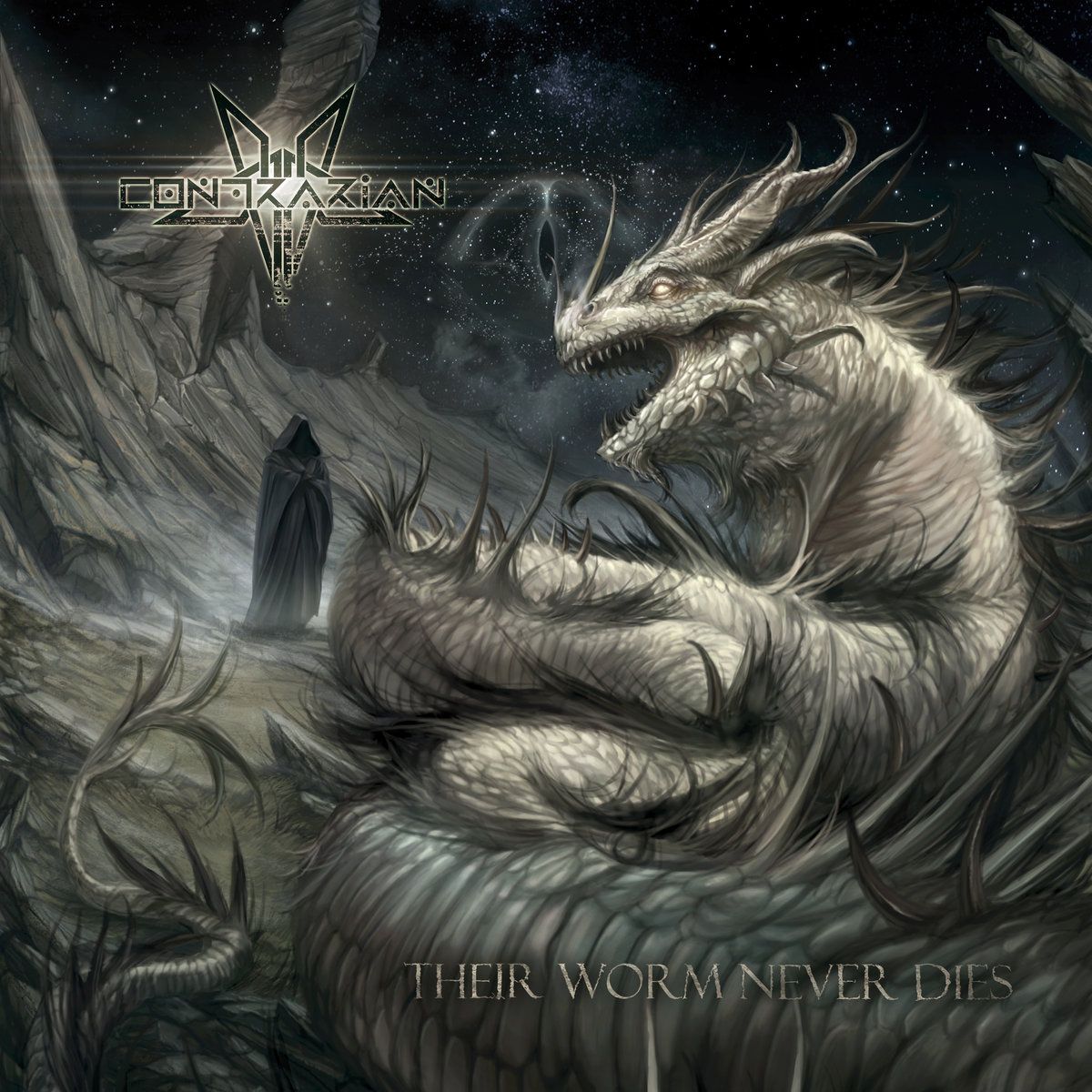
The tension between man and worm referenced in the band’s intro is well captured by the incredible work of Marco Hasmann. The worm is savage in appearance, its teeth bared and nostrils flaring as its burning yellow eyes stare down at the man. And yet, the man stands calmly alongside it, as if unmoved by its presence. Further, the worm could easily have enveloped the man with its snaking mass and yet it chose to merely lie alongside him. Thus, as a good cover should, the artwork has my interest piqued as to what is happening and how the story plays out – so get listening and start combing those lyrics to see how this epic tale ends.
Warforged – I: Voice
Warforged have really managed to pull a rabbit out of a hat with I: Voice, a sprawling endeavour of monolithic proportions whose core concept revolves around dreams, memory and, of course, nightmares. This concept flows through the music, the lyrics and the artwork as well, this time courtesy of Stigma. Shrouded in the same darkness that touches the music, the cover’s colours (or lack thereof) obscure the rich details to be found. Commencing from the bottom-left of the piece we see a small rowboat float in in a stream. While Chiron is nowhere to be found, the grim setting does little to dispel images of the underworld as the small boat, complete with a small lantern and fluttering moths, can be seen as a symbol of the journey we’re about to undertake. From there a series of moss or perhaps spiderweb covered steps lead into the mouth of a dwelling, an ent-like tree, or perhaps both: this is a nightmare after all.
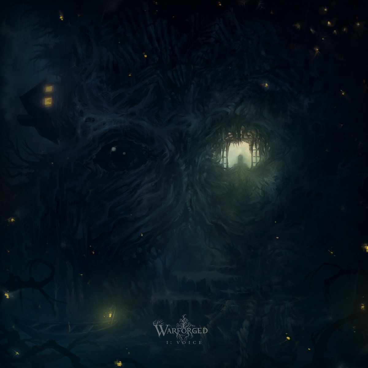
As our attention turns to the bigger picture this monstrosity of art begins to truly take shape before us. A figure looks out from an eye/window, the image’s main source of light and yet no source of comfort. It is eerie, spectral and mysterious. The symmetric ‘window’ is closed and unlit, the outline of an eye visibly staring at the reader, its gaze cutting through the gloom with a laser-like focus. A pile of inter-crossing branches, not dissimilar to the Iron Throne, comprises the creature/home’s forehead while a house juts out at right-angles in this nightmarish landscape demanding of our attention. It’s spectacular work, one entirely befitting this towering effort of a record, and there is doubtless much more to explore here for those invested in the concept.
And there you have it, a wrap of some of our favourite album artwork from 2019. Honourable mentions go to We Are Impala, The Devil Wears Prada and Abigail Williams (we’re saving that one for a Mariusz Lewandowski deep dive next year!) among others, for there was truly a huge volume of great art released this year. That being said, we’d love to get your thoughts too so please sound off your favourite album covers from 2019 and enjoy the rest of the year – we’ll be back with more killer art in 2020!