Welcome to A Gift To Artwork, where we at Heavy Blog analyze some of the most iconic metal album covers ever. To see previous installments, please click here.
Jacob Bannon is a name that is synonymous with hardcore music. Whether it’s because of his main occupation as the singer of the legendary Converge (and ambient side project Supermachiner) his founding of the Deathwish, Inc. label with Tre McCarthy, or his artwork, Bannon has had a profound and indelible influence on the metal genre.
In this case, we are going to focus on the latter of his accomplishments: his artwork. Anyone who’s owned a Converge album—or almost any Deathwish release—has beheld the paint-splattered chaos that is a Jacob Bannon album cover. His distinct style of illustration is known for its use of color, strangely romantic (though mostly abstract) imagery, and use of texture that altogether gives his work a raw, emotional feeling, no matter the medium he uses (which is usually a combination of spray-paint and screen printing). Bands from legends such as Sepultura to even metalcore groups like As I Lay Dying and Modern Life Is War have used Bannon’s work in the past, and the man seems to have no sign of slowing down.
Although it’s tempting to have an entire feature dedicated to Converge’s artwork, I am going to highlight some more obscure work that Bannon has done throughout his career. Let’s get to it!
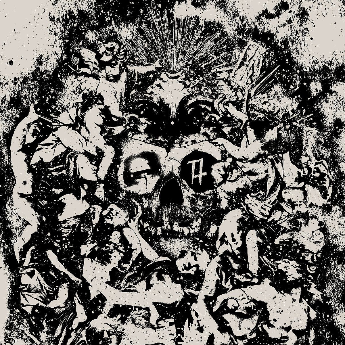
Trap Them — Seizures in Barren Praise (Deathwish, 2008)
This is an album that is just filled to the brim with detail, both musically and visually. Bannon’s monochrome approach makes the images vividly magnetic, yet makes the exact details tough to see at first. Probably most notable is the skull in the middle, which seems to be (if I’m not mistaken) the same skull from the band’s Deathwish debut EP Seance Prime, except with the addition of an eye and the Trap Them logo. If you look closely, there seems to be a volcano erupting above the skull, along with a barely-visible hourglass. Surrounding these main features are bodies or statues, with the most visible being an awake (if it is indeed a body) cupid-like figure pointing.

Now, good luck rendering all of this into a distinct meaning on first glance. In fact, this is an album that lyrically deserves its own Prognote, as each track is supposed to be a different day in a world known as Barren Praise. It is uncertain whether the artwork Bannon created is connected with the Barren Praise concept or not, but the cover nonetheless represents the music that the album provides quite succinctly. Seizures is full of chaotic riffs that walk the line between crust punk and grindcore, and Kurt Ballou’s production giving the guitars a nice crispy sound, complimenting Ryan McKenney’s gruff screams and yells. It’s an album that both optically and audibly has the capacity to grow, depending on how much time you wish to put into analyzing it.
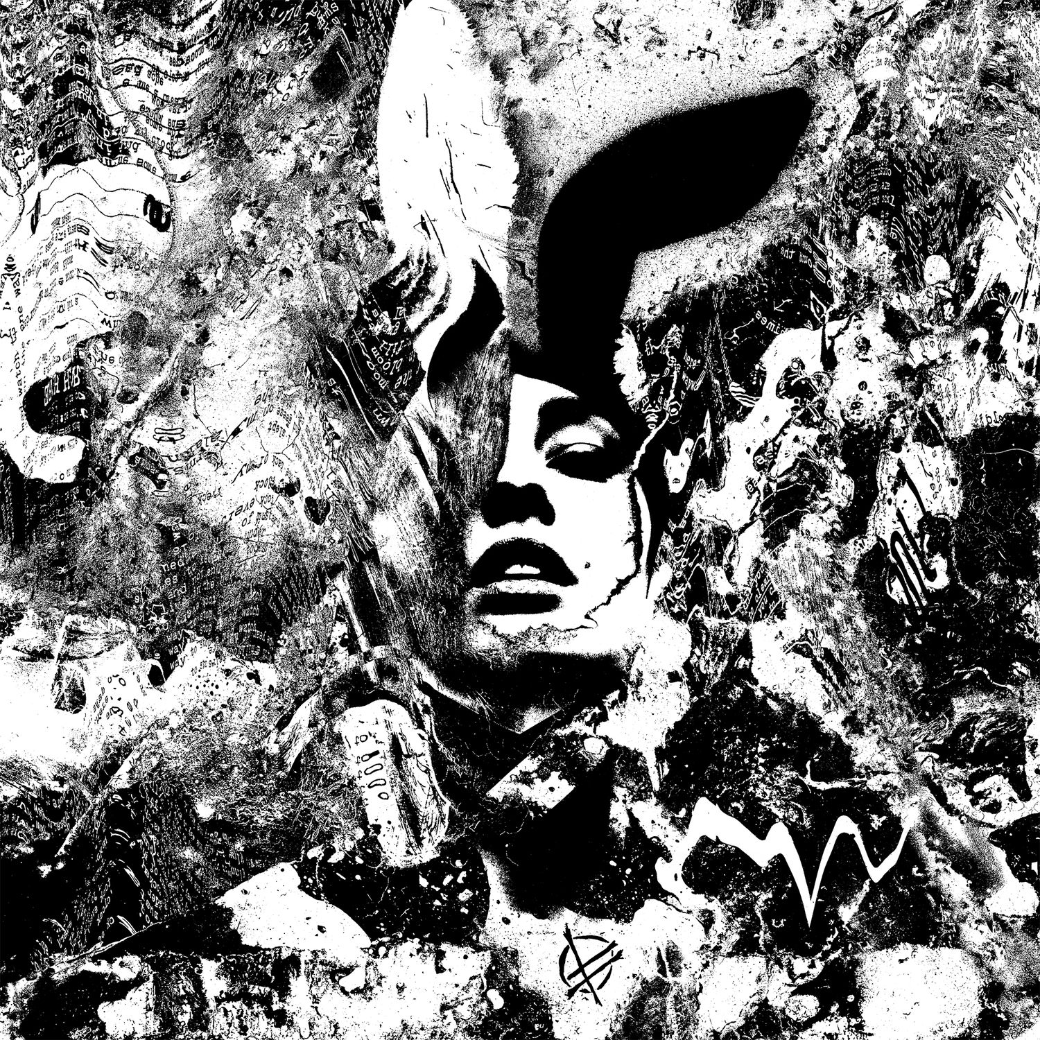
Fucked Up — Year of the Hare (Single; Deathwish, 2015)
What I consistently find so amazing about Bannon is how he manages to get to the heart of the music with his visuals. While there is almost always a lot happening within his artwork, he still manages to pluck out the beating heart of the music and present it to the audience in a optical format. With Fucked Up’s latest single in their Zodiac concept, Year of the Hare, he manages this feat again, but perhaps in a more literal way than usual. Here the chaos and messiness of the elements he puts on the page add to a more distinct meaning; that is, the idea of information and meaning being hidden and distorted.

Year of the Hare is, considering Fucked Up’s normal releases, pretty experimental. The single itself is about twenty minutes long, and utilizes some experiments in noise by the band. It’s also rabbit-themed, obviously, but not only lyrically but compositionally as well, according to an interview with the members of Fucked Up. (I’m not quite sure how a song can be compositionally like a rabbit, though.)
Both of these elements—the experimentation and the rabbit influences—show up on the artwork, however. The noise that the band uses can arguably be represented by the background, where one can see some a few pages of text being distorted and rendered illegible. And, of course, one can’t not mention the rabbit-eared woman in the center of the piece, who is symbolic of the project as a whole—while Year of the Hare’s length and light experimentation can be alienating to some, there’s still a source of beauty and thought in the entire single as a whole.
Although I’ve only picked two instances of Jacob Bannon’s work to analyze, I think that they both show a theme that resonates in really all of his art. As I’ve said before, Bannon has a way of showcasing the true spirit of his client’s music and themes through his use of space and texture. Like a most of Converge’s music, there’s a great deal of emotion put into his work that sometimes gets lost underneath boisterousness and pandemonium, which seems to be Bannon’s overarching goal.
If you’re interested in checking out more of Jacob Bannon’s work, visit his website.
-JM