Welcome to A Gift To Artwork, where we at Heavy Blog inspect the various art that has defined the heavy metal aesthetic through an in-depth introspection. For previous installments, please click here.
Mostly, the Gift to Artwork segments focus on one album cover, or, sometimes, a few by a single band, but today we’re going to do something different, and instead take a look at an array of work by the artists behind the design of album covers and see how and why these covers are meaningful.
Travis Smith might not be a name you’re incredibly familiar with, but his work has spanned the gamut of metal, from more traditional heavy metal to death metal, but is probably most renowned for his work with progressive rock and metal acts. Smith has worked with some of the biggest names in the metal genre, including Devin Townsend, Iced Earth, Katatonia and Overkill, among many, many, others. His signature style—if he even has one—incorporates interesting (and not always “metal”) imagery with textures that often add an other-worldly dimension to his pieces.
I can’t say I’ve listened to every album that Mr. Smith has made an album cover for, so I’m going to stick to what I do know, and try to explain how each cover not only represents its album perfectly, but also contributes to the overall aesthetic the bands are trying to create with each release.
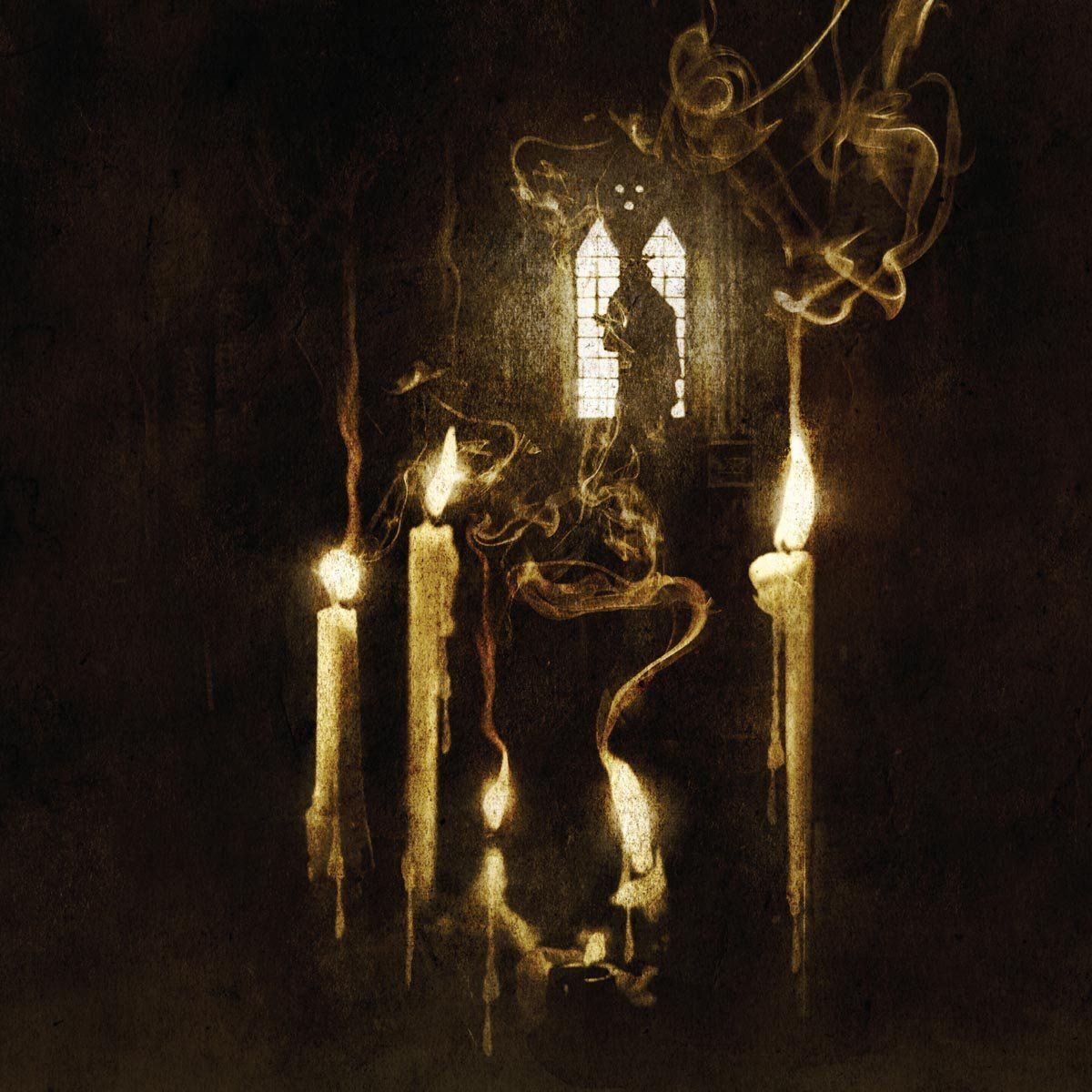
Opeth — Ghost Reveries (2005, Roadrunner)
Although Blackwater Park was a tempting pick, with its ethereal, swampy atmosphere, I needed to give this first slot to what I consider to be Opeth’s finest release to date, Ghost Reveries.

What’s going on in this album cover, though? The image, at first glance, doesn’t offer much. This is an album that both sonically and visually needs time to digest fully. The overall texture of the artwork adds a sense of antiquity to the scene presented. Exactly what time period is it? The candles at the forefront of the cover look ancient—the wax has been dripping for some time. For the middle two, the wicks are nearly gone—their flames are about to be extinguished. The smoke that comes out of these two has movement, to suggest, oh, I don’t know, ghosts? (I know, what a wild and original idea!) But let’s not forget about that strangeness in the background. The window—the only source of light in this album aside from the candles—seems more ornate than normal with its pentagonal shape and an unnecessary amount of grilles supporting the glass. Perhaps Victorian Era? Maybe older? And then there’s the figure, or what we assume to be a figure, by the window. Holding what might be a sextant but seems more likely to be some sort of scythe, this figure looks at us with what I interpret to be a menacing look.
Honestly, there couldn’t exist a better cover for Ghost Reveries than this. Travis Smith does a great job in creating a little sample of what the album is like to listen to. Opeth’s use of the Hammond Organ in this album just screams occult (thanks to the new addition of Per Widberg on keyboards), and with tracks like “Ghost of Perdition” and “Beneath the Mire” there’s little need to doubt the themes present: there’s definitely something spooky in the air. “The Grand Conjuration” in particular, with the guitar and organ sharing the same lead riff, evokes the image of a séance in an old English mansion, as lightning flashes and rain pours off the roof.
Considering that Mikael Årkerfeldt was actually considering using medieval woodcuts, it’s amazing that Travis Smith came through with such an amazing—and fitting—piece of art for what is one of the finest progressive metal albums to date.
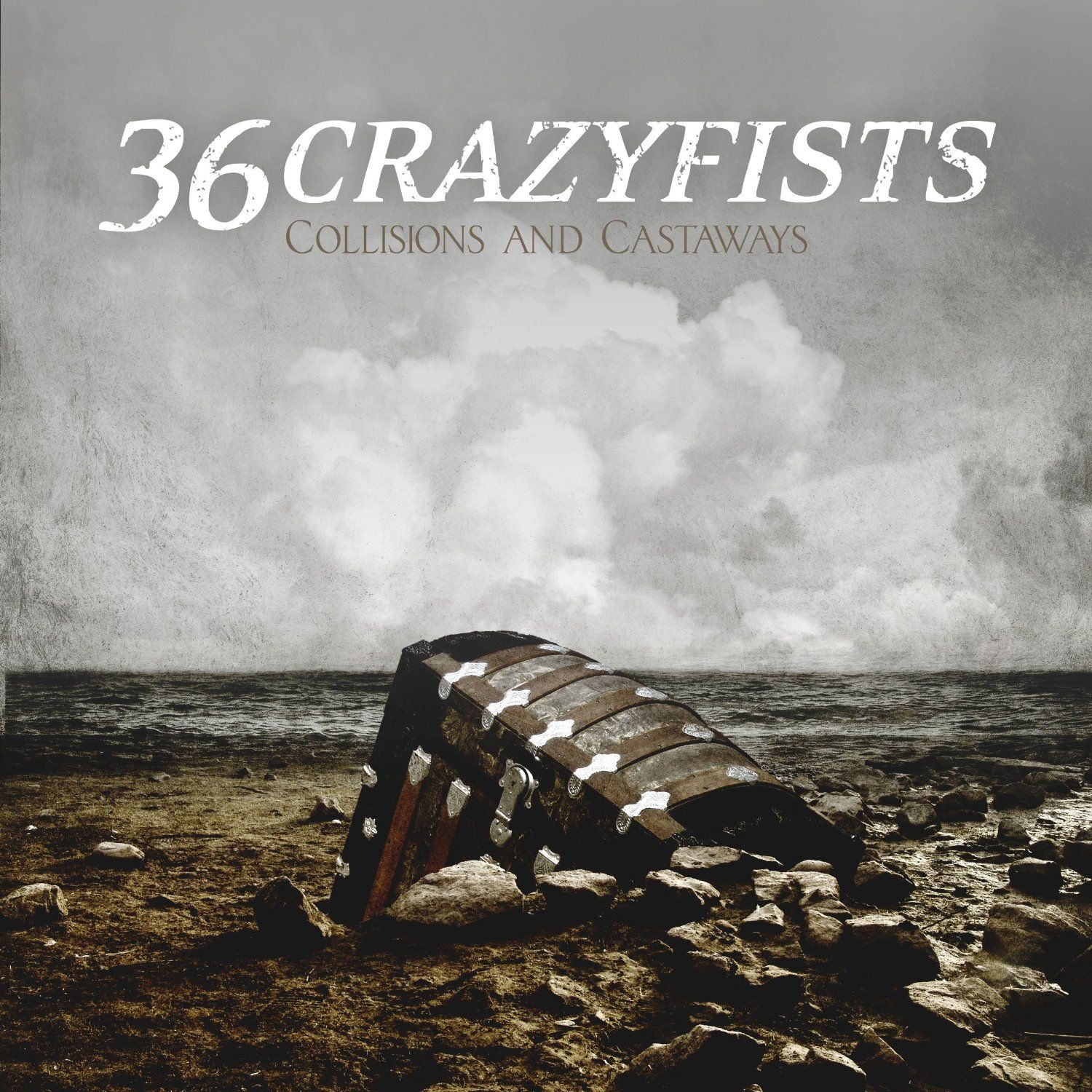
36 Crazyfists — Collisions And Castaways (2010, Roadrunner/Ferret)
First of all: if you haven’t heard of 36 Crazyfists, I urge you to at least give them a try. They are, in my opinion, one of the best metalcore bands. Vocalist Brock Lindow’s vocals—while grating to some—add a layer of emotion that is so touching in its honesty and power that it’s unlike anything I’ve ever heard (especially from a metalcore band).
Now, while Collisions and Castaways isn’t my particular favorite album by the band—I have to give that to 2004’s A Snowcapped Romance—it is the only album with artwork done by Travis Smith, and I must admit that Smith does the band’s image justice.

With a lot of his work, Mr. Smith keeps elements on the cover to a minimum, with less focus on what is on the page and more focus on the general atmosphere he can use. Obviously, this album is not different: the only big object of note is a treasure chest half-buried in a rocky beach. (If you flip through the liner notes (available here) Smith also draws a little boy digging this chest out of the sand and looking into it.) But it’s not so much the treasure chest itself as its relation to the rest of the piece and how it reflects the 36 Crazyfists’s sound. It’s a gloomy day on the coast—the clouds look like their about to burst forth with rain. The sea looks choppy—sailors be warned.
If you weren’t aware, 36 Crazyfists actually hails from Anchorage, Alaska, and their music tends to pay some sort of homage to their home. (A Snowcapped Romance includes a track called “Song For The Fisherman,” among other water-themed tracks throughout the band’s discography). The album cover, in a sense, is an homage to the ocean the band has probably grown up seeing. The texture that Smith uses creates a sort of archetype out of the gloomy ocean—that while it’s not beautiful in the conventional sense, there is something magnetic about it. (And the chest, in this case, could refer to the little, beautiful things we have despite the seemingly overwhelming presence of gloom and melancholy in the world.) This is an ideal that very much moves over to 36 Crazyfists’s music; the band employs a style of metalcore that takes heavy influence from melodic hardcore music. Brock Lindow’s vocals, while edgy and screaming, can also express huge amounts of sadness just as Steve Holt’s guitars can be both pummeling and grimly mellifluous. The ocean—and the world—can be a place of great tribulation or great happiness: it all depends on your outlook.
It might be a redundancy to say, but a good album cover will catch a potential listener’s eye, and, in some way, incorporate the album’s sound into its imagery. This is universal, whether we’re talking about Madonna or Metallica. And I think that Travis Smith’s work fits both of these definitions to a “T.”
If you’re interested in exploring more of Mr. Smith’s artwork (something I highly recommend), please visit his site here.
-JM