A Gift to Artwork, taken from the Caligula’s Horse song “A Gift to Afterthought”, breaks down and analyses your favourite album artwork. The first time an album’s name appears, it will link to a large and (where possible) high-resolution image of the cover so that you can take a closer look. Read other entries in this series here.
Editor’s Note: A Gift to Artwork features a regular guest contribution from Luis Flores (@luis.hoa), who runs and regularly writes for the excellent Heaviest of Art. If you’re looking for more analysis and discussion of album artwork Luis’ Behind The Cover column is a must-read.
Welcome one and all to another edition of A Gift to Artwork. This month we’ve got a real smorgasbord of different art styles to enjoy, from Craven Idol’s epic and classical depiction of Greek mythology, to the inimitable photograph adorning the cover of Annihilus, and the complete insanity that is The Grasshopper Lies Heavy’s latest artwork. Let’s get straight to it!
Craven Idol – Forked Tongues (Cover art by Eliran Kantor)
We’re no strangers to covering Eliran Kantor’s artwork in this column and well, just look at this stunning piece adorning Craven Idol’s Forked Tongues and you can see why. The band’s bandcamp page neatly summarises the concept of the record and a bit of background into the cover’s development:
.ugb-3b7a3bc .ugb-blockquote__quote{width:70px !important;height:70px !important}
The album takes on the anomalous tale of the serpentine beast Typhon, the fiercest of all Titans in Greek Mythology. The ‘Father of Monsters’ is said to have challenged Zeus to do battle for cosmic supremacy, ultimately succumbing to the Olympian’s might, and facing imprisonment beneath Mount Aetna. According to legend, the sporadic eruptions of the volcano are due to the enduring wrath of Typhon.
Instead of merely reciting an ancient myth, FORKED TONGUES acts as sequel to the original tale, with Typhon returning to settle old scores. The power of the Olympians has waned over millennia, with their ambitions tamed by excess and indulgence. Meanwhile, the misguided worship of a fictitious Golden Age has facilitated Typhon’s escape. A corpulent Zeus now faces the hundred-headed monstrosity once again.
Forked Tongues is a cautionary tale, warning of all craven idols.
The monumental artwork, courtesy of master painter Eliran Kantor (Sodom, Incantation, Testament, Atheist) displays a scene of our world on the brink of total devastation.
“Peculiarly enough, the original front cover concept was inspired by Japanese artist Katsushika Hokusai, more specifically the woodblock print (Ukiyo-e) ‘The Dragon of Smoke Escaping From Mount Fuji’. Completed 1849, the work is through to have been one of Hokusai’s last.
In Kantor’s piece, Shizuoka is replaced by Sicily, Fuji by Aetna, and the dragon by Typhon. The back cover also loosely pays homage to ‘The Great Wave off Kanagawa.'”
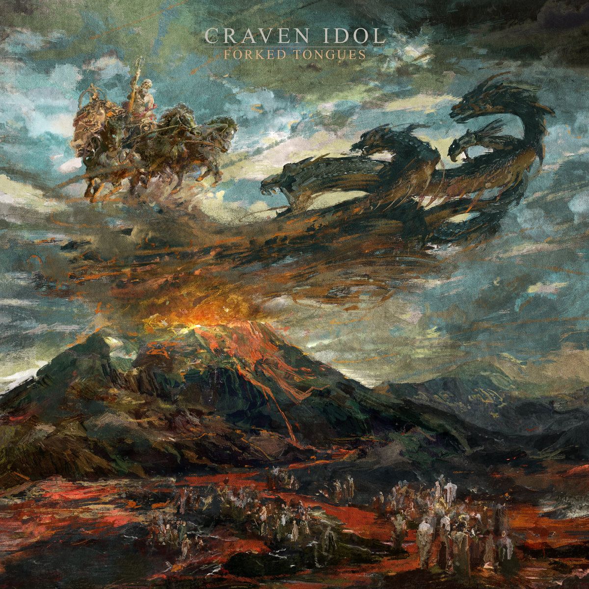
The central feature of the piece is the multi-headed serpent Typhon erupting from the volcanic Aetna, swirling above the volcano poised for combat with Zeus as the latter charges down from Olympus on his chariot. The flickering flames, exploding lava, and vortex of serpentine coils above Aetna’s summit lend a wonderful sense of motion to the piece, lending a strong sense of urgency to the cover as we await the titanic struggle to come. The smudgy, indistinct composition reinforces this sense as we imagine a vicious maelstrom developing before our eyes. The classical depiction of Zeus in the top left corner further serves to evoke a feeling of grandeur, a scale of truly epic proportions.
The pastel colour scheme works wonders, the blues of the sky and the oranges of the flame striking, but the dark overall palette entirely befitting the concept. The mixture of orange, charcoal and grey in the swirl above the volcano is a highlight, so too the deft lighting of Zeus’ horses’ legs. The lack of detail surrounding the crowd of people standing in groups at the very bottom of the piece, avoiding the lava as they observe the apocalyptic scenes above them, is also a fantastic choice. The faceless gathering emphasises the utter insignificance of the common person relative to the gods and titans while simultaneously focusing our attention where it matters: the glorious Zeus vs the monstrous Typhon. A stunning cover and strong record to boot.
-Karlo Doroc
Annihilus – Follow A Song From the Sky (Cover art by Jesse Draxler)
I love it when an album catches your eye not because it makes an immediate impression, but rather when it’s wtf levels of indiscernible and demands a more scrutinous examination. In this instance, Jesse Draxler’s photo of a burnt trash can that graces the cover of Follow A Song From the Sky encourages exactly that. We’ve featured a lot of intricate and complex covers here before, but not many photographs, and I think format lends to much of the intrigue here. The ambiguous, mutated form is alien at a glance, but soon becomes familiar – an impressive expression of Annihilus’ supremely noisy urban black metal.
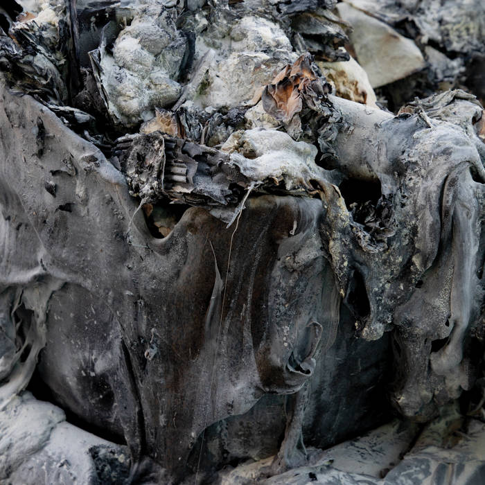
Part of what makes it so immediately interesting is how busy it is. I mean, it’s refuse, but it’s a lot to take in, in a way noisy and loud in spite of being almost monochrome, an apt metaphor for Follow’s sonic manifestations. It’s also texturally vivid, with raw, charred and ashen bits amidst the melted flows of greys, a juxtaposition that makes the ordinary captivating. Further, the trash as subject matter nods to the urban and industrial elements of the record, it’s spartan and unembellished – a far cry from romantic woodsy landscapes and castles – nailing FASFTS’s aural aesthetic. The trash also becomes a kind of dystopian symbol of failure where even the used and discarded items from society have been destroyed.
Yet, it still looks like a black metal cover. Dark greys dominate the image, there are vibes of destruction and violence enhanced by a sense of mystery. What caused this? What’s left outside of the frame? It’s a small frame of a world bleak and indifferent, the tight focus channels viewers directly into this world of waste, offering little context other than society’s indistinguishable throwaways. Draxler eyes a cold, end-of-the-line, and unusual landscape in the most common of subject matter, a perfectly suited visual for a black metal record that similarly seethes and undermines conventions.
-Jordan Jerabek
The Grasshopper Lies Heavy – A Cult That Worships A God Of Death (Cover art by John Guzman)
John Guzman’s work is likewise abstract and intriguing as it lends a visual voice to The Grasshopper Lies Heavy’s unusual contortion of noise rock, sludge, and post-metal. This piece, titled “The Room is Aware” deconstructs a human form, reassembling it into a twisted configuration that invokes a variety of ideas and emotions. It’s flexible, complex and tangled, with many of the individual components in this piece carrying their own symbolism: the teeth as representations of hunger, nourishment, wisdom, sensitivity, or social class; the wood as growth, experience, a tool, or death; the muscle as energy, strength, flesh, vitality, or productivity. There’s a lot of places this piece can go (as does the audio experience of A Cult That Worships A God Of Death), but it feels uniquely suited to its musical counterpart.
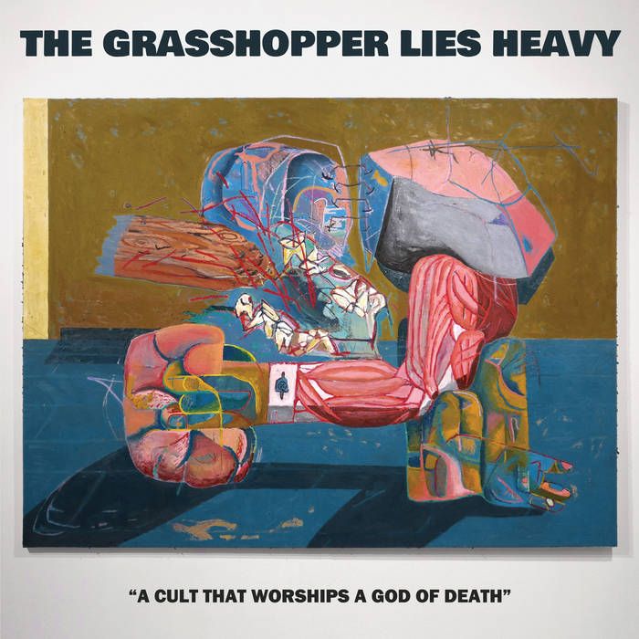
There’s a realness presented by the room along with a shadow, giving the piece dimension and almost a sense of confrontation with the figure occupying the space, a kind of challenge to reconcile what lies before you. The marriage of the human (muscles, teeth) and natural (stone, wood) is physical, raw, and primitive; but they’re complemented and given some direction by surrounding details. The arm-like structure is accompanied by a fist-like figure, as if it’s pounded down in frustration or exhaustion. What appears to be a shirt cuff and button or bandage gives the sense of society, authority, privilege, responsibility, or injury – the physical nature encouraging you to feel it in your own bones. Going upward, this arm is paired to this bone or stone which is in turn stapled, stitched, or otherwise networked to this jaw structure. And… is that blood spatter? Is that… a log or stake stabbing a jaw with missing teeth? Okay, there’s a lot to take in, process, and react to – but it’s a visceral experience.
It plays really well with the jarring riffs and raw aggression, and as the cover’s architecture has a sense of contortion and angularness, it also feels balanced and stable, evenly filling the canvas. The work feels very human, complicated, and honest, the impressions of hands are very powerful and expressive even though they’re abstract and intertwined within these other forms. There’s a distressed quality that comes through, too, a sort of “visual distortion” that amplifies the peculiar color palette of dirty golds, blues, and fleshtones. The lines aren’t always clean, there’s expression and texture from Guzman’s human touch. It’s definitely worth exploring while listening given how much there is going on both visually and audibly, there’s a lot in common here that I can’t put into words.
-JJ
Lacerate Thy Maker – Submergence (Cover art by Caelan Stokkermans)
Few metal adjacent artists are having a year as great as Cleveland’s Caelan Stokkermans, a master of vivid detail and organic atmospheres. From his recently announced cover for Sentinels’ debut, Collapse By Design, to the wondrous work for Interloper’s newest full-length. Search Party, Caelan continues to deliver tenfold on the visual immersion, hence the continuous projects that he’s commissioned for throughout the year. Though one of his most notable works as of late has been his cover of The Acacia Strain’s Slow Decay (2020), Lacerate Thy Maker’s recently released Submergence EP is a showcase of the depth within his prowess. It’s a standout among a hefty catalogue of memorable works in metal’s rich selections.
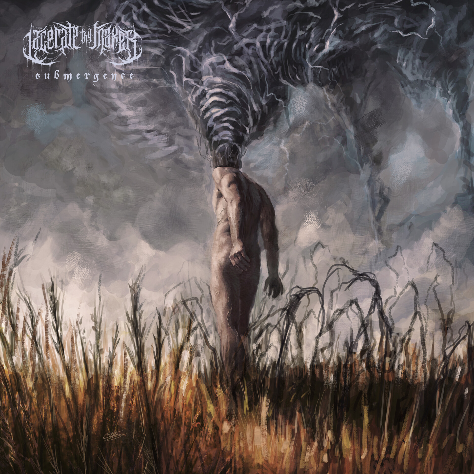
At the core of it all, a protagonist figure stands amidst cornfields with a tornado stemming from the root of his headless being. The tornado’s grey hues bleed and help compose the entirety of the dreary skies above the picture being presented. Though there are a variety of interpretations here, a prominent one is the commentary it provides on mental turmoil. It utilizes a very tense and somber color palette, reminiscent of the album’s themes of depression and anxiety. For as sane and stable as we may appear to be, what we carry on with us throughout the day can be slowly tearing us apart from the inside. As physically fit and formidable as the protagonist is depicted to be, the hell that lives within the psyche elaborates on the distinction between personal appearance and mental stability. The contrast is also shown here with the tranquil cornfields being offset by the protagonist’s mental state of mind, the likes of which of course is the catalyst for the natural disaster. When the weight of the world is constantly bearing us down, our thoughts run rampant and we worry with insecurity.
While advances have been made in the realm of accessibility and information, seeking mental health support remains taboo for many, due in part to cultural and societal norms in particular areas of the world. It’s art as dark as Caelan’s Submergence that helps shine a light on this pressing issue while serving as a compelling visual companion for a brief yet impactful composition of brutal death metal. If this is your introduction to Caelan’s work, rest assured, you’ll only be seeing more of his art in the coming months with bands across the spectrum slowly but surely becoming privy to his artistic talents.
-Luis Flores
Gates of Mourning – Of Raven’s Wings and a Blood Moon (Cover art by Adam ‘Nightjar’ Burke)
Whether you’re an avid or casual metal listener, the art of Adam ‘Nightjar’ Burke should need little to no introduction by this stage. Consider him and Eliran Kantor, if you will, the modern day Dan Seagrave or Ed Repka. Despite the countless covers he’s illustrated in recent years, what he’s done for Gates of Mourning is truly a work of atmospheric art.
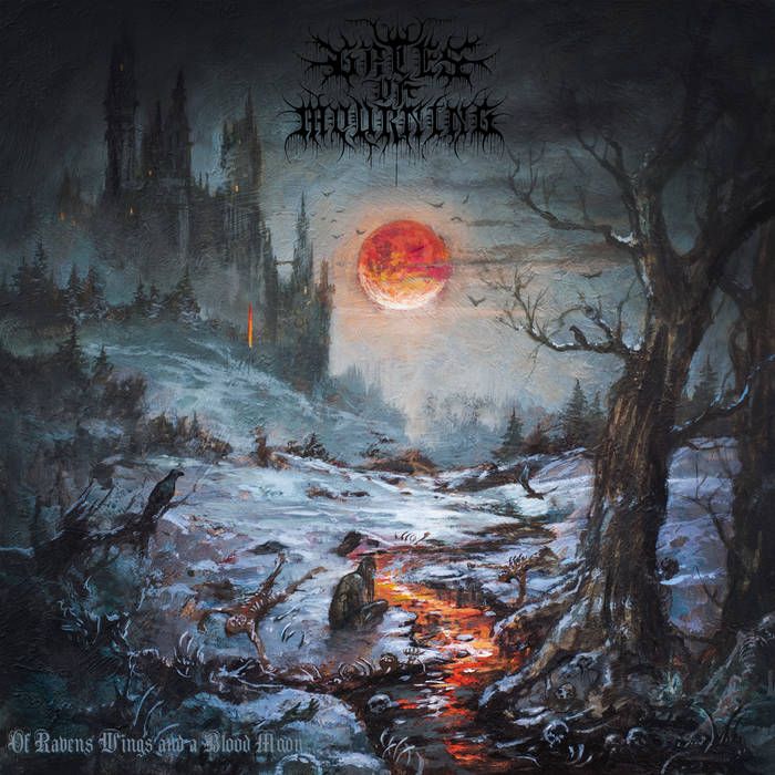
For one, Gates of Mourning’s Of Raven’s Wings and a Blood Moon couldn’t have come at a better time with Resident Evil Village having been released a week prior in May. The video game’s gothic tone and enticing setting drew many to its harrowing wonder upon seeing it revealed. In that same vein, Burke’s work on Gates of Mourning guides listeners through snowy woods with a towering castle looming in the background, akin to the game’s Castle Dimitrescu. A blood moon overlooks the scene as a haunting figure looks directly at the viewer after apparently ripping through the poor souls who dare walk in its path. Could the victims perhaps be a group of curious campers? Who knows, but a fire pit on the horizon would suggest that there is more for the killer to explore. Skulls and bones are spread across the bloody occurrence while an opportunistic crow stands by on the roots of a fallen tree, waiting for a chance to feast as bats fly in the distance. All of this occurs while a multitude of lights shines throughout the castle’s windows, evidence of life being present within. Like all of Burke’s works, brushstrokes are visible and the organic nature of his work is ever so strongly visible with trees fading beautifully into the background. The cover is living and breathing, existing beyond the confines of an album cover’s parameters.
Whether the painting was inspired by the Resident Evil Village’s acclaimed setting or not, what Burke does here is exquisite and entrancing, inviting listeners into a harrowing portrait of death and wonder. Of Raven’s Wings and a Blood Moon is quite frankly a testament to the importance of audiovisual cohesion as the striking melodic black metal becomes one with Burke’s elite talents. The full-length arrived in May but with Halloween and the fall season right around the corner, there’s no better time to revisit it. Hell, might as well pick up a copy of Resident Evil Village while you’re at it, which is equally as grand.
-LF