A Gift to Artwork, taken from the Caligula’s Horse song “A Gift to Afterthought”, breaks down and analyses your favourite album artwork. The first time an album’s name appears, it will link to a large and (where possible) high-resolution image of the cover so that you can take a closer look. Read other entries in this series here.
Welcome to the October edition of our bi-monthly A Gift to Artwork column, our last before our end-of-year wrap-up of our favourite covers from 2020. Today we’re going back, way back, to the 1980s and a pair of undisputed metal classics: none other than Metallica’s Master of Puppets and …And Justice For All (AJFA). A pair of albums that cemented Metallica as the foremost band of the wider genre, inspired a generation to follow in their footsteps, and laid the platform for them to become one of the biggest bands the world has known. And while the music from those records is incredible, as we will see today, there may be more to the artwork than you’ve previously considered.
Beginning with Master of Puppets, understanding the lyrical themes of the record are critical to understanding the cover art. Right the way through, each song is dark, political and places manipulation of one sort or another at its heart. “Battery“ and “Damage Inc.” refer to anger, violence and destruction, “Welcome Home (Sanitarium)” to a person unjustly imprisoned in a mental institution, “Disposable Heroes” to soldiers whose lives are in the hands of ruthless commanding officers, “Leper Messiah” to televangelists attempting to convert the masses and, most famously, the title track refers to people struggling with drug addiction. Whether the manipulator is a nurse, a military officer, one’s emotions or a drug addiction, death and manipulation are the two key motifs for the record.
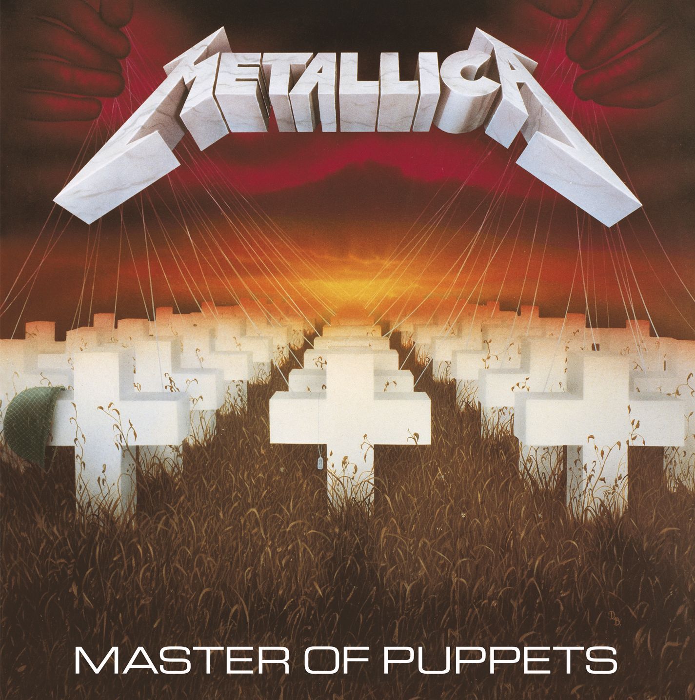
Turning our attention now to the artwork we see this entrenched in each aspect of the image. “Disposable Heroes” is the most apparent, a graveyard stretching endlessly into the distance, the dog tags and helmet from the first row marking these as poor soldiers sent “back to the front” by heartless superiors. The disregard shown for those young men in life continues in death, their graves nameless, the grounds above their bodies overgrown with weeds and forgotten by the living. The bright white of the grave markers evokes a sense of purity, of young men valiantly giving their lives for a cause they had believed in, yet they are surrounded by deathly, stale browns and foreboding, aggressive reds.
The top of the cover illustrates the proverbial master of puppets, a pair of hands pulling the strings of each of the fallen soldiers. These hands represent each of the manipulators referenced within the album, sinister and evil like the cackles and laughs which close the title track or Cthulhu, as described in “The Thing That Should Not Be”. The sky and landscape has a Mordor-esque quality to it, an infernal landscape that evokes nothing but fear and hopelessness. Indeed, the bright yellow centre point may even be interpreted as a setting sun, emblematic of those lost to the manipulative puppet masters, many of which will never see a new dawn. Before we move onto AJFA, it’s worth pointing out the Metallica logo. In almost every album cover their logo is metallic, the band hammering home their attitude and heaviness in their name and branding, not just their sound. However, with Master of Puppets we have a marble texture to the logo, reminiscent of the wealth and splendour of classical antiquity. With such a statement, perhaps it should have come as no surprise that we had a classic on our hands.
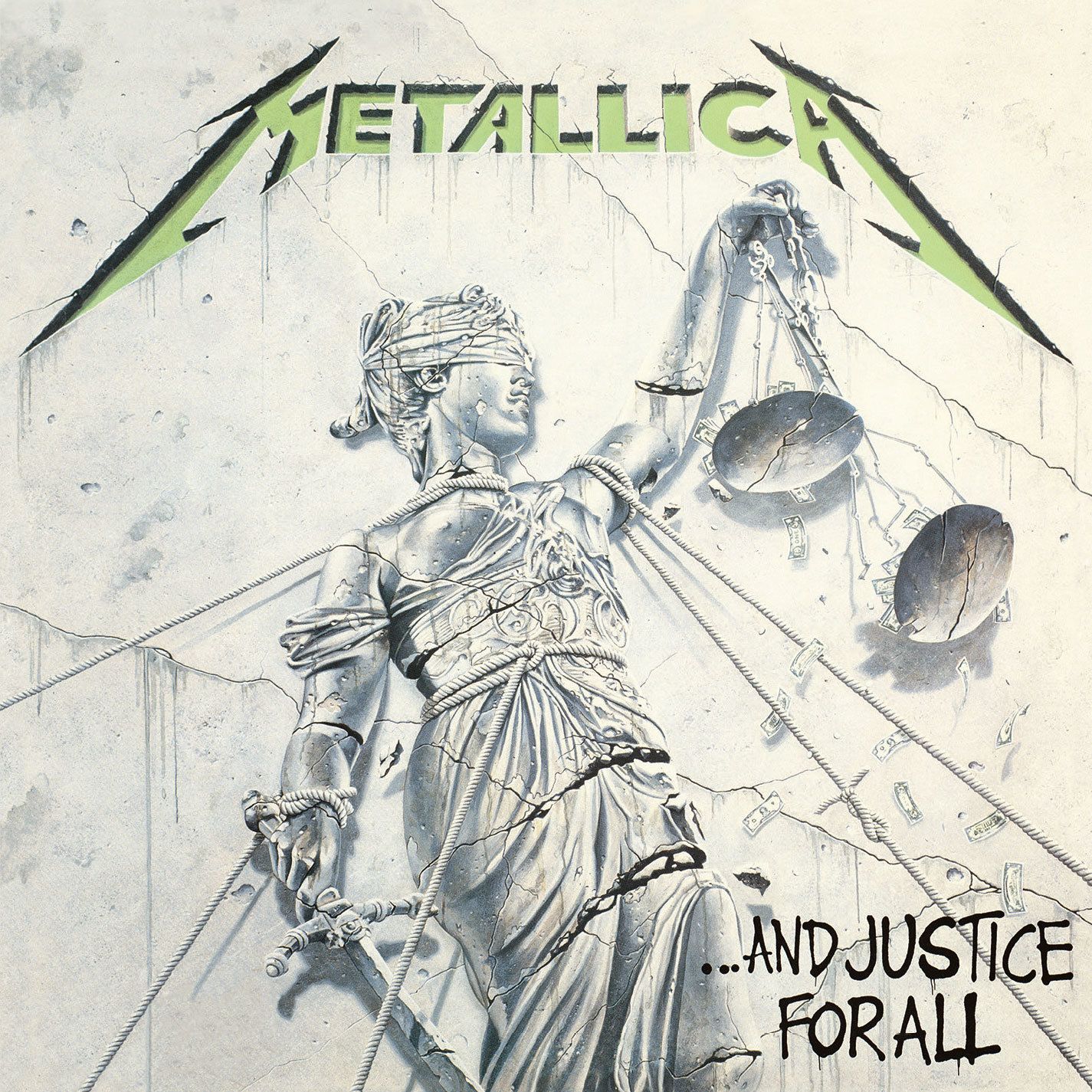
From one classic to another, let’s take a look at AJFA. I for one will admit that I never paid much attention to this cover before, and it wasn’t until I saw an alternative, coloured version of the artwork on Reddit that I noticed many of its details. The centre of the piece is Lady Justice standing upright with her customary blindfold, scales, and sword. A symbol of fairness, authority and, well, justice, she has a history dating back to Ancient Rome, Greece and Egypt. The blindfold represent her impartiality, the scales the fact she fairly weighs up one argument against another, and the sword that her judgement is powerful and final. The cover makes a mockery of such symbolism, depicting a crumbling statue being torn down and graffitied by vandals (pun intended), its sword arm constrained, and its scales broken as dollar bills fall freely. The title track bears out the overarching message:
Note: content/trigger warning for the below quote and the paragraph which follows it
“Halls of justice painted green, money talking…
Justice is lost, justice is raped, justice is gone
Pulling your strings, justice is done
Seeking no truth, winning is all
Find it so grim, so true, so real…
Lady justice has been raped, truth assassin
Rolls of red tape seal your lips, now you’re done in
Their money tips her scales again, make your deal
Just what is truth?
I cannot tell, cannot feel”…And Justice for All
Thus, Metallica are as political as ever here, with the artwork concisely expressing the key motif of political and legal corruption and injustice. Other details that add to the piece include the exposed breasts, which contributes to the degenerate anarchy evoked by the scene, and the monochrome colour palette, which gives the sense that justice and corruption are indistinguishable. Even the way Lady Justice’s left arm is cracked and crumbled is akin to the way one may slit their wrists when attempting suicide. This suggests that Justice herself is ashamed of what she has become and is unable to live with herself, or possibly that she sees the end coming and is choosing to depart on her terms rather than fall into enemy hands.
As with Master of Puppets, we conclude by having a look at the band’s logo. This time we see it carved into stone. Marking the first album since Cliff Burton’s passing, again we have a clear message. We are back and we are here to stay. Nothing will stop us.
That’s it for this month, hope you enjoyed reflecting on a couple of metal classics, and we’ll see you in December for a survey through our favourite album artwork of 2020.