A Gift to Artwork, taken from the Caligula’s Horse song “A Gift to Afterthought”, breaks down and analyses your favourite album artwork. The first time an album’s name appears, it will link to a large and (where possible) high-resolution image of the cover so that you can take a closer look. Read other entries in this series here.
Welcome to May’s instalment (at least I wrote it in May, that counts right?) of A Gift to Artwork – where we’re going to look at the stunning cover art to Rivers of Nihil’s Where Owls Know My Name. Despite landing as my personal, and Heavy Blog’s, Album of the Year for 2018, I hadn’t really considered writing about their artwork. That changed when I was one of the thousands of fans from the land down under that were treated to one of the greatest lineups yet to grace our upside-down stages – Rivers of Nihil, Allaegeon, Beyond Creation, Caligula’s Horse and Ne Obliviscaris. Each of the bands put on incredible performances, certainly marking the tour as one of the live highlights of the year, but as the only band I had yet to see live, Rivers were arguably my highlight. I’ve been jamming Owls ever since and my goodness, what a record it is. As if an ambitious concept, heartfelt performances and an immaculately crafted hour of progressive death metal wasn’t enough, Owls happens to boast one of the coolest damn covers of 2018 – so let’s get into it.
For those who haven’t looked past the music, and who could blame you given its depth, Owls is a concept album and the third from Rivers of Nihil to carry a seasonal theme. The Conscious Seed of Light, as the name suggests, represented Spring. Monarchy followed with Summer, before Owls arrived on the scene as – you guessed it – Autumn. As for the finer details, let’s allow the band to speak for themselves following a Reddit AMA last year:
“Owls is essentially the story of the last man on earth. He was made immortal by the planet itself (the conscious seed of light, as it were) to be the sole intelligent witness of the death of the planet. Really though this is all set dressing for the more emotional content on display here, so looking TOO closely at the lyrics for story purposes is probably a bit of a futile effort in my opinion. It’s really just about loss and getting older and coping with the things you’ve done in your life.” – Adam Biggs
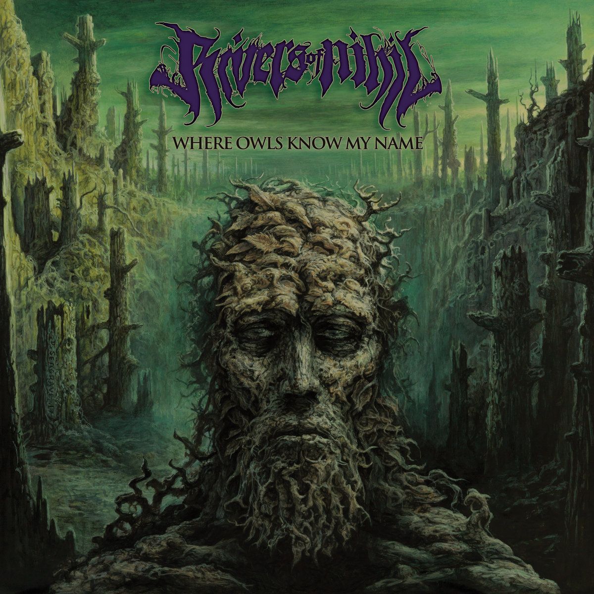
Looking towards the cover art it’s easy to see what Adam described. A single humanoid creature, resembling an ent, offers the listener a despondent stare as the world around him lies dead. The background depicts a forest of trees devoid of any signs of life. No wildlife. No foliage. Not even branches, with most trunks snapped off before they can reach their full height. This tattered landscape stretches back as far as the eye can see, a depressing sight that further reinforces the autumnal nature of the overarching concept, life falling away before the protagonist’s eyes.

Turning our attention to the central figure we see that he carries with him the last signs of life, dying as they may be. His ‘hair’ is made up of the remains of birds, leaves and other creatures that are equal parts ambiguous brush strokes and vivid imagination. One bird in particular, the one near the very top of his head, resembles a raven. That they’re symbols of death, loss and poor luck is no coincidence given the record’s concept. There is some colour to their depictions, a slightly reddish hue adorning the central figure’s ‘hair’, but this colour all but evaporates as we venture further down his body. Signs of life grow few and far between as we see lifeless eyes, perhaps the remains of a stag or two in the beard, and then nothing below.
When re-examining the artwork metaphorically, many of the album’s core themes come to the fore. Coping with loss, as illustrated by the dearth of life and those remarkably haunting eyes. Growing old, as shown by the ancient being that appears to be slowly melding into the Earth around him. He is part-man, part-tree, part-animal(s) – to the point that he doesn’t know what he is anymore. He is losing his identity, confused and lost as he looks at a deserted and lifeless landscape in full knowledge that he is alone. The piece almost evokes a sense of resigned horror, one which brilliantly encapsulates the motifs of dementia, lack of belonging, and confusion that permeates the record lyrically, musically, emotionally and, as we’ve explored, visually.
Whether you have immaculate taste and declared Where Owls Know My Name to be 2018’s Album of the Year, or whether you’re objectively wrong, I’m sure there is one thing we can all agree on – the record’s cover art is fantastic. Independently of the record, its colour scheme, detail, and fantastical depictions make it visually striking. Thematically, it wonderfully illustrates many of the album’s layers on both a conceptual and emotional level, and there’s not much more you can ask an album cover to do. Where Owls Know My Name was a massive step-up for Rivers from the two records that preceded it, and the same can be said for Dan Seagrave – the man responsible for each of their cover’s to date. Let’s hope what they come up with next is just as enthralling.