A Gift to Artwork breaks down and analyses your favourite album artwork to see what it communicates to the listener and how it interacts with the music and lyrics. Read other entries in this series here.
After a month off whilst I traveled the world, we’re back with October’s edition of A Gift to Artwork, and we’re looking at In Flames. The Gothenburg Trio alum took the world by storm when they emerged at the forefront of the melodic death metal movement in the mid-to-late ’90s; however, their change in sound and direction at the turn of the century – and again post-2010 – have polarised fans the world over. Though their modern relevance continues to erode, the artistic legacy they’ve left behind still stands the test of time. Part of this legacy rests within their cover artwork as well as their music, and so today we’re going to be looking at three album covers, one from each of the three main eras of the band’s history.
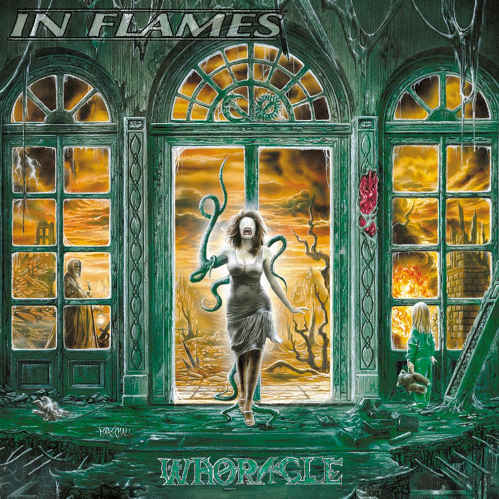
Whoracle (1997)
Up first we have the golden era from 1994-2000, represented by Whoracle. Even a glance at the cover shows how dense and detailed it is, the very epitome of a picture painting a thousand words. There are three main areas which immediately grab your attention; the broken home in the foreground, the flaming destruction of the background, and, if we were to split the image into three equally large vertical sections, the humanoid figures pictured in each section. My thought process when looking at this image was as follows, and it’s important to note that whilst I was familiar with the music, I’d never paid much attention to the cover or lyrics before. Immediately the first word which sprang to mind was ‘apocalypse’, and it’s not hard to see why when looking at a landscape virtually devoid of life, one of fire and brimstone with buildings either falling apart or already laying in ruins. As I spent a bit more time digesting it all and noticing all the little details, my next thought was that perhaps it was a concept album given that there was simply so much going on. Along the same lines, I thought of In Flames’ homeland of Sweden and that, even if I didn’t know it yet, there was likely to be a host of Norse imagery and symbolism within the cover artwork and lyrics. Despite the absence of prior knowledge I was right on all three counts, with Whoracle a concept album rife with Norse references, one dealing with the eventual arrival of an apocalypse on Earth. Thus before the analysis can even begin, the artwork has already provided the listener with a clear and succinct picture of what this album is about and where it is heading, a true testament to Andreas Marschall’s illustrative skills.
Beginning with our thoughts of an apocalypse, a clear parallel can be drawn with Ragnarok, the end of the world as described in Norse mythology. One of the stages of Ragnarok involves fire giants setting the world aflame, and one could imagine that the aftermath may look something like what is depicted here. Another image demanding attention is the woman who finds herself prominently located in the very centre, highlighting her central importance to the message being communicated. The woman’s lower half appears healthy and normal; however, the skin on her upper body is a sickly, pale white, her face is eyeless, noseless and turning to scales, whilst her right arm has become one of many serpentine limbs sprouting from her body. For millennia women have represented symbols of love, life and fertility because they have been the ones to bring and nurture new life into the world. This just makes the woman’s transformation all the more grotesque, as the disease she has will affect not only herself, but those that may come after her. The various roles women play in society (mother, wife/partner, caregiver, breadwinner etc.) have them rightly placed as the very foundation of one of the most basic building blocks of human society; that of the family. Thus there is a duplicity of meanings behind the foreground, not only has the home been
ravagedby Ragnarok, but the woman’s corruption has also seen the family home fall apart, literally and figuratively.
A metaphorical interpretation of the woman could see her represent Yggdrasil, the world tree of Norse mythology, which sustains life and holds up the world. Some sources claim that the arrival of a dragon named Nidhogg, the embodiment of evil, heralds the beginning of Ragnarok as he gnaws at Yggdrasil’s roots from below, trying to enter the earthly realm. The comparisons are clear, with our Yggdrasil (the woman) being attacked by Nidhogg (the reptilian limbs), with the serpent looking to enter the world and participate in Ragnarok (the apocalyptic destruction of all we can see). Continuing with our Norse themes, let’s now examine the male figure in the left section of the cover. One of the foremost gods of the Norse pantheon is none other than Odin, the All-Father, and he is often depicted in the guise of Odin the Wanderer (fun fact: Gandalf’s appearance in Lord of the Rings is inspired by this guise). Thus he is generally depicted as one-eyed, carrying a spear/staff and wearing a broad-brimmed hat and a cloak. Whilst we can’t see his eyes and the hat is missing, everything else is in place and so our comparison is viable. Furthermore, one of Odin’s more prominent activities was to roam battlefields and select which of the dead to take with him into Valhalla, warriors which will assist him in his futile attempt to fight his enemies during Ragnarok. It’s possible that he is thus disguised as he gathers the fallen here, moving amongst the shattered wastelands of the planet in a bid to recruit more warriors before entering his final battle, one in which he himself is fated to die.
Finally, let us now take a step back and examine each of the three vertical sections we mentioned earlier. Looking at each section from right to left, they can be seen to represent the past, present and future of this apocalyptic world. On the right-hand side we have an innocent young girl looking out at the destruction engulfing her world. Notice the lack of fear in her posture, the fact that she doesn’t hug or desperately clutch at her teddy bear in search of comfort and support. The way she carries herself suggests a numbed normalisation and distinct lack of hope regarding the events taking place. What’s more, the books which lie dusty, unattended and forgotten on the floor may represent the sciences and ideologies which led society astray, or perhaps the texts which society strayed from, those that could have prevented this self-inflicted doom. Moving to the central section we enter the present, our little girl having grown into a woman; however, half of her humanity has already begun its hideous transformation. There are no fresh flames in the background, only a wasteland as the initial fires seem to have ended. That brings us to the final section, one in which the torn up teddy bear suggests that the woman is dead, or at least any traces of her innocence and humanity are. With her goes the rest of humanity, Odin wandering amongst the ruins selecting his final batch of warriors.
Come Clarity (2006)
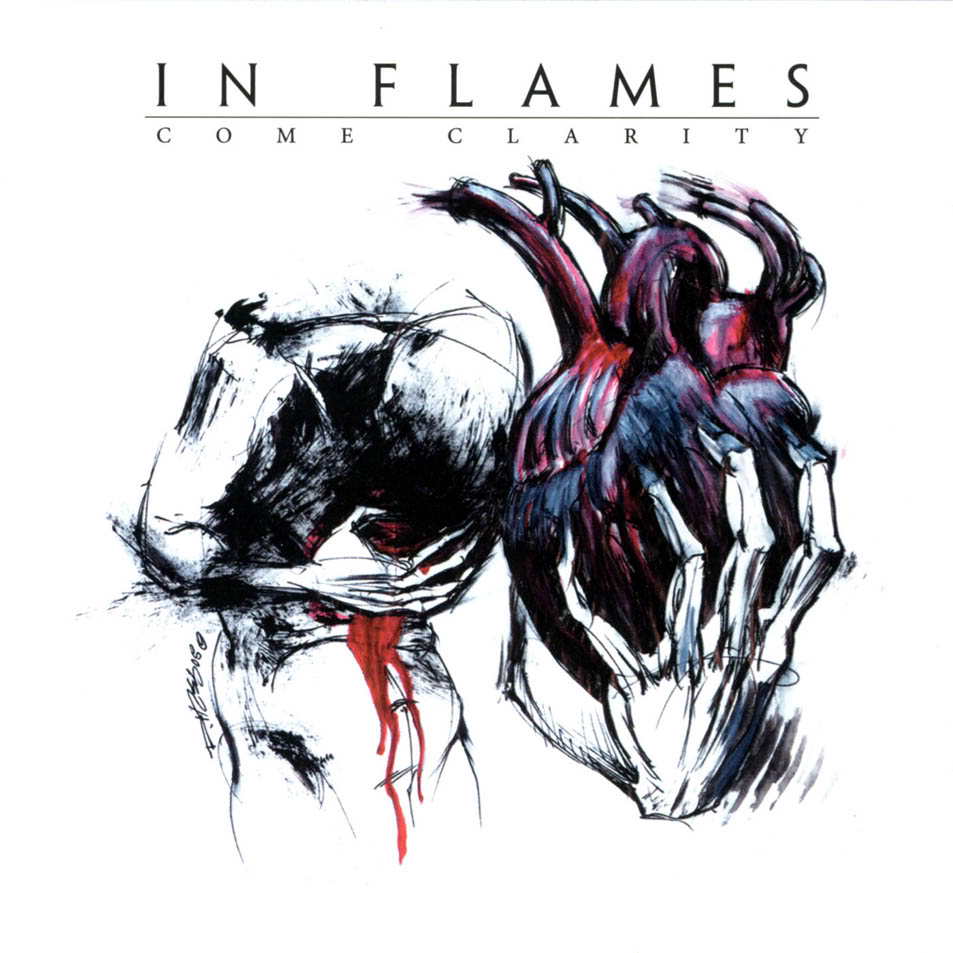
As fun as that was, we do have a couple of other albums to get to today and we’ll move on to Come Clarity. Representing the second era of In Flames, the period of 2001-2009 saw them substitute much of their death metal roots for a more mainstream metal sound. In contrast to Whoracle’s cover we have a much more stripped back approach here, with only a couple of details to focus upon. The colour scheme has also shifted enormously, with the raging reds and disease-ridden greens of the previous cover making way for the abysmal black, depressing blue/grey and pained reds visible here. These colours accentuate the emotions evoked by our lone human figure. Having just ripped his own heart from his body, the figure stands hunched over in pain, the centre of his being a dark shadow as he clutches his wound, blood pouring down his abdomen. The blood represents the pain and suffering of wounds which will not heal. The fact our figure stands alone emphasises his sense of loneliness, the dark shades of colour bringing to life his despair. That he has ripped his own heart free suggests a sense of heartbreak, his hand digging into it, clutching it desperately as if to stress the self-inflicted nature of his pain. The hidden face and darkness of the torso, parts of the body representative of the mind and soul, provide an insight into our figure’s state of mind. His mind is awhirl with dark and dreadful thoughts, whilst his soul is either absent or somewhat tainted. Tainted by feelings of disgust, contempt, self-loathing, shame and more. That such a simple, relatively unadorned cover could communicate all these feelings in an instant is indeed praiseworthy, and shows why artist Derek Hess has also been enlisted by acts such as Converge and Sepultura.
The crucial absence, or hiddenness, of key body parts indicates that the character has lost their sense of self and their identity, that they are now unsure of what it is that constitutes what they are. Is the heart still a part of them, even though it has been wrenched free? It was a part of what they once were, but what about now and what about the future? As a symbol, the heart represents love, courage and willpower, and so its absence is telling. What’s more, it is seen as the emotional, spiritual, moral and ethical epicentre of a human being, so if they no longer has a heart, what exactly does that make our character? The sketch-like nature of the illustration highlights this feeling of flux as it implies both that the figure is yet to reach their final form, and that their appearance could easily be altered as they continue to change who they are. All in all the cover does an excellent job of conveying the depressingly introspective nature of the album and leaves us pondering a few questions as we dig into the contents of the album itself.
Sounds of a Playground Fading (2011)
Finally, that brings us to our third and final cover, that of the controversial Sounds of a Playground Fading, which we will hitherto refer to as Playground. Whilst many felt A Sense of Purpose signaled the arrival of their third era, there were also many who saw it as a natural progression from Come Clarity. Playground was the moment that everyone could agree something was different, and so we’ve chosen to paint the third era of the band as ranging from 2010-present. Whilst this period marks the band’s creative decay, it is also the home of one of my favourite album covers of all time, so let’s get into it.
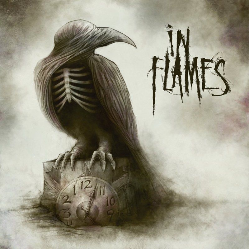
Once again, the cover immediately reveals much about the lyrical content of the album. The first image to capture our attention is that of the raven, a carrion bird whose scavenging nature has long made it a symbol of death and misfortune. As if to drive this point home, the bird’s torso is absent, revealing the skeletal form of its ribcage and ensuring we’re aware that death will be central to the album’s themes. The bird sits perched atop a clock embossed with the jester head, In Flames’ mascot, and the symbol of the jester has featured in each of their albums; either within the artwork, song titles or lyrics. What is notable about the clock is that the numbers are going backwards. This fact, in conjunction with the raven atop it, indicates that the clock represents our time on earth, and it is counting down to the moment of our death. Tick-tock… tick-tock…tick-tock. Every second of every day, continuously and inexorably counting away.
Due to the shape of their heads and the position of their eyes, birds are unable to see directly in front of their beaks. Therefore if they want to look at something directly in front of themselves, they will cock their head to the side so that one of their eyes has a clear view of that direction. Thus our raven is staring directly into our eyes, or at least, it would be if it had any eyes of its own. There are two ways we could interpret this. The first perspective is that the raven represents us, the listeners and the living. We are subject to the passage of time, knowing that each moment of our lives brings us one moment closer to our death. However, it does not matter where we move or in which direction we look, we will not know how much time we have left on this planet. The raven could hop down and look at the clock, but without eyes it will always be blind to its fate until it is too late. This also explains why we can see its skeletal underside, whilst the rest of the body is virtually whole and intact. It’s a metaphor for our journey towards death. As time continues to go, pieces of its body have slowly stripped away until at long last, the clock strikes 12 and there is nothing left but a skeletal corpse.
Our other interpretation of the crow brings us back towards Norse mythology. Whilst it appears blind, there is something about its bearing, something about the way it sits and carries itself that suggests it simply knows. Ravens were also one of the symbols of the god Odin, and so it could be that we’re staring at the personification of Odin himself. Odin sacrificed an eye and hung himself from a tree in exchange for true knowledge and wisdom, and this could explain the raven’s bearing. Thus Odin need not concern himself with looking at the clock, for he knows the fate of all men and, if they’re lucky, he may even visit them following their death and take them with him to Valhalla. In conclusion despite its relative simplicity, Playground’s cover is highly symbolic and looks absolutely amazing, a true credit to Dave Correia’s skill as an artist. That’s where we leave you today, so we hope you enjoyed it and, as always, it makes us feel really good when you comment with your own thoughts and feelings so fire away and we’ll be back next month!