A Gift to Artwork, taken from the Caligula’s Horse song “A Gift to Afterthought”, breaks down and analyses your favourite album artwork. The first time an album’s name appears, it will link to a large and (where possible) high-resolution image of the cover so that you can take a closer look. Read other entries in this series here.
Welcome one and all to July’s edition of A Gift to Artwork. This month we’re changing it up and, rather than our usual deep dive on the artwork of a given record or band, we’ll be doing a rapidfire edition where we look at great covers of albums released (or due to release) in July 2019. We’ve found no less than four awesome pieces of art to discuss today so let’s get straight into it.
WAIT – We Are In Transit
First up we have WAIT, a new progressive death metal project which features Max Phelps and Alex Weber of Exist fame alongside Anup Sastry (every djent album ever made) on the drums. Their debut EP We Are In Transit features a unique piece of art courtesy of Will Shanklin, whose linked page showcases some incredible sci-fi inspired work. There is one key motif which strikes me with this piece: duality. In the centre we have a grid of overlapping circles, each inscribed with a lovely detail or decorative pattern. There is a pleasing symmetry and the soft, brownish pastel colours offer a sense of mundanity and normalcy that serves to embellish the quaint turquoise in the centre. Yet, this pleasant enough, calm and ordered centre is surrounded by horror and disorder of the highest magnitude. The subdued reds now mark fiendish maws, the turquoise reveals insidious and ghoulish eyes, and the beige dominates with images of flayed skin and distorted skulls. In addition, a closer inspection of the piece reveals a veritable world of texture, the sketching style reminiscent of a grotesque tapestry ready to adorn the halls of a most evil ruler.
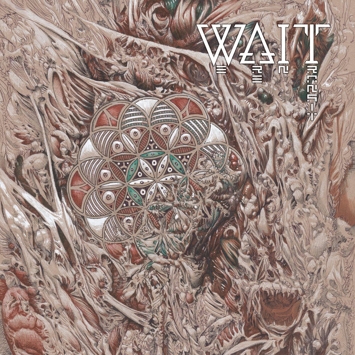
The potential for allegory with this work is near limitless, but there is one that immediately comes to mind. Our lives may seem ordered and pleasant enough. We have friends and family with whom to share our experiences. Schools, occupations and socially agreed upon stages of life lend our daily lives an inherent structure. Yet, so much around us is chaos, such as the seemingly inexorable doom of our planet or the political turmoil that much of us are embroiled in. More than this, the chaos appears overwhelmingly vast and all-consuming, slowly tearing at our structure one piece at a time. As the record’s title says, ultimately all of our lives are transitory, so let’s hope we can all do something while we’re here to keep the chaos at bay.
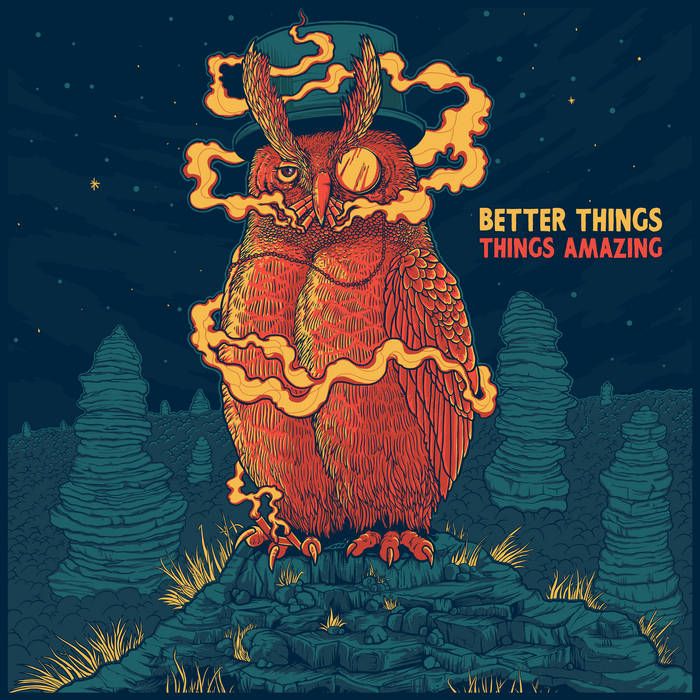
Things Amazing – Better Things
We now move on to a wildly different band, instrumental post-rockers Things Amazing, with some wildly different cover art for their upcoming EP Better Things. The artwork is far more subdued in its subject matter, but much more vibrant in its depiction. Front and centre we have a badass owl perched atop one of many stone spires that dot the landscape. Whether they’re seen growing from the ground or whether their towering height is pushing through dense foliage, or even clouds, is unclear, though the bare landscape, steel blue colour palette and open skyline certainly evoke an alien sensation. The owl is in a beautifully bright orange, dominating the piece with its strong posture and radiating colour. Replete with a top hat, monocle, and eyebrows akin to a laurel wreath, the owl stands with complete authority, its deadpan eye suggesting this is simply business as usual. The owl is puffing on no less than six cigarettes simultaneously, with another two on standby in between two of its talons, and one can only hope its lungs are in as good of a shape as this interesting piece of artwork’s aesthetics.
False – Portent
Next up we have my favourite cover for today, the latest in a stunning line from Mariusz Lewandowski (Bell Witch’s Mirror Reaper, anyone?). We’ll definitely need to dedicate one of these columns to him soon because he continues to produce remarkable works of art, this time for False’s fantastic sophomore effort Portent. In the foreground we have sheer cliffs dotted by people approaching and gathering dangerously close to the precipice. Beneath stretches a diabolical landscape of molten lava, hellfire, and sulphuric fumes as far as the eye can see. If ever there was a scene that depicted Mordor in all of its dread, this is it. Yet, this scene of perdition is dwarfed by the monolithic grim reaper which dominates our attention. Its hooded cloak is looking into the furnace, though whether it is drawing new strength or depositing fresh victims is unclear. Its left hand grips the dreaded scythe, the edge of its blade stained red from the blood of its victims. Behind the reaper stand colossal cliffs of darkness that make one thing abundantly clear: the only way in or out of this damnation is the reaper. Above these cliffs stand several figures shrouded in mist, their features indistinguishable as they wave a huge white flag, surrendering themselves as they accept their cursed fate. Overlooking it all is a pained face of loss, eyes hollow and dark, and with good reason. There is no comfort to be found in this scene, only pain, loss, and suffering.
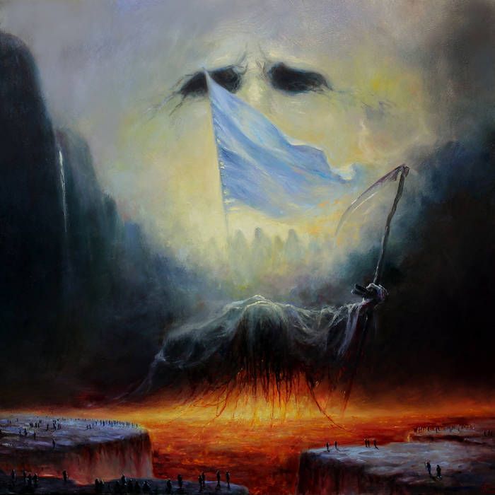
Overall, one cannot deny that the piece is striking. The imagery carries weighty symbolism with ease, clearly articulating the record’s overarching themes and emotions visually for all to see. The use of colour only accentuates the darkness, whilst the searing reds and submissive whites bring no levity, only a sense of hopelessness, inevitability, and destruction. In addition, the opaque and shrouded nature of the background in conjunction with the comparatively diminutive nature of the foreground draws the onlooker’s eye towards the most central and defined figure in the piece: the foreboding reaper. It is here that Lewandowski brings most detail to the fore, each tattered strip of cloth and twisting gnarl of wood emphasising the reaper’s power and prominence. A fantastic piece, and one which makes us truly excited to cover more of his work in future columns.
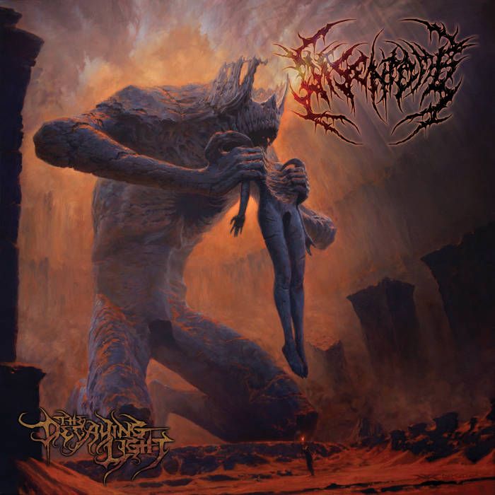
Disentomb – The Decaying Light
Last, but not least, we have the infernal cover art for Disentomb’s The Decaying Light, in which Nick Keller depicts, with frightening realism, just what it feels like to listen to Disentomb for the first time.
Catch you next month!